
If you are like me when thinking about 3D in the browser you immediately speak of WebGL. But what most developers forget is that we use simple 3D mechanism in our web sites and applications already: the z-index.
While the z-index in only stacking flat containers above each other. Almost all modern browsers can use CSS to create simple 3D models.
Let’s start with a cuboid.
<div class="container">
  <div id="cuboid">
    <div class="front">1</div>
    <div class="back">2</div>
    <div class="right">3</div>
    <div class="left">4</div>
    <div class="top">5</div>
    <div class="bottom">6</div>
  </div>
</div>
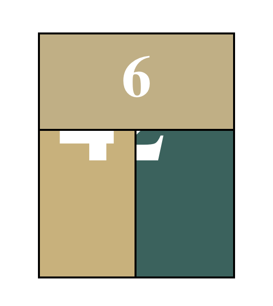
We have 6 sides and for easier recognizing each one each has a number on it. We make them bigger and give them a different background to distinguish them further.
.container {
  width: 300px;
  height: 300px;
  position: relative;
  margin: 0 auto 40px;
  padding-top: 100px;
}

#cuboid {
  width: 100%;
  height: 100%;
  position: absolute;
}

#cuboid div {
  display: block;
  position: absolute;
  border: 2px solid black;
  line-height: 196px;
  font-size: 120px;
  font-weight: bold;
  color: white;
  text-align: center;
}
Until now we didn’t use any 3D transformations. For ordering the sides we rotate and translate each side in its place.
    #cuboid .front  { transform: translateZ(100px); }
    #cuboid .back   { transform: rotateX(-180deg) translateZ(0px); }
    #cuboid .right  { transform: rotateY(90deg) translateZ(150px) translateX(-50px); }
    #cuboid .left   { transform: rotateY(-90deg) translateZ(50px) translateX(50px); }
    #cuboid .top    { transform: rotateX(90deg) translateZ(50px) translateY(50px); }
    #cuboid .bottom { transform: rotateX(-90deg) translateZ(200px) translateY(-50px); }

This brought the back side on top but no 3D visible yet. Further we tell the browser to use 3d on its children and move the scene a bit out.
#cuboid {
  transform-style: preserve-3d;
  transform: translateZ( -100px );
}

Still we are trapped in flatland. Ah we are looking straight onto the front. So we rotate the scene.
#cuboid {
  transform-style: preserve-3d;
  transform: translateZ( -100px ) rotateX(20deg) rotateY(20deg);
}
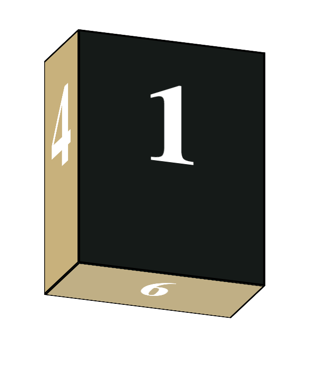
Now we have depth. Something is quite not right. If we remember one thing from our OpenGL days we need another ingredient to make it look 3D: a perspective.
.container {
  perspective: 1200px;
}
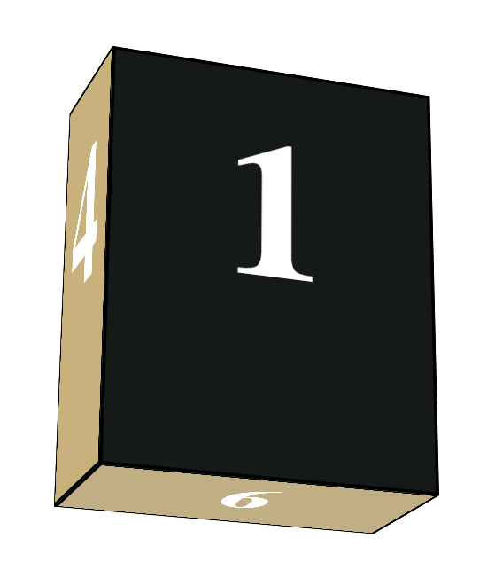
Last but not least we add animation to see it spinning.
#cuboid {
  transform-style: preserve-3d;
  transform: translateZ(-100px) rotateX(20deg) rotateY(20deg);
  animation: spinCuboid 5s infinite ease-out;
}
@keyframes spinCuboid {
  0% { transform: translateZ(-100px) rotateX(0deg) rotateY(0deg); }
  100% { transform: translateZ(-100px) rotateX(360deg) rotateY(360deg); }
}
 Schneide Blog