
I have a lot of electronic devices that essentially only do one thing. A flashlight, a hair trimmer, a razor, a toothbrush, some smoke detectors and a handful of power banks and other energy storage devices. They have a few things in common:
- They have their own rechargeable battery
- They store a (more or less) complex internal state
- They have exactly one status LED
- They try to communicate with me using the LED
The razor is an exception, because it has a lot more signal lights than just the LED, but I include it as the positive example. The LED of the razor changes its color to show what it wants from me.
All other devices try to convey meaning by different styles of blinking. Let’s take the hair trimmer as the negative example: It blinks when it is happy because it is fed energy. The blinking stops to indicate that it is fully loaded.
The flashlight blinks when it is unhappy and hungry. It will stop blinking when it is fed. It never indicates that it has enough, you have to guess.
The smoke detectors flash shortly once in a while to show that they are still on duty. They might flash more vigorously if they get hungry. But they have another means to get the message across: They sound a short alarm. You’ll feed them instantly and always have a spare battery at hands.
The point of this story is that it is impossible to decipher a blinking LED. What does it mean? The device is busy and I don’t need to do something? The device is on the verge of starvation and I should intervene? It’s the most ambiguous signal I can think of.
If there were a standard that blinking means the desire for human intervention, I would learn the signal and adhere to it. But nearly half of my devices blink when they are busy and don’t need anything from me. And some try to talk to me in morse.
I’m not going to learn dozens of LED signal dialects. If a device wants to be understood, it should be designed in an understandable way. Give it a color-changing LED and we can talk:
- Steady green: I’m happy.
- Steady orange: I’m content, but it could be better. You might allocate some care for me.
- Steady red: Please care for me.
- Blinking red: Attention! I need urgent care.
What does this interaction design rant have to do with software development?
I often see the same categorical error in the design of software user interfaces. And while manufacturers of cheap consumer electronics can argue that a multi-color LED is more expensive, we software developers can’t really hide behind costs.
Anything that pops up, slides in or just blinks on my screen better has a damn good reason to try to grab my attention. Grabbing not only my attention but also my input focus is the upmost interruption, comparable to the alarm signal of the smoke detector. I blogged recently about a blocking dialog that shows up unprompted and informs about some random unprompted background work.
But there is another type of ambiguous signal that I see more often than I like. It is silent and tries to shift the blame for the inevitable frustration on you: The vague selection field:
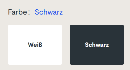
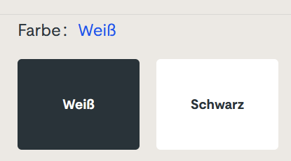
Sorry for the german text, I didn’t find it on an english website. The german website this is from is still online, so if you can find it, you can try it yourself. I won’t link it here, though. (Maybe search for “steckdosenleiste klemmbar” and roam the results)
Let me describe your experience: you can select the color of a product, either white or black. The selected color is stated above, inexplicably written in the color blue. The selected field is “highlighted” black. Or is it? Maybe the white field is the highlighted one? And why is the selection field for the color black presented in mostly white?
The selection is not communicating properly, but I feel intimidated and stupid by a simple choice between two colors.
You can probably think of dozens of improvements and that’s fine. But the designer was certainly restricted by a corporate design rulebook and had to use three colors only: blue, white and black. You decide if he used his potential successfully.
Which brings me back to the introductory example: Give an engineer a single color LED and he will implement an elaborate morse code scheme to make the most of it. The problem is the initial restriction, not the shenanigans that follow.
