When Optional sounds too optional: opt for more expressive types

So, I have one PyQt application which not only is quite data-heavy, but also has significant real-time requirements, as well as multiple windows. This construct brings some absolutely horrifying highly intellectually inspiring quests with it, and Python turned out to be kind of a good decision for that project, because that is one of the languages where, when you think about your structure a bit, you might get to write very natural-sounding like code.

Of course, the following idea is actually language-agnostic, I will just use fictive Python examples close to problems-based-on-a-true-story.

This in itself is not only a matter of aesthetics, but because real-time demands are quite tricky to reliably be covered by unit tests alone, the actual code has to read itself so clearly that one does not need to second-guess what any of this does. Think of a bedtime story, which usually would not, coming to think of it, contain clauses – or paragraphs, for that matter – requiring, under circumstances not even trivial to the human eye, one kind of meticulous gymnastics, easily negating twice, or thrice, and relying on Python’s borderline criminal degrees of freedom in duck typing, or canards even– you see — your toddler will now not go to sleep anytime soon. Or trust you with another story, for that matter.

Now I found out: While Qt is somewhat mature, one cannot even trust their way of doing things – i.e. turns out, the signals/slots system is not particularly designed for performance. Neither did I feel inclined to put my faith into even another state management solution like e.g. python-statemachine package, because – as capable as that sounds, it might be overkill, and distracting with its own idiosyncrasies (as also: I would not recommend Redux for a web project anymore, especially in TypeScript, except for you really know from the start that this is a good fit).

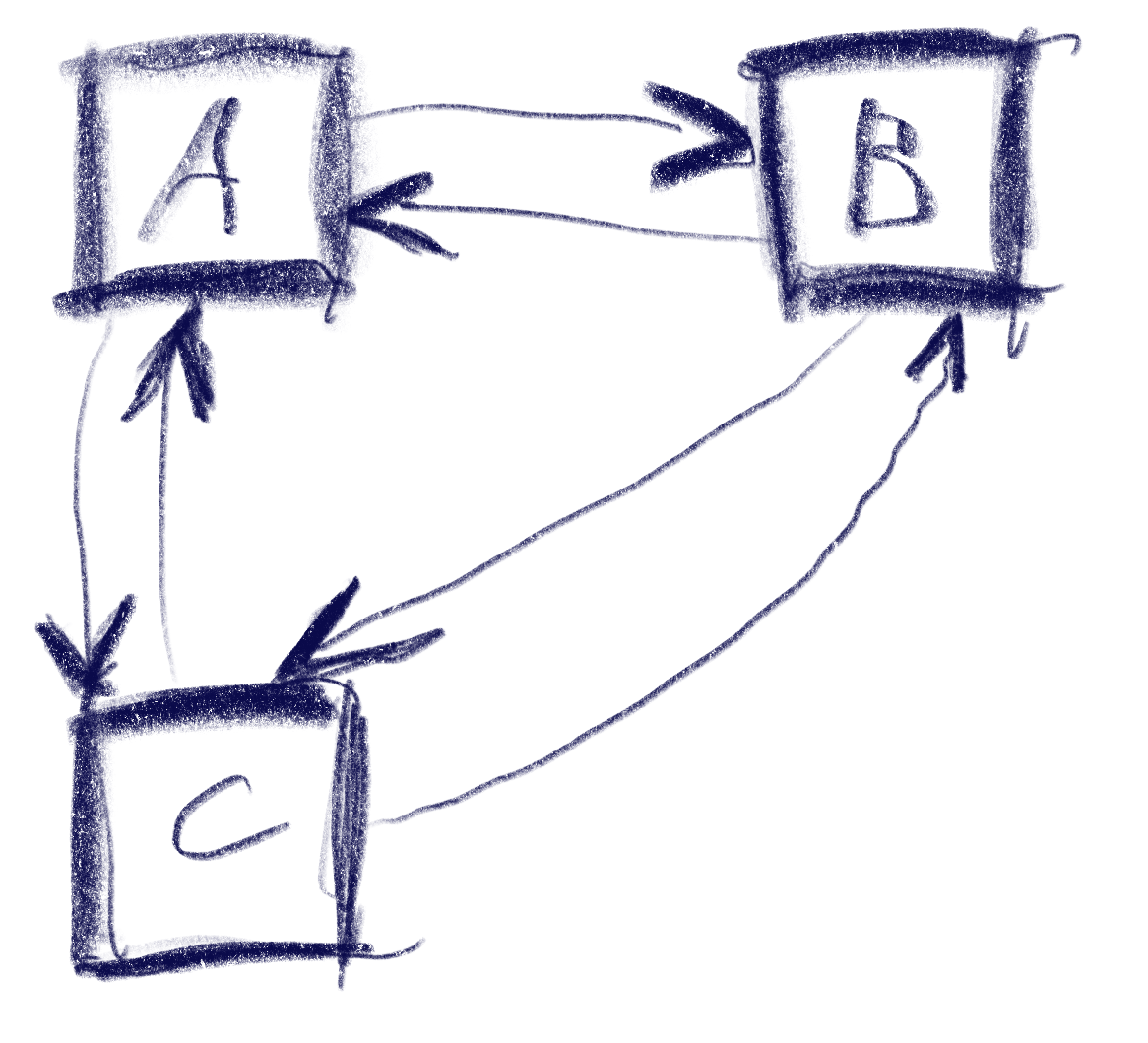
But, so, I have some tricky interplays between

  • Data consistency / single-source-ness demands that e.g. between two windows, there should only be primitive data exchanged, say str/int identifiers, and both have access to their repositories; not throwing loaded data sets around my memory in order to go stale at times
  • Comprehension, most significantly Single Level of Abstraction, or other indicators of mental load like how many levels of intendation / return paths are mixed within sight (and also, Type Annotations do help a lot in Python, even though not mandatory, i.e. the complete opposite of fighting Redux-TypeScript-chimaeras – but I digress…
  • Robustness, where I would believe that my user (me) has virtually no chance of even seeing this and that window when their data is maybe still loading somewhere – but I still check these cases, because this bedtime story has no business in leaving you an hopeful-to-anxious pile of nerves
  • Traceability of your state, for troubleshooting and useful UI feedback (as you’d guess, real-time event based stuff is not easily debugged by break points or logging alone).

So over months in that project, I grew annoyed of code like (Symbolbild)


class Editor:
    # ...
  
    def load_editor(self, params: Optional[EditorParams]):
        if params and (self._entity is not None or
                       self._entity.id != params.id):
            if entity := repository.load_entity(params.id):
                self._entity = entity
            else:
                raise ValueError("repository needs some alone time :(")
            self._entity.other_stuff = other_repo.check_stuff()
        elif params is None:
            raise TypeError(
                "sounds Optional in our signature, but actually is not"
            )
        elif self._entity.id == params.
            self.adjust_more_stuff(self._entity, params.stuff)
            # ...

Because encountering any single block of these drags you down, I have currently accustomed myself to write these as (one can argue whether the names like “Supplier” are the best here, but they’re not the worst, I believe)

@dataclass(frozen=True)
class LoadedEntity:
id: str
entity: Optional[Entity]
stuff: Optional[OtherStuff]
@property
def is_unusable(self):
return self.entity is None
@property
def missing_stuff(self):
if self.is_unusuable:
return True
else:
return self.stuff is None
class EntitySupplier:
_current: LoadedEntity
_entity_repo: EntityRepository
_stuff_repo: OtherStuffRepo
# __init__ etc. hereby left out as boilerplate
def load_params(self, params: Any):
# do all your checks in here
if (... very bad ...):
self._current = LoadedEntity(params.id, None)
return
entity = self._entity_repo.get(params.id)
stuff = self._stuff_repo.get(params.stuff).for(entity)
return LoadedEntity(
params.id,
entity,
stuff
)
@property
def entity(self):
return self._current.entity
def expecting(self, stuff: bool = False) -> Optional[LoadedEntity]:
if stuff and self._current.missing_stuff:
return None
return self._current
class Editor:
_supply: EntitySupplier
_logger: SomeLogger
def __init__(self, **kwargs):
self._supply = EntitySupplier(**kwargs)
self._logger = BlaBlaLogger()
def load(self, params):
self._supply.load_params(params)
if entity := self._supply.entity:
self.update_ui(entity)
else:
self._logger.error("Outsmarted, eh? %s | %s", str(params), stack_trace())
return
if supply := self._supply.expecting(stuff=True):
self.initiate_stuff_from(supply)
else:
self._logger.info("Entity %s is ready, Stuff is not | %s", str(entity), stack_trace())

So, the LoadedEntity serves like a concatenation of several Optional types, but it wraps the logic (i.e. there’s no sense in having stuff when you don’t have entity first) instead of just shruggingly claming “well, this entity here is optional – and that other stuff is, too”. Now, LoadedEntity is not a pretty name at all (have a better one?), but it sure beats having two straightaway lies.

I like that pattern because it allows me to stash the EntitySupplier and LoadedEntity somewhere on their own (I do strictly not believe that every class needs its own file, but some of the “Single …” ideas (Responsibility, Level of Abstraction, you name it) do also apply here; and the Editor.load(…) itself does read somewhat like a short story. It has quite linear structure and can early-return, and/or log, on demand, and while naming is still hard (consistently voted one half of famous Hard Things), I could even have some fun in designing that language while preserving the idea, that future-me can arrive in a few weeks (read: hours) and still trust in some of the entites and stuff.

The quintessence here is: Checking for None (which is Python’s NULL, and the typing Optional[T] is identically equal to T | None) is still a thing in 2026 due to its sheer practicality, but if you design some some structure around that and keep these checks in something like LoadedEntity, you can keep the abyss from staring back into you.

Finding the culprit in massive-components-interactions web apps

So, one of the biggest software developer joys is, when a customer, after you developed some software for them a few years back, is returning to you with change requests and it turns out that the reason you didn’t hear much from them was not complete abandonment of their project, or utter mistrust in your capabilites, or – you name it – but just that the software worked without any problems. It just did its job.

But one of the next biggest joys is, then, to actually experience how your software behaves after their staff – also just doing their job – growed their database up to a huge number of records and now you see your system under pressure, with all parts playing each other in large scales.

Now, with interactions like on-the-fly-updates during mouse gestures like drag’n’drop, falling behind real-time can be more than a minor nuisance; this might go against a core purpose of such a gesture. But how do you troubleshoot an application which is behaving smoothly most of the time, but then have very costly computations during short periods of time?

Naively, one would just put logging statements in every part that can possibly want to update, but this very quickly meets its limit when your interface just has so many components on display, and you can’t just check that one interaction on one singular part?

This is where I thought of this small device, which I now wanted to share. In my case, this was a React application, but we just use a single object, defined globally, which is modified by a single function like this


const debugBatch = {
    seen: [],
    since: null,
    timeoutId: null
};

const logBatched = (id)=> {
    if (debugBatch.timeoutId) {
        debugBatch.seen.push(id);
    } else {
        debugBatch.since = new Date();
        debugBatch.seen = [];
        debugBatch.timeoutId = setTimeout(() => {
            console.log("[UPDATED],", debugBatch);
            debugBatch.timeoutId = null;
        }, 1000);
    }
};

const SomeComplicatedComponent = ({id, ...}) => {
    ...

    logBatched(id);

    return <>...</>;
};

and I do feel compelled to emphasize that this completely goes outside the React way of thinking, taking care with every state to follow the framework-internal logic. Not some global object, i.e. shared memory that any component can modify at will. But while for production code, I would hardly advise doing so, our debugging profits from that ghostly setup of “every component just raises the I-was-updated-information to somewhere out of its realm”.

It just uses one global timeout, giving a short time frame during which every repeated function call of logBatched(...); raises one entry in the “seen” field of our global object; and when that collection period is over, you get one batched output containing all the information. And you can easily extend that by passing more information along, or maybe, replacing that seen: [] with a new Set() if registering multiple updates of the same component is not what you want. (Also, the timestamp is there just out of habit, it’s not magically required or so).

Note that you can do all additional processing of “how do I need to prepare my debugging statements in order to actually see who the real culprits are” after collecting, and done in an extra task, can even be as expensive as you want it to be without blocking your rendering. As in, having debugging code that significantly affects the actual problem that you are trying to understand, is especially probable in such real-time user interactions; which means you are prone to chasing phantoms.

I like this thing because of its simplicity, and particularly, because it employs a way of thinking that would instinctively make me doubt the qualification of anyone who would give me such a piece to review (😉) but for that specific use case, I’d say, does the job pretty well.

Make your users happy by not caring about how they would enter data

As many of our customers are operating somewhere in the technical or scientific field, we happen to get requests that are somewhat of the form

Well, so we got that spreadsheet managing our most important data and well…
… it’s growing over our heads with 1000+ entries…
… here are, sadly, multiple conflicting versions of it …
… no one understands these formulae that Kevin designed …
… we just want ONE super-concise number / graph from it …
… actually, all of the above.

And while that scenario might be exaggerated for the sole reason of entertainment, at its core there’s something quite universal. Now there’s one thing to feel like the only adult in the room, throwing one’s hands up into the air, and then calculating the minimum expenses for a self-contained solution and while doing so, we still would strive for a simple proposal, that’s always quite a tightrope walk between the “this really needs not to be fancy” and the “but we can not violate certain standards either”.

And in such a case, your customer might happily agree with you – they do not want to rely on their spreadsheets, it just was too easy just to start with. And now they’re addicted.

The point of this post is this: If your customer has tabular data, there’s almost no “simple” data input interface you can imagine that is not absolutely outgunned by spreadsheets, or even text files. The sheer amount of conventions that nearly everyone already knows, don’t try to compete with some input fields and “Add entity” buttons and HTML <form>s.

This is no praise towards spreadsheet software at all. But consider the hidden costs that can wait behind a well-intended “simple data input form”.

For the very first draft of your software

  • do not build any form of data input interface, if you cannot exactly know that it will quickly empower the user to something they can not do already.
  • Do very boldly state: Keep your spreadsheets, CSV, text files. I will work with them, not against them.
  • E.g. Offer something as “uncool” as a “(up) load file” button, or a field to paste generic text. You do not have to parse .xls, .xlsx, .ods files either. The message should be: Use whatever software you want to use, up to the point where it started to be a liability, not your friend anymore.
  • Do not be scared about “but what if they have wrong formatting”. Well then find the middle ground – what kind of data should you really sanitize, what can you straightout reject?

Make it clear that you prioritize the actual problem of your customer. Examples:

  1. if that problem is “too many sources-of-not-really-truth-anymore”, then your actual solution should focus on merging such data sources. But if that was the main problem of your customer, imagine them to always have some new long-lost-data-sources on some floppy disk, stashed in their comic book collection, or something.
  2. if that problem is “we cannot see through that mess”, then your actual solution should focus on analyzing, on visualizing the important quantities.
  3. if the problem is that Kevin starts writing new crazy formulae everyday and your customer is likely go out of business whenever he chooses to quit, then yes, maybe your actual solution is really in constructing a road block, but then rather in a long discussion about the actual use cases, not by just translating the crazy logic into Rust now, because “that’s safer”.

It is my observation, that a technically-accustomed customer is usually quite flexible in their ways. In some cases it really is your job to impose a static structure, and these are the cases in which they will probably approve of having that done to them. In other cases, e.g. their problem is a shape-shifting menace that they cannot even grasp, do not start with arbitrary abstractions, templates, schemas that will just slow them down.
I mean – either you spend your day migrating their data all the time, and putting new input elements on their screen, or you spend your day solving their actual troubles.

Integrating API Key Authorization in Micronaut’s OpenAPI Documentation

In a Java Micronaut application, endpoints are often secured using @Secured(SecurityRule.IS_AUTHENTICATED), along with an authentication provider. In this case, authentication takes place using API keys, and the authentication provider validates them. If you also provide Swagger documentation for users to test API functionalities quickly, you need a way for users to specify an API key in Swagger that is automatically included in the request headers.

For a general guide on setting up a Micronaut application with OpenAPI Swagger and Swagger UI, refer to this article.

The following article focuses on how to integrate API key authentication into Swagger so that users can authenticate and test secured endpoints directly within the Swagger UI.

Accessing Swagger Without Authentication

To ensure that Swagger is always accessible without authentication, update the application.yml file with the following settings:

micronaut:  
  security:
    intercept-url-map:
      - pattern: /swagger/**
        access:
          - isAnonymous()
      - pattern: /swagger-ui/**
        access:
          - isAnonymous()
    enabled: true

These settings ensure that Swagger remains accessible without requiring authentication while keeping API security enabled.

Defining the Security Schema

Micronaut supports various Swagger annotations to configure OpenAPI security. To enable API key authentication, use the @SecurityScheme annotation:

import io.swagger.v3.oas.annotations.security.SecurityScheme;
import io.swagger.v3.oas.annotations.enums.SecuritySchemeIn;
import io.swagger.v3.oas.annotations.enums.SecuritySchemeType;

@SecurityScheme(
    name = "MyApiKey",
    type = SecuritySchemeType.APIKEY,
    in = SecuritySchemeIn.HEADER,
    paramName = "Authorization",
    description = "API Key authentication"
)

This defines an API key security scheme with the following properties:

  • Name: MyApiKey
  • Type: APIKEY
  • Location: Header (Authorization field)
  • Description: Explains how the API key authentication works

Applying the Security Scheme to OpenAPI

Next, we configure Swagger to use this authentication scheme by adding it to @OpenAPIDefinition:

import io.swagger.v3.oas.annotations.info.*;
import io.swagger.v3.oas.annotations.security.SecurityRequirement;

@OpenAPIDefinition(
    info = @Info(
        title = "API",
        version = "1.0.0",
        description = "This is a well-documented API"
    ),
    security = @SecurityRequirement(name = "MyApiKey")
)

This ensures that the Swagger UI recognizes and applies the defined authentication method.

Conclusion

With these settings, your Swagger UI will display an Authorization field in the top-left corner.

Users can enter an API key, which will be automatically included in all API requests as a header.

This is just one way to implement authentication. The @SecurityScheme annotation also supports more advanced authentication flows like OAuth2, allowing seamless token-based authentication through a token provider.

By setting up API key authentication correctly, you enhance both the security and usability of your API documentation.

How React components can know their actual dimensions

Every once in a while, styling a Web Application can be oh so frustrating quite interesting because stuff that appears easy does actually not comply with any of your suggestions. And there are some fields that ambush me more often than I’d like to admit, and with each application there appears some unique quirk that makes a universal solution hard.

Right now, I’m thinking about a CSS-only nested layout of several areas on your available screen that need to make good use of the available space, but still be somewhat dynamic in order to be maintainable.

Web Apps are especially delicate in layout things because if you ask most customers, a fully responsive layout is never the goal (as in, way too expensive for their use case), but no matter how often you make them assure you that there is only a small set of target resolutions, there will be one day where something changed and well-yeah-these-ones-too-of-course.

It is also commonly encountered that “looking good” is “not that important”, but as progress goes, everyone still knows that that was a pure lie.

Of course, this is a manifestation of Feature Creep, but one that is hard to argue about. And we do not want to argue with customers anyway, we want to solve their problems with as little friction as possible.

So by now, one would have thought that CSS would have evolved quite enough in order to at least place dynamic content somewhat predictable. There are flexbox and grid displays and these are useful as hell, but still.

And while, for some reason or another, the width of dynamic nested content can usually be accounted for in some pure CSS solution that one can find in under a day’s work; getting the height quite right is a problem that is officially harder than all multi-order corrections I ever encountered in my studies of quantum field theory. Only solvable in some oversimplified use-cases.

The limits of “height: 100%;” are reached in cases where content is dominated by its content instead of their container; as in nested <svg> elements that love to disagree about the meaning of “100%”. Dynamic SVG content is especially more cumbersome because you neither want distorted nor cut-off content, and you can try to get along with viewBox and preserveAspectRatio, but even then.

Maybe it won’t budge, and maybe that’s the point where I find it acceptable to read the actual DOM elements even from within a React component, an approach that is usually as dangerous as it is intrusive,

but is it a code smell if it is rather concise and reliantly does the job?

const useHeightAwareRef = () => {
    const [height, setHeight] = useState({
        initialized: false,
        value: null,
    });
    const ref = useRef(null);

    useEffect(() => {
        if (!ref.current || height.initialized) {
            return;
        }

        const adjustHeight = () => {
            const rect = ref.current?.getBoundingClientRect();
            setHeight({
                value: rect?.height ?? null,
                initialized: true
            });
        };

        adjustHeight();
        window.addEventListener("resize", adjustHeight);
        return () => {
            window.removeEventListener("resize", adjustHeight);
        };
    }, [height.initialized]);

    return {
        height: height.initialized ? height.value : null,
        ref
    };
};

// then use this like:

const SomeNestedContent = () => {
    const {height, ref} = useHeightAwareRef();

    return (
        <div ref={ref}>
        {
            height &&
            <svg height={height} width={"100%"}>
                { /* ... Dragons be here ... */ }
            </svg>
        }
        </div>
    );
};

I find this worthfile to have in your toolbox. If you manage your super-dynamic* content in some other super-responsive** fashion in a way that is super-arguable*** to your customer, sure, go by it. But remember, at some point each, possibly,

  • (*) your customer might have data outside the mutually agreed use cases,
  • (**) your customer might have screens outside the mutually agreed ones,
  • (***) your customer might have less patience / time than originally intended,

so maybe move the idea of “there must be one super-elegant pure-CSS solution in the year of 2025” back into your dreams and shoehorn that <svg> & friends into where they belong :´)

Four-way Navigation in UIs

Just yesterday, I was working on the task of enabling gamepad navigation of a graphical UI. I had implemented this before in my game abstractanks but since forgotten how exactly I did it. So I opened the old code and tried to decipher it, and I figured that’d make a nice topic to write about.

Basic implementation

Let’s break down the simple version of the problem: You have a bunch of rectangular controls, and given a specific one, figure out the next one with an input of either left, up, right or down.

This sketch shows a control setup with a possible solution. It also contains an interesting situation: going ‘down’ from B box goes to C, but going up from there goes to A!

The key to creating this solution is a metric that weights the gap for a specific input direction, e.g. neighbor_metric(
box<> const& from, box<> const& to, navigation_direction direction)
. To implement this, we need to convert this gap into numbers we can use. I’ve used a variant of Arvo’s algorithm for that: For both axes, get the difference of the rectangles’ intervals along that axis and store those in a 2d-vector. In code:

template <int axis> inline float difference_on_axis(
box<> const& from, box<> const& to)
{
if (to.min[axis] > from.max[axis])
return to.min[axis] - from.max[axis];
else if (to.max[axis] < from.min[axis])
return to.max[axis] - from.min[axis];
return 0.f;
}

v2<> arvo_vector(box<> const& from, box<> const& to)
{
return {
difference_on_axis<0>(from, to),
difference_on_axis<1>(from, to) };
}

That sketch shows the resulting vectors from the box in the top-left going to two other boxes. Note that these vectors are quite different from the difference of the boxes’ centers. In the case of the two top boxes, the vector connecting the centers would tilt down slightly, while this one is completely parallel to the x axis.

Now armed with this vector, let’s look at the metric I was using. It results in a 2d ‘score’ that is later compared lexicographically to determine the best candidate: the first number determines the ‘angle’ with the selected axis, the other one the distance.

template <int axis> auto metric_on_axis(box<> const& from, box<> const& to)
{
auto delta = arvo_vector(from, to);
delta[0] *= delta[0];
delta[1] *= delta[1];
auto square_distance = delta[0] + delta[1];

float cosine_squared = delta[axis] / square_distance;
return std::make_pair(-cosine_squared, delta[axis]);
}

std::optional<std::pair<float, float>> neighbor_metric(
box<> const& from, box<> const& to, navigation_direction direction)
{
switch (direction)
{
default:
case navigation_direction::right:
{
if (from.max[0] >= to.max[0])
return {};
return metric_on_axis<0>(from, to);
}
case navigation_direction::left:
{
if (from.min[0] <= to.min[0])
return {};
return metric_on_axis<0>(from, to);
}
case navigation_direction::up:
{
if (from.max[1] >= to.max[1])
return {};
return metric_on_axis<1>(from, to);
}
case navigation_direction::down:
{
if (from.min[1] <= to.min[1])
return {};
return metric_on_axis<1>(from, to);
}
}
}

In practice this means that the algorithm will favor connections that best align with the input direction, while ties resolved by using the closest candidate. The metric ‘disqualifies’ candidates going backward, e.g. when going right, the next box cannot start left of the from box.

Now we just need to loop through all candidates and the select the one with the lowest metric.

This algorithm does not make any guarantees that all controls will be accessible, but that is a property that can easily be tested by traversing the graph induced by this metric, and the UI can be designed appropriately. It also does not try to be symmetric, e.g. going down then up does not always result in going back to the previous control. As we can see in the first sketch, this is not always desirable. I think it’s nice to be able to go from B to C via ‘down’, but I’d be weird to go ‘up’ back there instead of A. Instead, going ‘right’ to B does make sense.

Hard cases

But there can be ambiguities that this algorithm does not quite solve. Consider the case were C is wider, so that is is also under B:

The algorithm will connect both A and B down to C, but the metric will be tied for A and B going up from C. The metric could be extended to also include the ‘cross’ axis min-point of the box, e.g. favoring left over right for westerners like me. But going from B down to C and then up to A would feel weird. One idea to resolve this is to use the history to break ties, e.g. when coming from B to C, going back up would go back to C.

Another hard case is scroll-views. In fact, they seem to change the problem domain. Instead of treating the inputs as boxes in a flat plane, navigating in a scroll view requires to navigate to potentially only partially visible or even invisible boxes and bringing them into view. I’ve previously solved this by treating every scroll-view as its own separate plane and navigating only within that if possible. Only when no target is found within the scroll-view, did the algorithm try to navigate to items outside.

Don’t Just Blink at Me

I have a lot of electronic devices that essentially only do one thing. A flashlight, a hair trimmer, a razor, a toothbrush, some smoke detectors and a handful of power banks and other energy storage devices. They have a few things in common:

  • They have their own rechargeable battery
  • They store a (more or less) complex internal state
  • They have exactly one status LED
  • They try to communicate with me using the LED

The razor is an exception, because it has a lot more signal lights than just the LED, but I include it as the positive example. The LED of the razor changes its color to show what it wants from me.

All other devices try to convey meaning by different styles of blinking. Let’s take the hair trimmer as the negative example: It blinks when it is happy because it is fed energy. The blinking stops to indicate that it is fully loaded.

The flashlight blinks when it is unhappy and hungry. It will stop blinking when it is fed. It never indicates that it has enough, you have to guess.

The smoke detectors flash shortly once in a while to show that they are still on duty. They might flash more vigorously if they get hungry. But they have another means to get the message across: They sound a short alarm. You’ll feed them instantly and always have a spare battery at hands.

The point of this story is that it is impossible to decipher a blinking LED. What does it mean? The device is busy and I don’t need to do something? The device is on the verge of starvation and I should intervene? It’s the most ambiguous signal I can think of.

If there were a standard that blinking means the desire for human intervention, I would learn the signal and adhere to it. But nearly half of my devices blink when they are busy and don’t need anything from me. And some try to talk to me in morse.

I’m not going to learn dozens of LED signal dialects. If a device wants to be understood, it should be designed in an understandable way. Give it a color-changing LED and we can talk:

  • Steady green: I’m happy.
  • Steady orange: I’m content, but it could be better. You might allocate some care for me.
  • Steady red: Please care for me.
  • Blinking red: Attention! I need urgent care.

What does this interaction design rant have to do with software development?

I often see the same categorical error in the design of software user interfaces. And while manufacturers of cheap consumer electronics can argue that a multi-color LED is more expensive, we software developers can’t really hide behind costs.

Anything that pops up, slides in or just blinks on my screen better has a damn good reason to try to grab my attention. Grabbing not only my attention but also my input focus is the upmost interruption, comparable to the alarm signal of the smoke detector. I blogged recently about a blocking dialog that shows up unprompted and informs about some random unprompted background work.

But there is another type of ambiguous signal that I see more often than I like. It is silent and tries to shift the blame for the inevitable frustration on you: The vague selection field:

Sorry for the german text, I didn’t find it on an english website. The german website this is from is still online, so if you can find it, you can try it yourself. I won’t link it here, though. (Maybe search for “steckdosenleiste klemmbar” and roam the results)

Let me describe your experience: you can select the color of a product, either white or black. The selected color is stated above, inexplicably written in the color blue. The selected field is “highlighted” black. Or is it? Maybe the white field is the highlighted one? And why is the selection field for the color black presented in mostly white?

The selection is not communicating properly, but I feel intimidated and stupid by a simple choice between two colors.

You can probably think of dozens of improvements and that’s fine. But the designer was certainly restricted by a corporate design rulebook and had to use three colors only: blue, white and black. You decide if he used his potential successfully.

Which brings me back to the introductory example: Give an engineer a single color LED and he will implement an elaborate morse code scheme to make the most of it. The problem is the initial restriction, not the shenanigans that follow.

How to design a dynamic website with flex containers

Every frontend developer will know this situation: You design a frontend so that all components fit together perfectly. You invest your time, heart, and soul, working tirelessly and frequently testing to see the results. And then you deliver it to a customer, only to find that their display presents something different. The beautiful design looks bad, or some parts are no longer accessible.

To avoid these unpleasant surprises, you should make your layout dynamic. One possibility for achieving this is by using the flex container. In the following, I will demonstrate how to dynamically build an example page using flex containers.

Example page

My example page has a header spanning the entire content. The content is divided into a navigation area on the left and the content page on the right. The content page itself has a header, main content and a button bar. Now let’s cast that into HTML.

<!doctype html>
<html>
    <body>
        <div class="whole-page">
            <div class="header">
                Header<br>
                ...
            </div>
            <div class="content">
                <div class="navigation">Navigation</div>
                <div class="content-page">
                    <div class="content-header">
                        Title<br>
                        ...
                    </div>
                    <div class="main-content">
                        Content
                    </div>
                    <div class="button-bar">
                        Button Bar<br>
                        <button>Save</button>
                        <button>Cancel</button>
                    </div>
                </div>
            </div>
        </div>
    </body>
</html>

And now for the design: I want my page to take up the entire screen. The navigation area should take up 20% of the width, and the page should take up the rest. I want the button bar to be at the bottom of the screen and the main content to take up as much space as possible between the heading and the bar.

Let’s implement this with CSS:

html, body {
    font-family: sans-serif;
    font-size: 20pt;
    height: 100%;
    margin: 0;
}
.whole-page{
    display: flex;
    flex-direction: column;
    height: 100%;
    width: 100%;
}

.content {
    display: flex;
    flex-direction: row;

    flex-grow: 1;
    min-height: 0;
}
.navigation {
    min-width: 20%;
    overflow: auto;

}
.content-page {
    display: flex;
    flex-direction: column;
  
    flex-grow: 1;
    min-width: 0;
}

.main-content {
    flex-grow: 1;
    overflow: auto;

}

First, we configure html and body to take up the entire screen. To do this, we set the height to 100% and remove margins.

In the next step, we say that the layout of the whole page should build up flexibly among itself (column) and set the size to the maximum size of the screen.

For the parts with fixed sizes, like headers and the button bar, no further settings are needed.

The content also gets a dynamic layout, but side-by-side (row). Since row is the default, you would not have to write it explicitly, but I did it here for explanation. With “flex-grow: 1” we make the content take the maximum remaining height. With “min-height: 0” we prevent it from hogging more space than is still available and overflowing the screen.

Our navigation area gets the min-width of 20%. In most cases, width is sufficient, but, for example, with tables with large test cells, the table steals more space from the navigation than allowed. With min-width, this does not happen. As a bonus, the area gets a scrollbar with “overflow: auto” if the content is too big.

The content page arranges the elements in columns again and takes the maximum available width. The main content takes all the space left next to the header and button bar and gets a scrollbar if there is not enough space available.

When I fill my containers with background color and example content, I get the following views:

Conclusion

Flex containers are an easy way to create page layouts dynamically. Thus, applications can run independently of the screen to a certain extent. Of course, the whole thing also has its limits, and for very small devices such as smartphones, completely different operating concepts and layouts must be developed.

Interacting with SVG files inside your React applications

So, for some reason you have a SVG file that somehow resembles a part of the application you are currently developing.

This might be only a sketch that you want to prepare as a Click Dummy, or it might be that you need to display a somewhat unique, complicated structure that is best layed out per SVG editor. This is somewhat expected when you have customers in the technical / scientific research sector.

So now you want to fill it with life.

Now, the SVG format is quite close to the <svg> structure that one can embed into HTML, but there are some steps in between. Most importantly, most SVG Editors fill their .svg files up with meta data or specific information only required for the editor in case you want to edit the files again.

Thus, you have three choices to integrate the SVG component in a React application

  • Re-Build your SVG with custom React Components that, via JSX, render their <svg>, <g>, <path>, etc. accordingly
  • Convert your SVG to valid JSX – this is possible in many cases, but you need to take care e.g. that the style attribute is a string in the SVG and an object in JSX, also it can be still way too large to be readily put in a single React Component
  • Import your .svg as its own React Component and then wrap that into an own Component that takes care about the interaction part

While I also have written a small converter that does the SVG-JSX-Conversion just fine for me for any file that comes out of Inkscape (probably an idea for my next blog post), we had the case of some files with about 16000 lines of SVG each, so I chose the third method in our case.

In my eyes, it is very correct to mention that the following way somehow goes against the React Mindset. In which you render all your components yourself to attach them the required mouse event handlers, never having to interact with a HTML “id” or any document.getElementById() or document.getElementByClassName().

In any React application, these should be avoided, but the idea here is to have a singular point – a SvgWrapper Component – where you allow these functions because you’d agree about the need to somehow target the specific SVG elements.

The gist:

import {ReactComponent as OurHorrificSvgMonster} from "/src/monster.svg";

const OurBeautifulComponent = () => {

    useOurCarefulSvgSynchronizationEffect(); // more on this below

    return (
        <SvgWrapper>
             <OurHorrificSvgMonster/>
        </SvgWrapper>
    )
};

Quick note: you can target the embedded <svg> element itself by <OurHorrificSvgMonster ref={...}/> and you could use this (ref.current holds that HTML element) to traverse all the children, so if you know much about the structure of your svg you could even live without the <SvgWrapper>. But say someone else made the horrific svg monster and all you have is the id or class names to all the individual svg elements inside.

Then

const WithVanillaHandlersConnected = ({children}) => {
    const dispatch = useDispatch();

    React.useEffect(() => {

        const onClick = (event) => {
            dispatch(awesomeAction(event.target.id));
        };

        const awesomeElements = [...document.getElementsByClassName("awesome")];

        awesomeElements.forEach(elem => {
            elem.addEventListener("click", onClick);
        });

        return () => awesomeElements.forEach(pipe => {
            pipe.removeEventListener("click", onClick);
        });
    }, []);

    return children;
};

I chose this dispatch() as a placeholder for any interaction with the surrounding web application, it could also be a simple React state or something. You can register any event listener you want here (also “mouseover”, “mouseout”, “contextmenu”, …), but think of removing it again in the effect return function.

By the way, document.getElementsByClassName(…) returns something like a HTMLCollection which is not exactly iterable, thus the […destructuring] to make the .forEach() possible.

We now have the first part – our elements (in our case, everything that has class “awesome”) has got a click handler that allows to dispatch anything to the application state. But now they need to change, too.

In a purely React-y way, this could be done by a svg element that chooses its fill = {isActive? "magenta" : "black"} but as we choose not to render our components ourselves, we need to once again grab deeply into the DOM and dare to manipulate it by hand.

As mentioned above – this is a step towards very ugly problems as React cannot guarantee that your visual layer matches your application state. You, on yoru own, have to guarantuee to do what’s right.

This is where this comes in:

/*
 for this example, think of that the redux selector selectSomethingFromTheState returns something like:

result = [
  {elementId: "elem1", isActive: true},
  ...
];

and isActive could be the thing that was toggled by our awesomeAction() above

*/

const useOurCarefulSvgSynchronizationEffect = () => {
    const elementStates = useSelector(selectSomethingFromTheState);

    React.useEffect(() => {
        for (const state of elementStates) {
            const element = document.getElementById(state.elementId};
            element.style.fill = isActive ? "magenta" : "black";
            // ... do other stuff with the DOM element
        }
    }, [elementStates]);
};

There we have it – we have the SvgWrapper and the use…SynchronizationEffect() that both stray from the React mindset by accessing the DOM directly, but we do it in a fashion where it is concisely encapsulated inside <OurBeautifulComponent> and there is no direct knowledge about the IDs inside the SVG, or Class manipulations, CSS Selectors, etc. elsewhere.

In my opinion, one can indeed go against the rules if it’s necessary, but I also see the option for a Stockton Rush quotation here.. so, if you know of any more elegant way, please feel free to share.

PS: by the way, if you use vite, you might get an “Uncaught SyntaxError” when trying import { ReactComponent ... }I’ve written about this before.

Using the File System as an Interaction Device

In a recent project, my job was to build a scientific data processing pipeline for a new algorithm that wasn’t set in stone yet. Part of my work would be to explore different mathematical formulas interactively with the customer.

My usual approach to projects is a “risk first” strategy. I try to identify the riskiest or most demanding part of the project and deal with it first. This approach essentially resembles the “fail fast” mindset, just that we haven’t failed yet.

In the case of the calculation pipeline, the riskiest part and at the same time the functionality that matters to the customer most, was the pipeline itself. If we were able to implement a system that can transform the given entry data into the desired results, we had an end-to-end prototype and the means to explore different mathematical approaches.

The pipeline consists of different steps that can be described as a complex transformation each. The first step/transformation takes a proprietary data format file and converts it into a big JSON file. The main effort of this step is a deep physical analysis of the data contained in the proprietary format. This analysis requires a lot of thought, exploration and work, but can be seen as a black box that the data traverses on its way from proprietary format to JSON.

The next step takes the JSON input and extracts the necessary information required by the following step. It is essentially a data reduction operation.

The third step feeds the analyzed, reduced data into the formulas and stores the calculation result.

The fourth step aggregates the calculation results into a daily time series report in a format that can be read by a spreadsheet application. This report is the end product of the pipeline and will be used to make decisions and to rule out certain environmental hazards.

The main difference of this project to virtually every project before is that I didn’t write any user interface code. The application’s main window is still blank. The whole interaction of the system with other systems that provide the entry data, of the pipeline steps among each other and with the human user is based on files in the file system.

The system periodically checks for the existence of new entry data. If some is found, it is copied in the “inbox” directory of the first step. The first step periodically checks for the existence of files in its inbox and processes them into its “outbox” that conveniently serves as the inbox of the second step. You probably get the idea by now. All the steps in the system, including the upstream data fetching routine, are actors in an file-based actor model. The files serve as messages from one actor to another. The file system and its directory structure is the common communication channel that passes the messages around.

Each processing step is an actor node with input and output storages

One advantage of this approach is that the file system viewer application of the operating system can be used as the (graphical) user interface. By opening the appropriate directories and viewing their content, the user can supervise the operating state of the system. The system can report problems by moving the incoming message not in the step’s “done” directory , but into its “failed” or “problem” directory. If several directories are on display at once, the user can follow a specific piece of data through the pipeline and view the intermediate results. For domain specific reasons, the actors in this project also have the result directory “omitted” for data that will not be processed any further because some domain rules have determined a cancellation.

An user can even manipulate the data’s flow by moving files away or into a specific directory. Let’s say that we want to calculate a certain amount of data again, we can just copy the files from the “done” directory of the first step into its “inbox” and the system will process it again.

Because the analysis step takes some time while the calculation step is surprisingly fast, we can perform just the calculation again by not moving the initial data files, but the analyzed and reduced entry files for the calculation step. Using this approach, we can try different mathematical formulas by stopping the system, swapping the calculation step with a new version, starting the system again and moving the desired entry files into its inbox.

Using the file system as an interaction device for the user and the system’s parts has many immediate advantages, but some drawbacks, too. One drawback is performance. Using the harddisk for data transfer is the slowest possible way to bring data from step X to step X+1. If your system is required to have high throughput or low latency, this approach isn’t suitable. My project has a low, forecastable throughput and a latency requirement that is measured in minutes or seconds, but not in milliseconds or even nanoseconds. It can spend some time in the filesystem, because the first step alone takes several seconds for each file.

Another drawback is a certain fragility of the communication medium, the file system. You have to account for concurrent reads, writes or even deletes. The target platform of my system (Microsoft Windows) exhibits signs of exhaustion if the amount of files in one directory grows too large. This means that your file selection, already a costly operation, becomes more costly if the systems is put under pressure. If your throughput is usually steady, which is the case in my project, this won’t be a problem. Until you manually copy 100k files in an inbox for swift recalculation and discover that the file copy process alone takes several minutes.

Of course, the system cannot operate without a graphical user interface forever. But some basic interactions with the system will probably just result in some files being copied from one directory to another one in the background.