As many of our customers are operating somewhere in the technical or scientific field, we happen to get requests that are somewhat of the form
Well, so we got that spreadsheet managing our most important data and well… … it’s growing over our heads with 1000+ entries… … here are, sadly, multiple conflicting versions of it … … no one understands these formulae that Kevin designed … … we just want ONE super-concise number / graph from it … … actually, all of the above.
And while that scenario might be exaggerated for the sole reason of entertainment, at its core there’s something quite universal. Now there’s one thing to feel like the only adult in the room, throwing one’s hands up into the air, and then calculating the minimum expenses for a self-contained solution and while doing so, we still would strive for a simple proposal, that’s always quite a tightrope walk between the “this really needs not to be fancy” and the “but we can not violate certain standards either”.
And in such a case, your customer might happily agree with you – they do not want to rely on their spreadsheets, it just was too easy just to start with. And now they’re addicted.
The point of this post is this: If your customer has tabular data, there’s almost no “simple” data input interface you can imagine that is not absolutely outgunned by spreadsheets, or even text files. The sheer amount of conventions that nearly everyone already knows, don’t try to compete with some input fields and “Add entity” buttons and HTML <form>s.
This is no praise towards spreadsheet software at all. But consider the hidden costs that can wait behind a well-intended “simple data input form”.
For the very first draft of your software
do not build any form of data input interface, if you cannot exactly know that it will quickly empower the user to something they can not do already.
Do very boldly state: Keep your spreadsheets, CSV, text files. I will work with them, not against them.
E.g. Offer something as “uncool” as a “(up) load file” button, or a field to paste generic text. You do not have to parse .xls, .xlsx, .ods files either. The message should be: Use whatever software you want to use, up to the point where it started to be a liability, not your friend anymore.
Do not be scared about “but what if they have wrong formatting”. Well then find the middle ground – what kind of data should you really sanitize, what can you straightout reject?
Make it clear that you prioritize the actual problem of your customer. Examples:
if that problem is “too many sources-of-not-really-truth-anymore”, then your actual solution should focus on merging such data sources. But if that was the main problem of your customer, imagine them to always have some new long-lost-data-sources on some floppy disk, stashed in their comic book collection, or something.
if that problem is “we cannot see through that mess”, then your actual solution should focus on analyzing, on visualizing the important quantities.
if the problem is that Kevin starts writing new crazy formulae everyday and your customer is likely go out of business whenever he chooses to quit, then yes, maybe your actual solution is really in constructing a road block, but then rather in a long discussion about the actual use cases, not by just translating the crazy logic into Rust now, because “that’s safer”.
It is my observation, that a technically-accustomed customer is usually quite flexible in their ways. In some cases it really is your job to impose a static structure, and these are the cases in which they will probably approve of having that done to them. In other cases, e.g. their problem is a shape-shifting menace that they cannot even grasp, do not start with arbitrary abstractions, templates, schemas that will just slow them down. I mean – either you spend your day migrating their data all the time, and putting new input elements on their screen, or you spend your day solving their actual troubles.
One of my fundamental driving forces for designing a suitable user experience is the motto of “no scrolling”. It is not a hard principle in the sense of Bret Victor’s “Inventing on Principle”, but it is motivation enough to always look for context-aware ordering of lists and tables.
One of the cornerstones of such “scrolling-free” or “scrolling-reduced” applications is a possibility for the user to define a context of work. You might call it an ordinary search field, but it is highly interactive (immediate feedback, as mandated by Bret Victor) and doesn’t lead to a special result view. It just reduces the amount of data that is presented to the user. The idea behind the context field is that the user has some idea about the piece of work she wants to edit. So, if for example she remembers that the customer of an order was named “Miller”, she would type “mil” in the context field and have the list of orders reduced to just the “Millers” and “Camilles” (the latter contains “mil” in the middle).
This works fine for text-based information, but less so for numerical data. Most users typically remember text like names better than numbers like values or phone numbers, so it fits the natural inclination of humans. And then there is a form of data that is remembered easily and used for orientation, but presented as numbers: dates.
If you store a date in a persistent storage, it is probably stored as a number, several numbers or a short piece of text like “2024-12-24”. To make a date searchable, the textual representation of “2024-12-24” is a good start, but we can do better with a simple trick:
Instead of just using one textual representation for the search index (or whatever search functionality you use), you can append several representations of the same date at once:
This enables your user to restrict to a context of “dec” for “December” or even “tue” for “Tuesday”.
This search-extended representation of the date is never shown on screen, so it doesn’t have to be readable or brief. It should contain the concepts of managing dates that your users will facilitate during their normal interaction with the data (not with your application!). So it might even be useful to add several more representations like a relative period (“in 5 months, 16 days”) and maybe special date names (“christmas, xmas”). It might be useful to cut down on filler words like “months” or “days”, because they are included in virtually every date you’ll search. So the relative period might come down to “5 five, 16 sixteen”. If your search allows for multiple texts that all need to be present (which I would encourage because in my experience, that’s how people triangulate: “It was Miller and at the end of the year”), you might add the filler words again, because it allows for a context string like “5 mo” with matches with “in 5 months” (and “5 months ago”, but that’s another topic).
In a nutshell, my trick is to craft the textual representation of data for the search (not the visualisation!) in accordance to the navigation patterns of my users. If they can rely on the data being focussed effectively, they won’t miss the scrollbars.
Just yesterday, I was working on the task of enabling gamepad navigation of a graphical UI. I had implemented this before in my game abstractanks but since forgotten how exactly I did it. So I opened the old code and tried to decipher it, and I figured that’d make a nice topic to write about.
Basic implementation
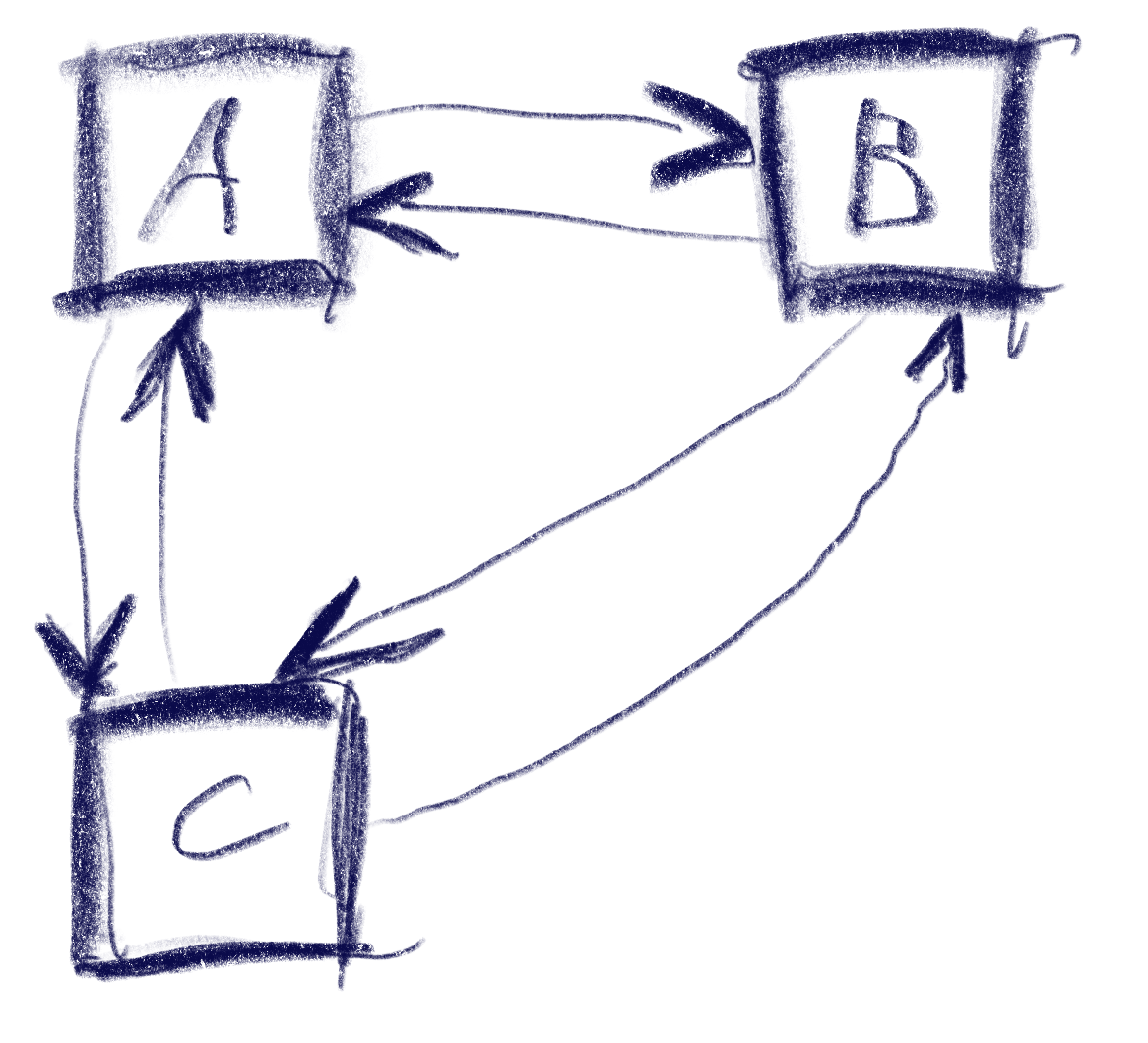
Let’s break down the simple version of the problem: You have a bunch of rectangular controls, and given a specific one, figure out the next one with an input of either left, up, right or down.
This sketch shows a control setup with a possible solution. It also contains an interesting situation: going ‘down’ from B box goes to C, but going up from there goes to A!
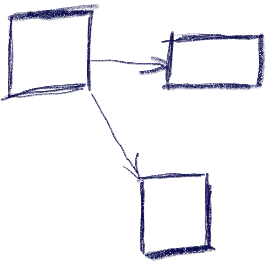
The key to creating this solution is a metric that weights the gap for a specific input direction, e.g. neighbor_metric( box<> const& from, box<> const& to, navigation_direction direction). To implement this, we need to convert this gap into numbers we can use. I’ve used a variant of Arvo’s algorithm for that: For both axes, get the difference of the rectangles’ intervals along that axis and store those in a 2d-vector. In code:
That sketch shows the resulting vectors from the box in the top-left going to two other boxes. Note that these vectors are quite different from the difference of the boxes’ centers. In the case of the two top boxes, the vector connecting the centers would tilt down slightly, while this one is completely parallel to the x axis.
Now armed with this vector, let’s look at the metric I was using. It results in a 2d ‘score’ that is later compared lexicographically to determine the best candidate: the first number determines the ‘angle’ with the selected axis, the other one the distance.
template <int axis> auto metric_on_axis(box<> const& from, box<> const& to) { auto delta = arvo_vector(from, to); delta[0] *= delta[0]; delta[1] *= delta[1]; auto square_distance = delta[0] + delta[1];
std::optional<std::pair<float, float>> neighbor_metric( box<> const& from, box<> const& to, navigation_direction direction) { switch (direction) { default: case navigation_direction::right: { if (from.max[0] >= to.max[0]) return {}; return metric_on_axis<0>(from, to); } case navigation_direction::left: { if (from.min[0] <= to.min[0]) return {}; return metric_on_axis<0>(from, to); } case navigation_direction::up: { if (from.max[1] >= to.max[1]) return {}; return metric_on_axis<1>(from, to); } case navigation_direction::down: { if (from.min[1] <= to.min[1]) return {}; return metric_on_axis<1>(from, to); } } }
In practice this means that the algorithm will favor connections that best align with the input direction, while ties resolved by using the closest candidate. The metric ‘disqualifies’ candidates going backward, e.g. when going right, the next box cannot start left of the from box.
Now we just need to loop through all candidates and the select the one with the lowest metric.
This algorithm does not make any guarantees that all controls will be accessible, but that is a property that can easily be tested by traversing the graph induced by this metric, and the UI can be designed appropriately. It also does not try to be symmetric, e.g. going down then up does not always result in going back to the previous control. As we can see in the first sketch, this is not always desirable. I think it’s nice to be able to go from B to C via ‘down’, but I’d be weird to go ‘up’ back there instead of A. Instead, going ‘right’ to B does make sense.
Hard cases
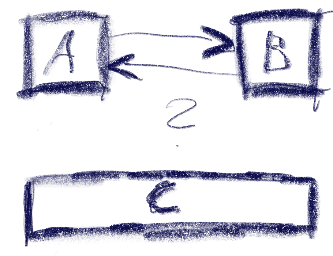
But there can be ambiguities that this algorithm does not quite solve. Consider the case were C is wider, so that is is also under B:
The algorithm will connect both A and B down to C, but the metric will be tied for A and B going up from C. The metric could be extended to also include the ‘cross’ axis min-point of the box, e.g. favoring left over right for westerners like me. But going from B down to C and then up to A would feel weird. One idea to resolve this is to use the history to break ties, e.g. when coming from B to C, going back up would go back to C.
Another hard case is scroll-views. In fact, they seem to change the problem domain. Instead of treating the inputs as boxes in a flat plane, navigating in a scroll view requires to navigate to potentially only partially visible or even invisible boxes and bringing them into view. I’ve previously solved this by treating every scroll-view as its own separate plane and navigating only within that if possible. Only when no target is found within the scroll-view, did the algorithm try to navigate to items outside.
I have a lot of electronic devices that essentially only do one thing. A flashlight, a hair trimmer, a razor, a toothbrush, some smoke detectors and a handful of power banks and other energy storage devices. They have a few things in common:
They have their own rechargeable battery
They store a (more or less) complex internal state
They have exactly one status LED
They try to communicate with me using the LED
The razor is an exception, because it has a lot more signal lights than just the LED, but I include it as the positive example. The LED of the razor changes its color to show what it wants from me.
All other devices try to convey meaning by different styles of blinking. Let’s take the hair trimmer as the negative example: It blinks when it is happy because it is fed energy. The blinking stops to indicate that it is fully loaded.
The flashlight blinks when it is unhappy and hungry. It will stop blinking when it is fed. It never indicates that it has enough, you have to guess.
The smoke detectors flash shortly once in a while to show that they are still on duty. They might flash more vigorously if they get hungry. But they have another means to get the message across: They sound a short alarm. You’ll feed them instantly and always have a spare battery at hands.
The point of this story is that it is impossible to decipher a blinking LED. What does it mean? The device is busy and I don’t need to do something? The device is on the verge of starvation and I should intervene? It’s the most ambiguous signal I can think of.
If there were a standard that blinking means the desire for human intervention, I would learn the signal and adhere to it. But nearly half of my devices blink when they are busy and don’t need anything from me. And some try to talk to me in morse.
I’m not going to learn dozens of LED signal dialects. If a device wants to be understood, it should be designed in an understandable way. Give it a color-changing LED and we can talk:
Steady green: I’m happy.
Steady orange: I’m content, but it could be better. You might allocate some care for me.
Steady red: Please care for me.
Blinking red: Attention! I need urgent care.
What does this interaction design rant have to do with software development?
I often see the same categorical error in the design of software user interfaces. And while manufacturers of cheap consumer electronics can argue that a multi-color LED is more expensive, we software developers can’t really hide behind costs.
But there is another type of ambiguous signal that I see more often than I like. It is silent and tries to shift the blame for the inevitable frustration on you: The vague selection field:
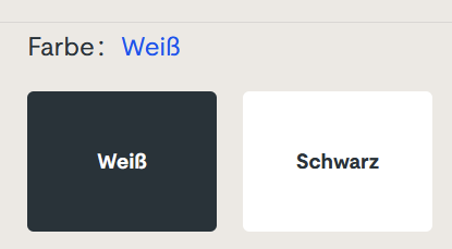
Sorry for the german text, I didn’t find it on an english website. The german website this is from is still online, so if you can find it, you can try it yourself. I won’t link it here, though. (Maybe search for “steckdosenleiste klemmbar” and roam the results)
Let me describe your experience: you can select the color of a product, either white or black. The selected color is stated above, inexplicably written in the color blue. The selected field is “highlighted” black. Or is it? Maybe the white field is the highlighted one? And why is the selection field for the color black presented in mostly white?
The selection is not communicating properly, but I feel intimidated and stupid by a simple choice between two colors.
You can probably think of dozens of improvements and that’s fine. But the designer was certainly restricted by a corporate design rulebook and had to use three colors only: blue, white and black. You decide if he used his potential successfully.
Which brings me back to the introductory example: Give an engineer a single color LED and he will implement an elaborate morse code scheme to make the most of it. The problem is the initial restriction, not the shenanigans that follow.
Nowadays many applications are very complex or handle so much data that users need and expect a fast and powerful search functionality. Popular search engine you can leverage are ElasticSearch and Solr. They both use Lucene for index management under the hood and provide a similar functionality regarding indexing and text search.
Even if these frameworks work really great implementing a great search functionality can be quite hard, especially when handling special data like DOIs, IP-Adresses, Hostnames and other text containing special characters.
What’s the deal with special characters?
The standard analyzers are tuned for dealing with natural language based texts. So they split words on punctuation, whitespace and certain special characters. These are usually filtered out and not indexed. So if you index something like my-cool-hostname the dashes and the complete string will not land in the index only leaving the separate parts my, cool and hostname.
The problem with that is, that neither an exact match nor a substring like my-cool will yield any results. That is not what your users will expect…
Making your search work with special data
There are several ways to improve your search functionality for fields or texts containing different kinds of non-language strings. Here are some simple options that will improve or fix handling problematic cases and make your search work as expected by your users.
My examples use ElasticSearch features and wording, so they may be called differently for other search engines.
Using a keyword field
If you only need an exact match on some weird data field like a DOI 10.1000/182 containing punctuation and slashes, where a user normally just copy & pastes the search string from somewhere using a keyword field for indexing instead of the text type might be the better option. Usually this is easy to implement and fast for indexing and searching.
Using multiple index fields for one data field
ElasticSearch also offers the possibility to index the same data using multiple index fields. So you can keep sub-string features while adding exact match or special character support by adding different index fields like keyword above or an index field using a different analyzer (see this option below). This is called multi-field in ElasticSearch. Using multi-fields can also be used to improve sorting and scoring matches.
Using different analyzers
As I mentioned before the standard analyzers for text fields use tokenization rules and character filters useful for natural language. Sometimes you want to keep words together or preserve special characters. To implement an appropriate search for hostnames or IP addresses you could for example use a custom analyzer with a whitespace or pattern tokenizer.
Conclusion
Default full text search works great out-of-the-box in many cases. However, there are many cases of special, structured data where you need to fine-tune the way the index gets populated.
Many approaches can be combined using different analyzers and indexing a data in several ways.
There is a lot you can do to provide awesome search capabilities to your users but that requires quite some knowledge of the way the search engines work and about the data you want to be searchable.
There is a classic book from 1998 about interaction design and user experience called “The Inmates Are Running the Asylum” by Alan Cooper. It essentially points out that technology that is too hard to understand or handle is a self-chosen burden. We humans decided that our technology should be the way it is. We are the inmates of our digital (or technological) asylum and we built it ourselves.
There is another classic law of software design and software evolution, called Zawinski’s law:
Every program attempts to expand until it can read mail. Those programs which cannot so expand are replaced by ones which can.
Jamie Zawinski, 1995
If you interpret the law with some degree of freedom, that might mean that e-mail client applications are the pinnacle of software evolution, because they are designed to perform the one task every other application sets out to achieve.
You might think that an e-mail client can lean back and relax, knowing that it won’t be replaced and doesn’t need to adapt. It can concentrate on the one task it is asked to do, provide the perfect service and be the most essential tool for any digital worker.
But, for reasons that baffle me, my e-mail client apparently has better things to do than to deal with those pesky mails that I receive or want to send.
Let me tell you about my e-mail client. It is a Thunderbird running on Windows. If you want to attribute all the problems I’m about to point out to these two decisions, you probably miss the greater point that I’m trying to make with this blog post. It isn’t about Thunderbird or e-mail clients, it is about a software ecosystem that strays from its original intent: To serve the human operator.
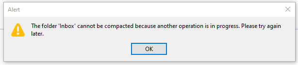
Every morning, I open my e-mail client and let it run on a secondary monitor, just visible in my peripheral vision. Most of the day, it has nothing to do. I suspect that this causes boredom, because sometimes, it shows this dialog window out of the blue:
There are a few things wrong with this dialog:
I didn’t ask for a folder compaction, so it is not necessary to tell me to “try again later”.
Because I didn’t ask for anything, it surprises me that Thunderbird needs my interaction with a modal dialog in order to proceed with… doing nothing?
If there is “another operation” that causes problems, I can only help if it has a name. Without more details given, I can only deduce that my Inbox is involved.
My only choice is to close the modal dialog window. I cannot interact with Thunderbird until I dismiss the dialog. I cannot choose to “retry” or “view details”, even if I had resolved the unnamed problem outside of Thunderbird.
Think about what really happens here from an interaction design viewpoint: I command my e-mail client to stand ready to receive or send e-mails. It suddenly decides that something else is important, too. It does the thing and fails. It fails in such a grandiose manner that it needs to inform me about it and blocks all other interaction until I acknowledge its failure. It cannot fail silently and it cannot display the alert notification in a non-modal manner. My e-mail client suddenly commands me to click an arbitrary button or else… it won’t do my e-mail stuff anymore.
The digital asylum isn’t there to serve the inmates, the inmates are there to serve the asylum. Thunderbird doesn’t help me doing my e-maily things, I need to support Thunderbird to do its own things. The assistant involves the boss for secondary (or even less important) tasks.
The problem is that I recognize this inversion of involvement all the time:
The windows operating system decides that it needs to update right now. My job is to keep the machine running under all circumstances. Once I ran from one train to the next with the updating notebook in my hands, carefully keeping the lid open and the updates running.
My text editor might open the file I want to edit later, but first I need to decide if the latest update is more important right now. I cannot imagine the scenario when an update of a text editor is so crucial that it needs to happen before my work.
My IDE is “reconstructing the skeletons” or “re-indexing the files” whenever it sees fit. My job is to wait until this clearly more important work is done. I can see that these things help me do my thing later. But I want to do my thing now, maybe with slightly less help for a while.
Sometimes, I feel more like a precatory guest than the root administrator on my own machine. I can use it in the gaps between computer stuff when all applications decide that they generously grant me some computation time.
It’s not that there aren’t clear rules how computers should behave towards users. The ISO norm 9241-110 is very on point about this:
Users should always be able to direct their interaction with the product. They retain control over when to begin, interrupt, or end actions.
We build a digital asylum for ourselves that is complicated and hard to grasp. Then we demote ourselves to guests in the very same asylum that we built and after that, we let the asylum choose its own endeavors.
If you translate this behaviour in the real world, you would call it “not customer-centered”. It would be the barkeeper that cleans all the glasses before you can order your drink. It would be the teacher that delays all student questions to the end of the lecture. Or it would be the supermarket that you can only enter after they stored all the new products on the shelves, several hours after “being open”.
By the way, if you want to help me with my mutinous Thunderbird: The problem is already solved. It is just a striking example of the “controllability violations” that I wanted to describe.
You probably have another good example of “inversed involvement” that you can tell us in the comments.
In a recent project, my job was to build a scientific data processing pipeline for a new algorithm that wasn’t set in stone yet. Part of my work would be to explore different mathematical formulas interactively with the customer.
My usual approach to projects is a “risk first” strategy. I try to identify the riskiest or most demanding part of the project and deal with it first. This approach essentially resembles the “fail fast” mindset, just that we haven’t failed yet.
In the case of the calculation pipeline, the riskiest part and at the same time the functionality that matters to the customer most, was the pipeline itself. If we were able to implement a system that can transform the given entry data into the desired results, we had an end-to-end prototype and the means to explore different mathematical approaches.
The pipeline consists of different steps that can be described as a complex transformation each. The first step/transformation takes a proprietary data format file and converts it into a big JSON file. The main effort of this step is a deep physical analysis of the data contained in the proprietary format. This analysis requires a lot of thought, exploration and work, but can be seen as a black box that the data traverses on its way from proprietary format to JSON.
The next step takes the JSON input and extracts the necessary information required by the following step. It is essentially a data reduction operation.
The third step feeds the analyzed, reduced data into the formulas and stores the calculation result.
The fourth step aggregates the calculation results into a daily time series report in a format that can be read by a spreadsheet application. This report is the end product of the pipeline and will be used to make decisions and to rule out certain environmental hazards.
The main difference of this project to virtually every project before is that I didn’t write any user interface code. The application’s main window is still blank. The whole interaction of the system with other systems that provide the entry data, of the pipeline steps among each other and with the human user is based on files in the file system.
The system periodically checks for the existence of new entry data. If some is found, it is copied in the “inbox” directory of the first step. The first step periodically checks for the existence of files in its inbox and processes them into its “outbox” that conveniently serves as the inbox of the second step. You probably get the idea by now. All the steps in the system, including the upstream data fetching routine, are actors in an file-based actor model. The files serve as messages from one actor to another. The file system and its directory structure is the common communication channel that passes the messages around.
Each processing step is an actor node with input and output storages
One advantage of this approach is that the file system viewer application of the operating system can be used as the (graphical) user interface. By opening the appropriate directories and viewing their content, the user can supervise the operating state of the system. The system can report problems by moving the incoming message not in the step’s “done” directory , but into its “failed” or “problem” directory. If several directories are on display at once, the user can follow a specific piece of data through the pipeline and view the intermediate results. For domain specific reasons, the actors in this project also have the result directory “omitted” for data that will not be processed any further because some domain rules have determined a cancellation.
An user can even manipulate the data’s flow by moving files away or into a specific directory. Let’s say that we want to calculate a certain amount of data again, we can just copy the files from the “done” directory of the first step into its “inbox” and the system will process it again.
Because the analysis step takes some time while the calculation step is surprisingly fast, we can perform just the calculation again by not moving the initial data files, but the analyzed and reduced entry files for the calculation step. Using this approach, we can try different mathematical formulas by stopping the system, swapping the calculation step with a new version, starting the system again and moving the desired entry files into its inbox.
Using the file system as an interaction device for the user and the system’s parts has many immediate advantages, but some drawbacks, too. One drawback is performance. Using the harddisk for data transfer is the slowest possible way to bring data from step X to step X+1. If your system is required to have high throughput or low latency, this approach isn’t suitable. My project has a low, forecastable throughput and a latency requirement that is measured in minutes or seconds, but not in milliseconds or even nanoseconds. It can spend some time in the filesystem, because the first step alone takes several seconds for each file.
Another drawback is a certain fragility of the communication medium, the file system. You have to account for concurrent reads, writes or even deletes. The target platform of my system (Microsoft Windows) exhibits signs of exhaustion if the amount of files in one directory grows too large. This means that your file selection, already a costly operation, becomes more costly if the systems is put under pressure. If your throughput is usually steady, which is the case in my project, this won’t be a problem. Until you manually copy 100k files in an inbox for swift recalculation and discover that the file copy process alone takes several minutes.
Of course, the system cannot operate without a graphical user interface forever. But some basic interactions with the system will probably just result in some files being copied from one directory to another one in the background.
When developing software in general and also specifically user interfaces (UIs) one important aspect is often neglected: The form, shape and especially the amount of data.
One very common practice is to fill unknown texts with fragments of the famous Lorem ipsum placeholder text. This may be a good idea if you are designing a software for displaying a certain kind of articles similar in size and structure to your placeholder text. In all other cases I would regard using lorem ipsum as a smell.
My recommendation is to collect as many samples of real or at least realistic data as feasible. Use them to build and test your application. Why do I think it matters? Let me elaborate a bit in the following sections.
Data affects the layout
You can only choose a fitting layout if you have knowledge about the length of certain texts, size of image etc. The width of columns can be chosen more appropriately, you can descide if you need scrollbars, if you want them permantently visible for a more stable and calm layout, how large panels or text areas have to be for optimum readability and so on.
Data affects the choice of UI controls
The data your application has to handle should reflect not only in the layout but also in the type of controls to be used.
For example, the amount of options for the user to make a choice from drastically affects the selection of an adequate UI control. If you have only 2 or 3 options toggle buttons, checkboxes or radio buttons next to each other or layed out in one column may be a good fit. If the count of options is greater, dropdowns may be better. At some point maybe a full-blown list with filters, sorting and search may be necessary.
To make a good decision, you have to know the expected amount and shape of your data.
Data affects algorithms and technical decisions regarding performance
The data your system has to work with and to present to the user also has technical impact. If the datasets are moderate in size, you may be able to transfer them all to the frontend and do presentation, filtering etc. there. That has the advantage of reducing backend stress and putting computational effort in the hands of the clients.
Often this becomes unfeasible when the system and its data pool grows. Then you have to think about backend search and filtering, datacompression and the like.
Also algorithmns and datastructure may change from simple lists and linear search to search trees, indexes and lookup tables.
The better you know the scope of your system and the data therein the better your technical decisions can be. You will also be able to judge if the YAGNI principle applies or not.
Conclusion
To quickly sum-up the essence of the advice above: Get to know the expected amount and shape of data your application has to deal with to be able to design your system and the UI/UX accordingly.
In this blog post, I’ll describe my experiences with a certain product (a computer monitor) and its manual. It might serve as an example of how ridiculous a poorly designed customer experience is perceived on the receiving end. Hopefully, it inspires some readers to think about sensible defaults and how to communicate them.
This meant that we bought a lot of smaller monitors in the last months. We decided to go the monoculture route and bought one piece of our favorite model.
It arrived faulty. The only thing that this device did was to indicate “battery full” when the battery status button was pressed (yes, this particular monitor has its own battery for mobile usage). Everything else didn’t work, especially not the power button. The device was a dead fish. I returned it to the supplier.
The replacement unit was also dead on arrival. This puzzled me, because the odds of having two duds in a row seem very small. So I investigated and found an interesting fact: The unpacking and assembly instruction sheet is incomplete. Well, even more than that. It’s plain misleading.
It starts with a big lettered alert that reads “Please follow the illustration and text description strictly when opening the package and installing the display.” It then shows three illustrations of a totally different monitor and ends the instructions at the step when the styrofoam is removed (and no cables attached). At the bottom of the sheet, there’s an explanation: “The machine picture and styrofoam shown are for illustration purpose only and may differ from the actual product”. You can’t make this up.
The manual urges me to follow it “strictly” and then vaguely tells me how to unwrap the monitor from the styrofoam and nothing more. Even better, in the illustrations, there are different options given like “For binding-less, please ignore the untying action” (actual quote!). You can’t follow strictly if given multiple options and hand-wavey instructions. “Unpack the monitor correctly” is more actionable than this manual.
But that was just the beginning. The user manual actually references the correct monitor and gives usage instructions for common use cases, but it lacks a troubleshooting section. The user manual starts with a working device – and my device(s) don’t work. They don’t turn on if the power button is pressed – and it has to be pressed for 3 seconds to turn on the monitor! Yes, the manual is clear on this one: To turn the monitor on by using its power button, you have to press for three, long, “twenty-two”, tedious, “twenty-three”, seconds. That’s like having a light switch, but if you press it in the dark, it requires you to keep pressing because it could be a mistake – do you really want to have the lights on?
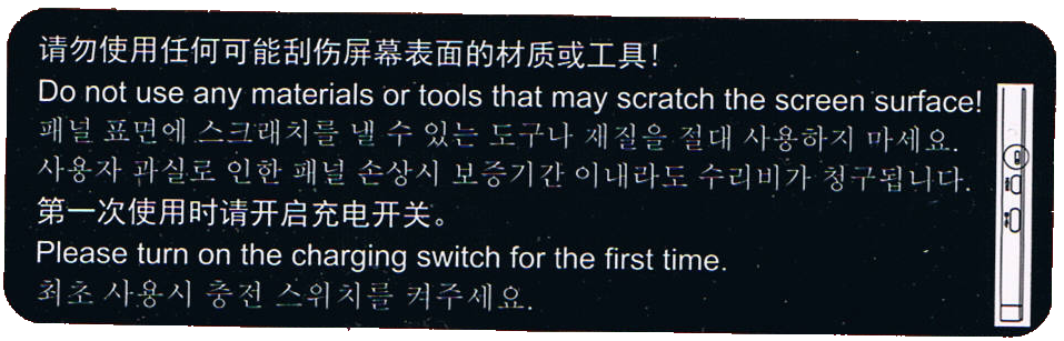
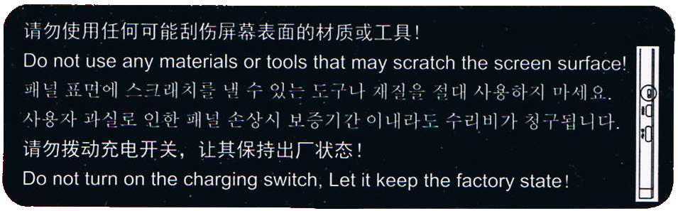
The device is still dead, the manual is no help for my situation, so I inspect the material a little bit more thorough. There is a sticker at the bottom of the monitor (at the opposite side from the power plug and the power button) that catches my eye. I have photographed it, because nobody would believe me otherwise. Here it is:
The first sentence is a no-brainer. But the second one is a head-scratcher: “Please turn on the charging switch for the first time”.
There is no mention of a “charging switch” in the manual. There is no switch labeled “charging” on the device. All the buttons/switches and ports that are present are described in the manual and can’t be interpreted as a “charging switch”.
But if you look at the sticker more closely, you’ll see the illustration at the right side. In reality, it is 3 mm wide and 18 mm in height. It is very small. Even smaller are the depicted things – they resemble the input ports on the right side! From the bottom up, there is a USB-C port, a micro-HDMI port and something that is encircled in the illustration. The circle is probably our hint that this is indeed the “charging switch” mentioned on the sticker.
I searched for the switch and only found a notch in the plastic, about 3 mm wide. Only by using a magnifying glass did I find a small black plastic knob at the bottom of the notch (2 mm deep). The knob is probably one square-millimeter tiny. It was situated more to the top of the notch.
I have built electronics since the early nineties. I know how to solder and recognize all kinds of electronic parts. This thing was a DIP-switch, but one of the smallest ones I’ve ever seen. And it wasn’t labeled at all. The only hint we get to search for it is the illustration on the sticker.
So – is it in the “on” position? I decided to find out by moving it down. A paper clip wire was too big to fit, so I used the smallest screwdriver my micro-mechanic screwdriver set would offer. Just a bit smaller and I would have resorted to an actual hair. The DIP-switch moved half a millimeter down and got stuck more to the bottom of the notch.
The monitor suddenly worked – after the three second pressing. The unlabeled “on” position of the unlabeled “charging switch” that you have to manipulate by using the smallest metal rod that you can find in an electronics lab is at the bottom. Good to know.
I won’t reiterate the madness that we just experienced. It gets even worse, so buckle up.
Right now, I have a working monitor that is actually pleasing to use. I buy it again – the same routine. I wonder if I should report the trick to the supplier.
We have more than two workplaces, so I buy the monitor – the same product for the same price – again, but five times now.
I get five packages with identical content. Well, nearly identical. The stickers are different!
Three monitors have the same sticker as seen above. One of them needs to be switched to turn on, the other two were already in the “on” position.
But the other two monitors have a different sticker:
Both monitors were already in the “on” position, so nothing needed to be done. But this sticker tells you to leave the charging switch alone – A switch that is never mentioned in the manual, that is so small that you probably miss it even if you search for it and that needs special equipment to be changed. That’s as if my refrigerator came with a warning sticker not to disable a particular fuse when this fuse is safely hidden away in the internals of the refrigerators electronics and never mentioned in the manual. Why point it out if my only job is to ignore it?
Remember the first manual that “strictly” tells a vague story? This is the same logic. And it gets even better with the second sentence, the one with an exclamation mark! “Let it keep the factory state!” means that it is turned off when coming from the factory? Or does it mean to keep it in the state that is delivered, regardless of the monitor being functional or disabled by it?
I still don’t know what the “on” position of this switch really is and now I’m even more confused than before.
My mind invented this elaborate fantasy story about a factory that produces monitors. One engineer is tasked with designing the charging functionality and adds the “charging switch” to enable or disable the whole feature. But she/he forgets to remove it before the blueprint is committed into production and now the switch is part of the consumer product. The DIP switch is on the “off” position by default from its producer. This renders the first batches of monitors useless because the documentation doesn’t mention the magic switch that needs to be flipped once to have the monitors turn on. The return rates are horrendous and management gets involved. They decide to get rid of the problem by applying a quick fix – the first sticker. This sentences their customers to perform a scavenger hunt of subtle hints to have the monitors work. They also install a new production line station – the switch flipper. This person needs training and is only available for the day shift – Half of the monitors leave the factory with the switch in the “on” position, the other half is in the “off” position. The first sticker remains, it is still a mystery, but the return rates are cut in half nearly overnight.
In my story, the original engineer recognizes her/his error and tries to correct it – by reversing the switch positions. The default position (“off”) now enables the feature, while the “on” position disables it. Just by turning the (still unlabeled) positions around, the factory produces ready-to-use monitors without requiring intervention from the customer.
The problem? A lot of customers have now learned the switch-flip trick and deactivate their product. And the switch flipper still deactivates half of the production without noticing. They need to inform their customers! They apply the second sticker, hoping to clear this matter once and for all.
And here I am, having bought 7 monitors so far and received nearly every possible combination of sticker and initial switch position. I am more confused and wary as if they had stuck to their original approach and just updated their manual.
But there is one indicator that might be helpful: The serial number of the monitors start with some letters and then two digits:
79: You get sticker 1 and need to flip the switch
99: You get sticker 2 and need not flip the switch
69: You get sticker 1, but the switch is already flipped
At least that was my observation with the samples at hand.
What can we, as software developers, learn from this disaster?
First, keep an eye on your feature switches! One non-sensible default and you chase that error forever.
Second, don’t compensate the first error by making the complemental error, too. Sometimes, the cure is worse than the disease.
Third, don’t ever not avoid negative logic! Boolean logic is hard enough itself, if you further complicate it, people like me will just resort to guessing and trial-and-error.
Fourth, and that is the most important one for me: Don’t explain things that need no attention from the user. I’m definitely guilty of that one. Often, I want my documentation to be “complete” and to “show all opportunities” when all I do is confuse my users with sentences like “Do not turn on the charging switch. Let it keep the factory state!” and then never mention the “charging switch” anywhere again.
Great principles have the property that while they can be stated in a concise form, they have far-reaching consequences one can fully appreciate after many years of encountering them.
One of these things is what is known as the Principle of Least Astonishment / Principle of Least Surprise (see here or here). As stated there, in a context of user interface design, its upshot is “Never surprise the user!”. Within that context, it is easily understandable as straightforward for everyone that has ever used any piece of software and notices that never once was he glad that the piece didn’t work as suggested. Or did you ever feel that way?
Surprise is a tool for willful suspension, for entertainment, a tool of unnecessary complication; exact what you do not want in the things that are supposed to make your job easy.
Now we can all agree about that, and go home. Right? But of course, there’s a large difference between grasping a concept in its most superficial manifestation, and its evasive, underlying sense.
Consider any software project that cannot be simplified to a mere single-purpose-module with a clear progression, i.e. what would rather be a script. Consider any software that is not just a script. You might have a backend component with loads of requirements, you have some database, some caching functionality, then you want a new frontend in some fancy fresh web technology, and there’s going to be some conflict of interests in your developer team.
There will be some rather smart ways of accomplishing something and there will be rather nonsmart ways. How do you know which will be which? So there, follow your principle: Never surprise anyone. Not only your end user. Do not surprise any other team member with something “clever”. In most situations,
it’s probably not clever at all
the team member being fooled by you is yourself
Collaboration is a good tool to let that conflict naturally arise. I mean the good kind of conflict, not the mistrust, denial of competency, “Ctrl+A and Delete everything you ever wrote!”-kind of conflict. Just the one where someone would tell you “hm. that behaviour is… astonishing.”
But you don’t have a team member in every small project you do. So just remember to admit the factor of surprise in every thing you leave behind. Do not think “as of right now, I understand this thing, ergo this is not of any surprise to anyone, ever”. Think, “when I leave this code for two months and return, will there be anything… of surprise?”
This principle has many manifestations. As one of Jakob Nielsen’s usability heuristics, it’s called “Recognition rather than Recall”. In a more universal way of improving human performance and clarity, it’s called “Reduce Cognitive Load”. It has a wide range of applicability from user interfaces to state management, database structures, or general software architecture. I like the focus of “Surprise”, because it should be rather easy for you to admit feeling surprised, even by your own doing.


 Schneide Blog