The web has come a long way since its inception. But nevertheless many applications fail to serve the user appropriately. We talk a lot about new presentation styles, approaches and enhancements. These are all good endeavors but we should not neglect the basics. Say you have crafted a beautiful application. It is fast, reliable and has all features the client, user or product manager has envisioned. But is it usable? Is its design up to the task? How should you know? You are no designer. But you can evaluate if your application has the fundamental building blocks, the basics. How?
Fortunately there is an ISO standard about the proper behaviour of information systems: ISO 9241-110. It defines seven principles for dialogues (in a wider sense):
- Suitability for the task: the dialogue is suitable for a task when it supports the user in the effective and efficient completion of the task.
- Self-descriptiveness: the dialogue is self-descriptive when each dialogue step is immediately comprehensible through feedback from the system or is explained to the user on request.
- Controllability: the dialogue is controllable when the user is able to initiate and control the direction and pace of the interaction until the point at which the goal has been met.
- Conformity with user expectations: the dialogue conforms with user expectations when it is consistent and corresponds to the user characteristics, such as task knowledge, education, experience, and to commonly accepted conventions.
- Error tolerance: the dialogue is error tolerant if despite evident errors in input, the intended result may be achieved with either no or minimal action by the user.
- Suitability for individualization: the dialogue is capable of individualization when the interface software can be modified to suit the task needs, individual preferences, and skills of the user.
- Suitability for learning: the dialogue is suitable for learning when it supports and guides the user in learning to use the system.
This sounds pretty abstract so let’s take a look at each principle in detail.
Suitability for the task
Simple and easy. You all know the bloated applications from the desktop with myriads of functions, operations, options, settings, preferences, … These are easy to spot. But often the details are left behind. Many applications try to collect too much information. Or in the wrong order. Scattered over too many dialogues. This is such a big problem in today’s information systems that there’s even a German word for preventing this: Datensparsamkeit. Your application should only collect and ask for the information it needs to fulfill its tasks.
But not only collecting information is a problem. Help in little things like placing the focus on the first input field or prefilling fields with meaningful values which can be automatically derived improve the efficience of task completion. Todays application has many context information available and can help the user in filling out these data from the context she is in like the current date, location, selected contexts in the application or previous values.
Above all you have to talk to your users and understand them to adequately support their goals. Communication is key. This is hard work. They might not know what is important to them. Then watch them using your application, look at how they reached their goals before your application was there. What were their problems? What went well? What (common) mistakes did they make? How can your application avoid those?
Self descriptiveness
In every part of your application the user needs to know what is the function of every item on the screen. A recent trend in design generates widgets on the screen that are too ambiguous. Is this a link, a button or just text? What is clickable? Or editable? UX calls this an affordance:
“a situation where an object’s sensory characteristics intuitively imply its functionality and use”
So just from looking at it the user has to have an idea what the control is for. So when you look at the following input field, what is the format of the date you need to enter?

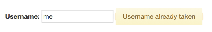
So if your application accepts a set of formats you should tell the user beforehand. Same with required fields or constraints like maximum or minimum length or value ranges. But nowadays applications can go a step further: you can tell the user while she enters her data that her input contradicts another input or value in your database. You can tell her that the username she wants is already taken, the date of the appointment is already blocked.
Controllability
Everybody has seen this dreaded message:

Despite any complex confirmations needed to delete an item items get deleted accidentally. What now? Adding levels of confirmation or complex rituals to delete an item does not value the users and their time. Some applications only mark an item as deleted and remove this flag if necessary. That is not enough. What if the user does not delete but overwrites a value of an item by mistake? Your application needs an undo mechanism. A global one. Users as all humans make mistakes. The technology is ready to and should not make them feel bad about it. It can be forgiving. So every action an user does must be revocable. Long running processes must be cancelable. Updates must be undoable.
I know there are exceptions to this. Actions which cause processes in the real world to start can sometimes be irrevocable. Sometimes. Nobody thought that sending an email can be undone. Google did it. How? They delay sending and offer an option to cancel this process. Think about it. Maybe you can undone the actions taken.
Your application should not only allow to reverse a process but also to start a process and complete it. This sounds obvious. But many applications set so many obstacles to find how to start an action. Show the actions which can be started. Provide shortcuts to the user to start and to advance. If your process has multiple steps make it easy for the user to return to where she left.
Conformity with user expectations
Especially in web design where there is so much freedom how your application looks: avoid fancy- or cleverness.

There are certain standards how widgets look, stick to them. If the users clicks a button on a form she expects that the content she entered is submitted. If she wants to upload a file the button should be labelled accordingly. Use clear words. Not only conventions determine how something is worded but also the task at hand. If the user expects to see a chart of her data, “calculate” or “generate” might not be the right button label even if the application does that. So again: talk to your users, understand them and their experience. Choose clarity over cleverness. Make it obvious. Your application might look “boring” but if the user knows where and what to do this is some much more worth.
Error tolerance
Oh! Your application accepts scientific notation. Entering 9e999999999… and

Users don’t enter malicious data by purpose (at least not always). But mistakes happen. Your application should plan for that. Constrain your input values. Don’t blow up when the users attachs a 100 GB file. Tell them what values you accept and when and why their entered information does not comply. Help them by showing fuzzy matches if their search term doesn’t yield an exact match. Even if the user submitted data is correct, data from other sources might not be. Your application needs to be robust. Take into account the problem and error cases not just the sunshine state.
Suitability for individualisation
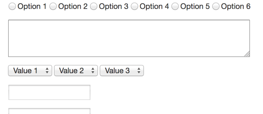
Users are different. They have differ in skills, education, knowledge, experience and other characteristics. Some might need visual assistance like a color blind mode. Your application needs to provide this. Due to the different levels of experience and the different approachs a user takes your application should provide options to define how much and how the presented information is shown. Take a look at the following table of values. Do you see what is shown?

Now take a look at a graph with the same values.

Sometimes one representation is better as another. Again talk to your users they might prefer different presentations.
Suitability for learning
You know your application. You know where to start an action and where to click. You know how the search is used and what filters are. You know where to find the report generation. You built it. But for first time users it is as entering a foreign city. Some things might be familiar and some strange. You need to think about the entry of your application. Users need help. Think about the blank slate, when your user or your application does not have any data. How do you guide the user to create her first project or enter information for the first item. She needs help with where to find the appropiate buttons and links to start the processes. She might not recognize the function behind an icon at first glance. Sometimes a tooltip helps. Sometimes you need a legend. And sometimes you should use a text instead of an icon.