
Creating user interfaces is traditionally an expensive development effort. Every web page, dialog or screen is hand crafted from scratch. Developers on the one hand write object oriented, modular code in the whole application, use myriads of frameworks and libraries but as soon as the UI level is reached everything breaks down. Each view is written in isolation.
Designers have a different view of the UI. They see the interface through the lens of style guides and guidelines. The look and feel throughout the interface should be consistent and should be experienced as a whole.
Atomic design
These two worlds can be combined.
Many designers and developers see the need to design and create design systems. Brad Frost is the one who coined and describes a language for structuring user interfaces: atomic design. The names take heavy cues from chemistry but the important part is the containment part.
Atoms are the low level building blocks: e.g. the widgets in native UI kits or the tags in the web world. But also things like colors or type faces are atoms.
Molecules are simple combinations of atoms. A search field which is comprised of a label, a text field and a button is a molecule.
Organisms are more complex UI components. Organisms can be created from atoms, molecules and other organisms. A complete form would be a perfect example.
Combining all these into a full page or window layout is called a template in atomic design. This template is the abstract definition, the blueprint of the complete screen or page.
Filling this template with content results in a page.
All this sounds pretty abstract and the examples found in the web are very basic so let’s dive in and identify the parts in an example UI.
Decomposing a complex UI
Here we take an example from the excellent UI concept by Lennart Ziburski: desktop neo. (If you haven’t seen this, you should take a look).
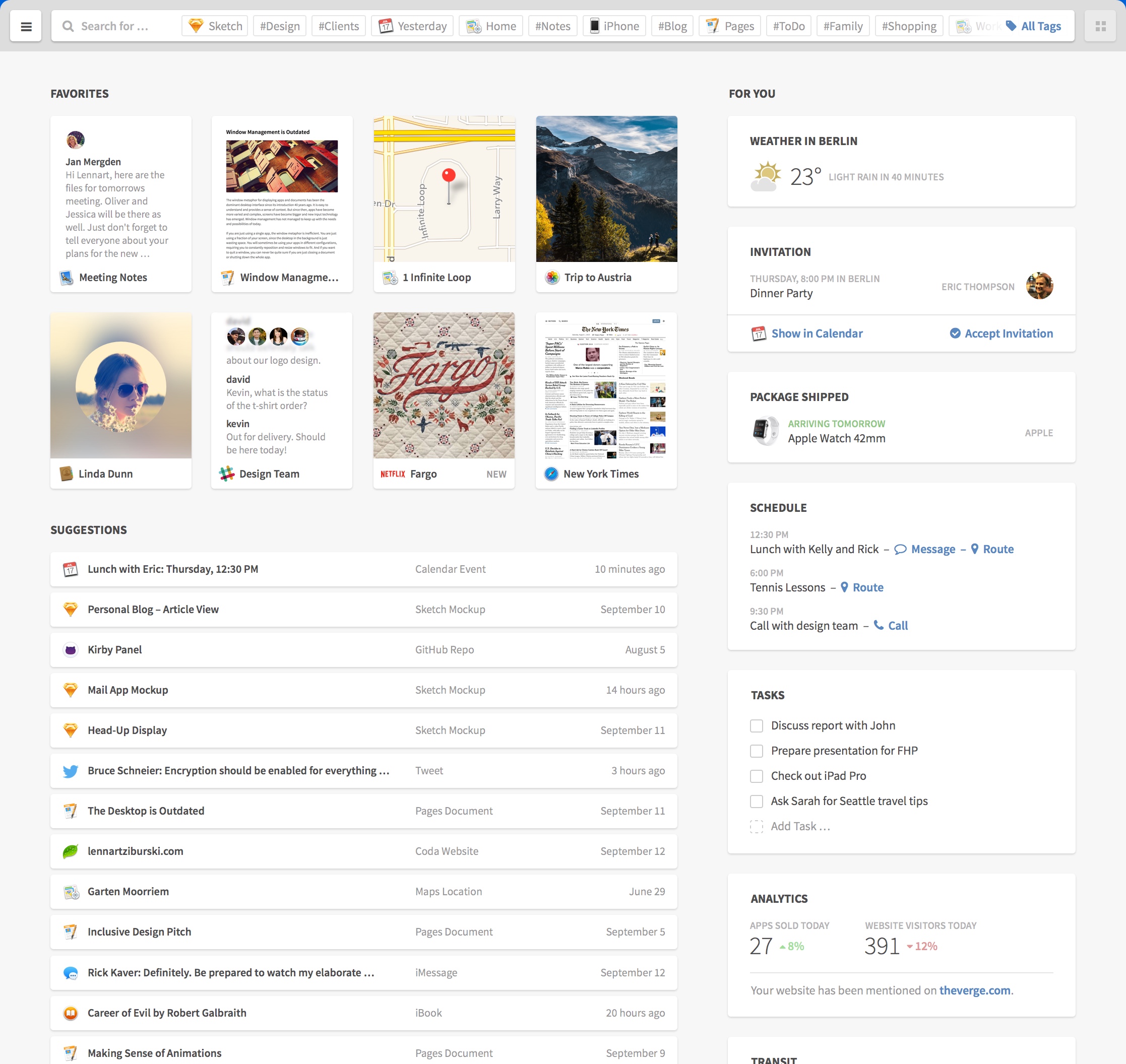
Our first decomposing task is to identify distinct parts of the user interface and give them names. These would be the organisms.

Interlude: how to name things
As with every naming endeavor it is hard to decide which name is appropriate. Dan Mall argues in favor of display patterns to be name givers. Display patterns describe the (abstract) visual aspect and can be used with multiple content patterns. Content patterns describe the types of elements and can be rendered in multiple display patterns. Since we want to name an organism which is content agnostic we should take cues from the visual appearance not the content inside it.
Decomposing further
Now we break those organisms further down. Let’s start with the card grid organism. As the name already suggests it organizes cards in a grid or tabular layout. We have different kinds of cards. First take a look at the preview card at the left.

The preview card consists of a thumbnail showing a preview of an item, an icon and a label. This is a simple interface element and is therefore a molecule created from the three mentioned atoms. A name for this molecule could be “image with caption”.
Interlude: testing states in the abstract
Our example touches an important and often neglected part of interfaces: you need to test for different content. Here the longer name is cut with an ellipsis. This is a simple case. But what if the name is missing? Or has unusual characters. Or or or. Besides that we need to indicate the current state of the interface as well. Do we have an error? Are we loading something? Interfaces have different states. Five to be exact. The good part is that we can (and should) test them on the abstract level of atoms, molecules and organisms.
A more complex organism
The cards in the right card grid are more complex examples. Every card is an organism with a title (atom) and a content part (molecule/organism).
The weather card has a simple molecule consisting of an icon and two labels.

Whereas the schedule card consists of a list organism which itself includes molecules. These molecules have two labels and one or more actions (links or buttons).

The other parts of the interface can be decomposed as well. Charlotte Jackson describes an interesting approach to decomposing your existing interfaces: print them out, cut them to pieces and name these pieces.
Making the jump
Until now we talked about the designer’s view of the interface but the developer has to translate all these definitions into code and hook them up to content. The approach from the atomic design side is largely the same for web or native but in development we have to distinguish between them.
On Rails
Let’s first take a look at the web side of things. We could use a client side component framework like react but here are like to keep it simple.
We just use Rails in our example but every other web framework will work as well. We need to organize our newly defined chemistry lab in three parts: HTML (or views), CSS and JavaScript.
For CSS and JavaScript we use the include mechanism of the asset pipeline or import if you use SASS. Each dimension gets a separate directory inside app/assets/stylesheets or app/assets/javascripts respectively.
We name our directories atoms, molecules and organisms. The same is true for views: a directory named molecules and one named organisms inside app/views/atomic_design. No need for atoms since they are basic HTML tags or helpers. Atomic design’s templates become Rails’ layouts. Via calls to render we can inject content into these abstract organisms:
<%= render layout: '/atomic_design/organisms/card', locals: {title: 'weather in Berlin'} do %>
  <%= render layout: '/atomic_design/molecules/image_with_text', locals: {image_class: 'fa_sunny'} do %>
    <span class="temperature">23 °C</span><span class="condition">Sunny</span>
  <% end %>
<% end %>
Native
On the native side we also need a component and include mechanism. Usually every widget toolkit has a preferred way to create custom components or containers. If you develop for iOS you extend the UIView class in order to create a custom UI component. These custom views would be the molecules and organisms of our design system. To combine them you add them to other views as their subviews. The init* or properties can be used to fill these with content. The actual mechanism is similar for most native UI kits.
Design with benefits
Using atomic design to create a design system seems to be a lot of work at first. And it is.
We already mentioned two benefits: creating a common understanding and a better way to test things in isolation. Design systems help all project participants, not only designers and developers, to share a common language and understand each other. They help new members to hit the ground running. With tools like pattern lab your atomic design can also be used as documentation.
On the testing front the holy grail is to test things in isolation and in integration, atomic design and its strict separation helps immensely. Often only the sunshine or ideal state is tested and maybe a handful of error states. Thinking in isolation of molecules and organisms about the whole five states and the diverse structure of your content creates a manageable endeavor and maps a path through the jungle of our interfaces. The value which atomic design brings to the table is that your efforts to test scale with the number of molecules and organisms and not with the number of pages or screens. The isolation which a design system, and in particular atomic design, creates is comparable to the advent of unit testing in the world of software development. The separation of display patterns and content patterns reminds me of the functional paradigm with its separation of data and functions.
 Schneide Blog