Make it visible: The Project Cockpit

How to use a whiteboard as information radiator for project management, showing progress, importance, urgency and volume of projects.

We are a project shop with numerous customers booking software development projects as they see fit, so we always work on several projects concurrently in various sub-teams.

We always strive for a working experience that provides more productivity and delight. One major concept of achieving it is “make it visible”. This idea is perfectly described in the awesome book “Behind Closed Doors” by Johanna Rothman and Esther Derby from the Pragmatic Bookshelf. Lets see how we applied the concept to the task of managing our project load.

What is the Project Cockpit?

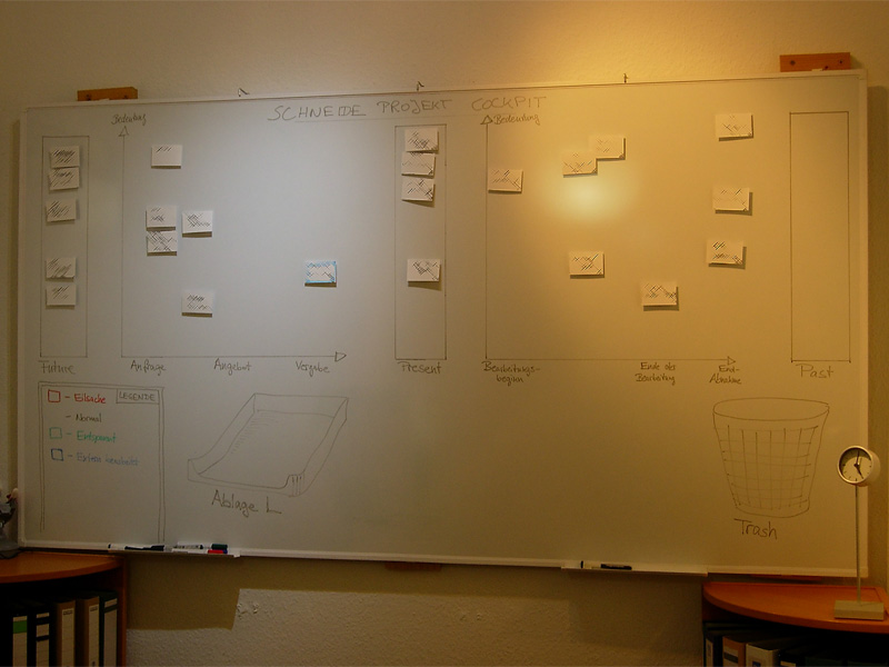
The Project Cockpit is a whiteboard with titled index cards and separated regions. If you glance at it, you might be reminded of a scrum board. In effect, it serves the same purpose: Tracking progress (of whole projects) and making it visible.

Here is a photo of our Project Cockpit (with actual project names obscured for obvious reasons):

cockpit1

How does it work?

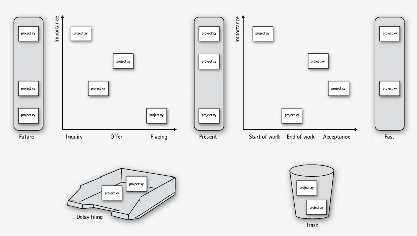
In summary, each project gets a card and transitions through its lifecycle, from left to right on the cockpit.

The Project Cockpit consists of two main areas, “upcoming projects” and “current projects”. Both areas are separated into three stages eachs, denoting the usual steps of project placing and project realization.

Every project we are contacted for gets represented by an index card with some adhesive tape and a whiteboard magnet on its back. The project card enters the cockpit on the left (in the “future” or “inquiry” region) and moves to the right during its lifecycle. The y-axis of the chart denotes the “importance” of the project, with higher being more important.

cockpit2

In the “upcoming” area, projects are in acquisition phase and might drop out to the bottom, either into the “delay filing” or the “trash”. The former is used if a project was blocked, but is likely to make progress in the future. The latter is the special place we put projects that went awry. It’s a seldom action, but finally putting a project card there was always a relief.

The more natural (and successful) progress of a project card is the advance from the “upcoming” area to the “present” bar. The project is now appointed and might get a redefinition on importance. Soon, it will enter the right area of “current” projects and be worked on.

The right area of “current” projects is a direct indicator of our current workload. From here on, project cards move to the rightmost bar labeled “past” projects. Past projects are achievements to be proud of (until the card magnet is needed for a new project card).

If you want to, you can color code the project cards for their urgency or apply fancy numbers stating their volume.

What’s the benefit?

The Project Cockpit enables every member of our company to stay informed about the project situation. It’s a great place to agree upon the importance of new projects and keep long running acquisitions (the delay filing cases) in mind. The whiteboard acts as an information radiator, everybody participates in project and workload planning because it’s always present. Unlike simpler approaches to the task, our Project Cockpit includes project importance, urgency and volume without overly complicating the matter.

The whiteboard occupies a wall in our meeting room, so every customer visiting us gets a glance on it. As we use internal code names, most customers even don’t spot their own project, let alone associate the other ones. But its always clear to them in which occupancy condition we are, without a word said about it.

Ultimately, we get visibility of very crucial information from our Project Cockpit: When the left side is crowded, it’s a pleasure, when the right side is crowded, it’s a pressure 😉

Batteries not included

Your feature isn’t ready-to-use until you provide the necessary requirements alongside, too.

When I bought a label printing device lately, it came bundled with a label tape roll. That suggested instant usage – no need to think of additional parts upfront. Only tousb-battery-little find out that, you’ve guessed it already, batteries weren’t included. A bunch of standardized parts missing (Murphy’s law applied) and the whole ready-to-use package was rendered useless. The time and effort it took me to get the batteries was the same as to get the label tape I really wanted to use instead of the bundled one.

This is a common pattern not only with device manufacturers, but with software developers, too.

Instant feature – just add effort

Frequently, a software comes “nearly” ready-to-use. All you have to do to make it run is

  • upgrade to the latest graphics drivers
  • install some database system (we won’t tell you how as it’s not our business)
  • create some file or directory manually
  • login with administrator rights once (or worse: always) to gather write access to the registry or configuration file
  • review and change the complete configuration prior to first usage

The last point is a personal pet peeve of mine.

It all boils down to the question if a software or a feature is really ready-to-use. Most of the work you have to do manually is tedious or highly error-prone. Why not add support for this apparently crucial steps to the software in the first place?

It works instantly – with my setup

A common mistake made by developers is to forget about the history of a feature emerging in the development labs. The history includes all the little requirements (a writeable folder here, an existing database table there) that will naturally be present on the developer’s machine when she finishes work, because fulfilling them was part of the development process.

If the same developer was forced to recreate the feature on a fresh machine, she would notice all these steps with ease and probably automate or support (e.g. documentate) them, least to save herself the work of wading through it a third time.

But given that most developers regard a feature “finished”, “done” or “resolved” when the code was accepted by the repository (and hopefully the continuous integration system), the aching of the users wont reach them.

This is a case of lacking feedback.

Feel the pain – publicly

To close this open feedback loop, we established a habit of “adopting” features and bringing them to the user in person to overcome the problem of “nearly done”. If you can’t make your own feature run on the client’s machine within a few seconds, is it really that usable and “ready”? The unavoidable presence of the whole process – from the first feature request to the installed and proven-to-work software acts as a deterrent to fall for the “works on my machine” style of programming. It creates a strong relationship between the user, a feature and the developer as a side-effect.

We’ve seen quite a few junior developers experiencing a light bulb moment (and heavy sweating) in front of the customer. This is the hot-wired feedback loop working. In most cases, the situation (a feature requiring non-trivial effort to be run) will not repeat ever.

Batteries are part of the product

If your product (e.g. software) isn’t usable because some standard part (e.g. a folder) is missing, make sure you add these parts to the delivery package. It is a very pleasant experience for the user to just unwrap a software and use it right away. It shows that you’ve been cared for.

Spelling the feedback: The LED bar

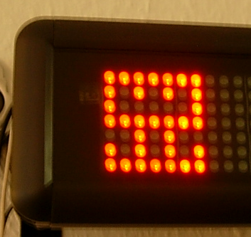
Our fully automated project ecosystem provides us with feedback of very different type and granularity. We felt it was impossible to render every single notable event into its own extreme feedback device (XFD). Instead, we implemented an universal feedback source: the LED bar.

ledbar-alone

You know the LED bar already from a shop window of your town. It tells you about the latest special bargain, the opening hours of the shop or just something you didn’t want to know. But you’ve read it, because it is flashing and moving. You just can’t pass that shop window without noticing the text on the LED bar.

Our LED bar sells details to us. The most important issues are already handled by the ONOZ Lamp and the Audio feedback, as both are very intrusive. The LED bar is responsible to spell the news, rather than to tell it.

A very comforting news might be “All projects sane”, which happen to be our regular state. You might be told that you rendered “project X BROKEN”, but you already know this, as the ONOZ Lamp lit up and you were the one to check in directly before. It’s better to be informed that “project X sane” was the build’s outcome. After a while, the text returns to the regular state or blanks out.

Setting up the LED bar

We aren’t the only ones out there with a LED bar on the wall. Dirk Ziegelmeier for example installed his at the same time, but blogged much earlier about it. He even gives you detailed information about the communication protocol used by the device and a C# implementation for it. The lack of protocol documentation was a bugger for us, too. We reverse engineered it independently and confirm his information. We wrote a complete Java API for the device (in our case a LSB-100R), which we might open source on request. Just drop us a note if you are interested.

Basically, we wrote an IRC bot that understands commands given to it and transforms it into API calls. The API then deals with the low-level transformation and the device handshake. This way, software modules that want to display text on the LED bar from anywhere on the internal net only need to talk on IRC.

The idea of connecting an IRC channel and the led bar isn’t unique to us, either. The F-Secure Linux Team blogged about their setup, which is disturbingly equal to ours. Kudos to you guys for being cool, too.

Effects of the LED bar

The LED bar is the perfect place to indicate project news. Its non-intrusive if you hold back those “funny” displaying effects but versatile enough to provide more than simple binary (on/off) information. Its the central place to look up to if you want to know what’s the news.

We even found out that our company logo (created by Hannafaktur) is scalable down to 7×7 pixels, which exactly fits the LED bar in height:

logo_on_led

Try this with your company’s logo!


Read more about our Extreme Feedback Devices:

Give your project a voice

We are all very into Extreme Feedback Devices (XFD), so we decided to use all our senses to gather feedback from our projects. This becomes a real challenge once you think about it, because we are naturally very focused on (and limited to) visual feedback.

So we decided to put audible feedback to work.

All our projects get continuously built by two servers in parallel. The first server checks for compilation and test errors, just like a good CI server should. The second server applies every quality metric we found helpful to the code and spits out huge amounts of numbers for every single build.

We identified the numbers that really matter to us and established a simple mechanism to scrape them from the result web pages. Then we associated a sound sample with all possible changes and plugged some speakers to our feedback server.

So now, expect our projects to clearly articulate their news.

To give you an idea of how it sounds, here’s a short list of possible audio samples:

  • Fixed an important bug: “Impressive”
  • Reduced code crap: “Excellent”
  • Introduced a bug: “Humiliation”

Imagine the words spoken like in an old Quake game. Now you can have an eventful build and be yelled at like “Impressive Excellent Humiliation”.

We reserved the biggest coding failure we can imagine happening here to a special audio sample. If somebody introduces new code crap (as determined by Crap4J), he gets ordered to “CUT THE CRAP!” at incredible volume. We used the voice of the inventor of XFDs, Alberto Savoia, taken from his delightful training video for management by numbers (position 2:03ff). The audio quality isn’t convincing, his command surely is.

If you wonder what it’s like to be suddenly interrupted by different voices rebuking or praising you – it’s healthy. You get used to it very quickly, yet the information always catches on. And the information is always relevant.

We call it our “audible remorse”.


Read more about our Extreme Feedback Devices:

Der blinde Fleck von Continuous Integration

Blinder FleckAn english version of this blog entry can be found at https://schneide.wordpress.com/2009/12/28/a-blind-spot-of-continuous-integration/

Am Montag früh brach nach einem Routine-Update unseres CI-Servers und anschließendem manuell gestartetem Baudurchgang plötzlich ein Test in einem Projekt, das seit Wochen keine Änderung mehr erfahren hatte.

Die Analyse des Tests zeigte relativ schnell, dass offensichtlich die A-TRIP Regeln für gute Unit Tests verletzt wurden und der Test unter Verwendung des aktuellen Zeitpunkts Datumsberechnungen in die Zukunft und die Vergangenheit testet. Am Sonntag früh wurde auf Sommerzeit umgestellt, so dass dem Test plötzlich eine Stunde in der Vergangenheitsberechnung fehlte.

Den Test zu beheben war einfach, allerdings war er bereits seit Mai 2006 im Projekt enthalten. Seitdem muss dieses Projekt immer um die Zeitumstellung herum inaktiv gewesen sein. Unser Continuous Integration hat das Problem jedenfalls erst jetzt (und auch da nur durch den Zufall einer CI-Aktualisierung zum richtigen Zeitpunkt) gefunden.

Die Phänomene, die durch ungeschickte Unit Tests hervorgerufen werden, sind mit einem verdachtunabhängigen Nightly Build scheinbar zuverlässiger zu finden als mit Continuous Integration. Eine Kombination beider Techniken scheint uns nach dieser Erfahrung lohnenswert zu sein.

Unabhängig von CI oder Nightly Builds gilt: Ein Unit Test, der den Konstruktor von Date, DateTime, Calendar oder einer ähnlichen Klasse aufruft, ist vermutlich ein schlechter Unit Test.

Gedanken zu Online-Hilfen

Eine gute moderne Software hat eine kontextbezogene Online-Hilfe. Bei einer sehr guten modernen Software wird diese nie benutzt, aber das ist ein anderes Thema.

Wir haben in der Schneide verschiedene Ansätze ausprobiert, die alle einen großen Nachteil hatten: Die eingestellten Inhalte waren an manchen Stellen unverständlich oder zu knapp und der Benutzer konnte nicht viel dagegen tun. Daher befassen wir uns gerade mit der Idee, eine Online-Hilfe mit einem Wiki zu koppeln. Auf diese Weise könnten die Benutzer ihre Online-Hilfe selbst verbessern und fortschreiben, so dass die Inhalte hilfreicher werden.

Um die Vor- und Nachteile dieses Ansatzes nicht erst durch den Kunden testen zu lassen, haben wir einen Selbstversuch gestartet. Die Online-Hilfe betrifft allerdings keine Software, sondern die Schneide selbst.

Eine Online-Hilfe für den Arbeitsplatz

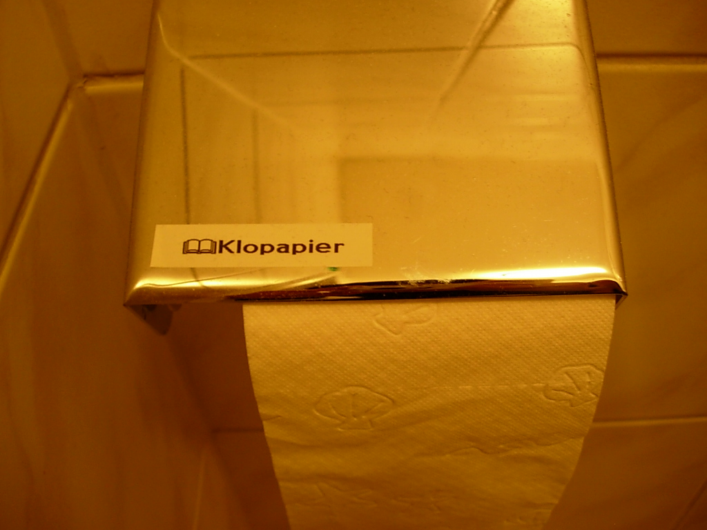
Wir haben uns das Konzept der “WikiTags” ausgedacht, kleine Aufkleber mit einer Wiki-Adresse und einem Symbol, das auf diesen Umstand hinweist.

Thumb Spoon WikiTag 

Mit diesen WikiTags rüsten wir gerade alle Räume und Gegenstände in Reichweite aus, so dass sie einem Eintrag in unserer Firmen-Online-Hilfe (unserem Wiki) zugeordnet sind. Über ein kleines Eingabefeld in unserem Intranetportal gelangt man direkt auf die betreffende Wiki-Seite (der sogenannte WikiWarp), kann dort die Informationen zum Gegenstand (z.B. Bedienhinweise oder Bezugsquellen) einsehen und auch gleich verbessern und ergänzen.

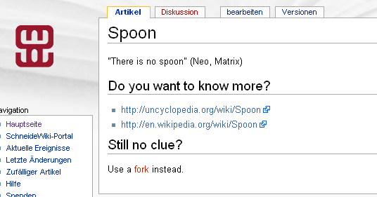
Spoon Wiki Page

Wir haben also eine halbautomatisch aktivierbare Online-Hilfe für unsere Firma implementiert und die ersten Erfahrungen damit gesammelt. Was ist die einprägsamste Erfahrung? Wir brauchen kleine, portable Anzeigegeräte für spezielle Anwendungsfälle (siehe Bild).

Special WikiTag

Das Ende einer Ära

Seit kurzer Zeit hat die Schneide den ersten Vertreter einer neuen Ära in der Computertechnik in Besitz: einen mechanikfreien Rechner.

Bisherige Elektronik funktionierte nie ohne einen Restbestand an Mechanik, die dann in bester Tradition auch zu den beliebtesten Verschleißteilen gehörte. Herausragendstes Beispiel waren/sind Festplatten (hier sei besonders die IBM DTLA/IC35-Todesserie genannt, die in der Schneide damals in Massen starb). Aber auch Lüfter gehören unüberhörbar zur Mechanik.

Unser neuer Rechner ist ein Hilfsserver, d.h. ein “Immer-an”-Rechner mit einer Aufgabe, die nur geringe Anforderungen stellt. Mehr zu dieser Aufgabe in den folgenden Beiträgen. Dementsprechend ist er kompakt und stromsparend konzipiert.

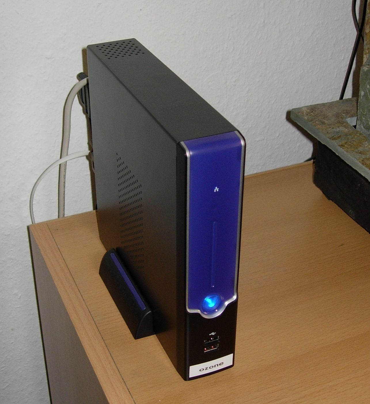
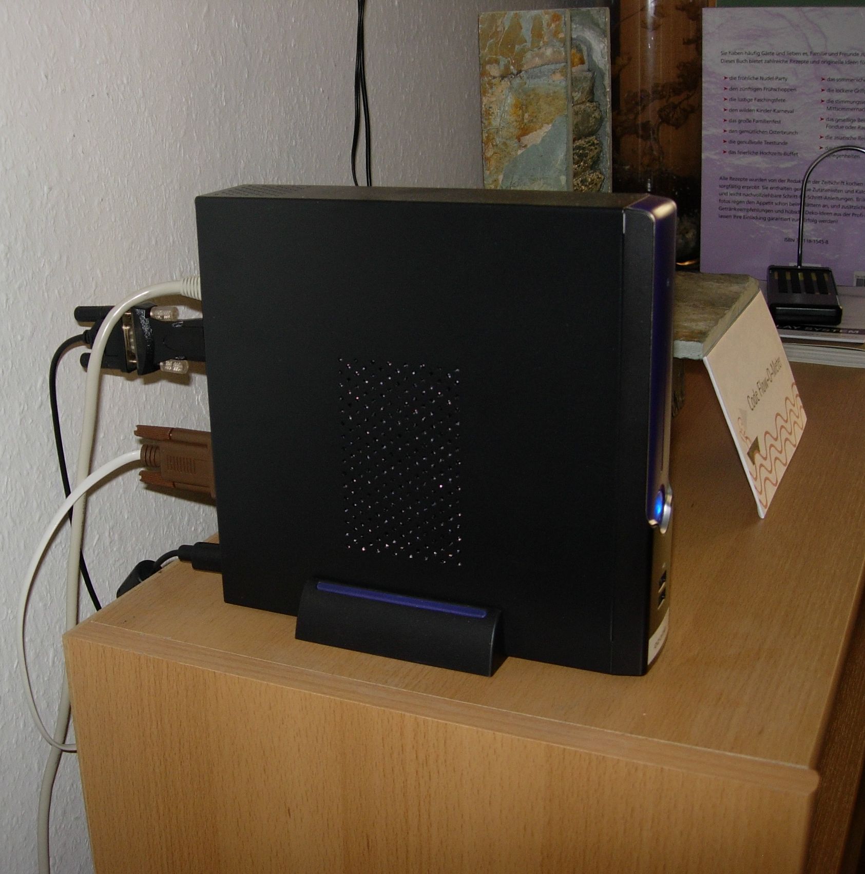
Ozone von vorne Ozone von der Seite

Wir entschieden uns für den kochbuchgroßen Thin-Client “Linux Via C7” der deutschen Firma Thinking Wires. Der Via C7 Prozessor ist als Nachfolger des in der Schneide vielfach eingesetzten C3 ein gerne gesehener, endlich vollständig 686-kompatibler Rechenknecht. Er lässt sich lüfterlos betreiben, so dass die Kühlung lautlos geschieht. Das passende Netzteil ist ein ebenfalls lautloses externes 65 Watt Netzteil. Die Festplatte wird durch ein sogenanntes Flash-IDE-Modul ersetzt, das bei uns mit 2GB Kapazität genug Platz für eine Ubuntu Server Installation hat.

Dieses Flash-Laufwerk ist garantiert kein Geschwindigkeitswunder (die Installation des Betriebssystems dauerte fast zwei Stunden gegenüber 10 Minuten auf einem normalen Server), aber dafür wirklich komplett lautlos.

Der ganze Rechner liefert im Betrieb nur ein leises Summen (bzw. Bruzzeln, wenn man pessimistisch formuliert), das in einem Meter Abstand nur noch hörbar ist, wenn sonst keine Geräuschquelle in der Nähe ist. Da unser Rechner direkt neben dem Code Flow-O-Meter steht und dieses entsprechend unserer Produktivität meistens läuft, ist das kein Problem.

Wir haben den Rechner “Ozone” genannt. Dabei ist uns selbst nicht klar, was der Name wirklich aussagen will:

  • Ozon: Mehr als Ozon wird durch den Rechner nicht emittiert
  • 0Sone: Das Betriebsgeräusch liegt bei fast Null Sone
  • Onoez: Mal wieder alles falsch geschrieben…

Und wofür brauchen wir diesen Rechner? Das verraten wir erst in den nächsten Beiträgen. Nur ein Tipp: Die ONOZ-Lamp gehört zum Einsatzzweck dazu.

Mein Bug, dein Bug

Historisch wertvolles TerminalIm Jahr 2002 entwickelten wir Software für eine Messapparatur, die unter anderem mit einer historisch wertvollen Datenbank über eine VT3270-Terminalemulation kommunizieren musste. Der Datenaustausch geschah über kleine Textdateien, die ausgelesen oder geschrieben wurden. Das Format der Textdateien war strikt spezifiziert und auf ein Minimum reduziert. Einige Messwerte mussten im “wissenschaftlichen Format” übergeben werden:
1.32E-01 ist gleichwertig zu 0.132

Wichtig an der Spezifikation war, dass das Format nach dem Exponententrenner “E” immer ein Vorzeichen haben musste, d.h. es wurde für den Wert 132 nicht 1.32E02, sondern 1.32E+02 erwartet.

Dummerweise hatte das damals verwendete Java 1.4.0 genau an dieser Stelle einen Bug:
http://bugs.sun.com/bugdatabase/view_bug.do?bug_id=4691683
Das Format +0.00000E00 erzeugt Wertrepräsentationen wie “+1.32E+02”, aber auch solche Kuriositäten wie “+1.32E-+01”.

Interessant ist dabei, dass das Vorzeichen des Formats im Exponenten wiederholt wird. Manuelles Entfernen der überflüssigen “+”-Zeichen brachte damals das gewünschte Ergebnis in die Dateien.

Dummerweise war das nicht der einzige Bug in Hinsicht auf das wissenschaftliche Formatieren in Suns DecimalFormat, so dass mit der Version Java 1.5 das Format “+0.00000E00” Wertrepräsentationen wie “+1.32E02”, aber auch Kuriositäten wie “+-1.32E02” erzeugt.

Mit der Änderung der Java-Version kam also ein vor Jahren durch Workaround behobener Fehler zurück, da jetzt (unter anderem) der Workaround zum Fehler wurde.

Was habe ich aus dieser Episode gelernt? Liefere möglichst kein spezifiziertes Format aus, das nicht mit Unit Tests vollständig abgesichert wurde. Und vor allem: Sichere jeden Bugreport, der nach außen geht, mit einem entsprechenden Test ab. Denn wenn der Bug nicht mehr da ist, wird auch der Workaround hinfällig und im schlimmsten Fall sogar selbst zum Bug.

Lethal risks of bugfree software

Bei der routinemäßigen Kontrolle unserer Continous Integration Server Hardware fanden wir heute eine tote Spinne auf dem Mainboard. Das ist sehr bedauerlich für das arme Tier, wir glauben aber zu wissen, woran sie gestorben ist: Verhungert wegen zu wenigen Bugs.

Eventuell hätte sie in einen Entwicklerrechner ziehen sollen.

It’s not a bug, it’s coolness

In alten Eclipse-Versionen wurden Anwendungen meistens über den “Run-Button” gestartet. Ein Klick und die vorher gestartete Anwendung wurde erneut gestartet. Das war an sich ganz praktisch, aber für “Code->Run Test->Run Application”-Zyklen leider unpassend.

Also erfanden das Eclipse-Team eine neue Funktionalität für den alten Knopf: Context launching. Leider wurde vergessen, dies dem Benutzer mitzuteilen. Der Knopf sieht aus wie früher, verhält sich (meistens) wie früher und hat auch sonst keine neuen Features. Nur manchmal, heimlich, wechselt der Kontext und man startet völlig unvorhergesehene Dinge.

Zuerst mal ein paar gute Nachrichten zu diesem Feature:

Damit hören die guten Nachrichten aber auch schon auf und die Probleme fangen an. Eine kleine Sammlung an Bugs zum Thema findet sich in den Links.

Das Feature wird bleiben – und damit eine meiner Meinung nach mittlere Usability-Katastrophe.

  • Alle Veteranen des “Run-Button” müssen umlernen oder die Funktion deaktivieren (anstatt es bei geeigneter Coolness bewusst zu aktivieren). Ok, das ist nur ein temporäres Problem der nächsten Monate
  • Der Kontext, und damit die “Intelligenz” im Hintergrund der Entscheidung, bleibt unsichtbar. Keine Farbe, kein Sinnbild, kein Ton. Ich bin wahrlich geübt im Umgang mit interrelationsreichen Computerprogrammen und Geräten, aber diesen Kontext habe ich nicht intuitiv erfasst.
  • Der Knopf bietet keinerlei Hinweis darauf, dass er jetzt etwas anderes tun wird als gerade eben noch. Er bietet auch keinen Hinweis darauf, was er jetzt tun wird. Schon eine leichte Umfärbung bei einem Kontextwechsel wäre zumindest ein Anfang.
  • Der Knopf funktioniert entweder mit Kontext oder ohne (im sogenannten Last-launch-Modus). Eine Art “Modus-Umschaltung” durch gedrückte Shift-Taste oder ähnlich gibt es nicht. Hier hilft nur der Weg durch die globalen Einstellungen oder das Bewusstmachen des Kontextes.

Fazit: Intention des Eclipse-Teams war die Erhöhung der Coolness der IDE. Erreicht wurde meiner Meinung nach eine Verhöhnung versierter Anwender: “Ihr habt es nicht mehr im Griff!”. Echte Coolness braucht den Überraschungsmoment nicht, um zu wirken.


Nachtrag/Ergänzung: In einem Kommentar zum verlinkten Blog-Eintrag des Eclipse-Teams wird davon geredet, dass das Feature sehr praktisch ist, wenn Eclipse im Tutor-Betrieb vor Studenten eingesetzt wird. Ich hoffe, trotz der unbestrittenen Wichtigkeit der Lehre, dass dies nicht der anvisierte bzw. hauptsächliche Einsatzzweck für Eclipse sein soll.