Walking Skeletons

The time has come. My first own project is starting. But where to start? In the backend, frontend, with the data? Or perhaps with the infrastructure and the delivery pipeline that the current state can always reach the customer? But what should be delivered when I don’t have it yet?

The solution for me was the walking skeleton. The zombie apocalypse may not sound like a good solution at first, but in the following I explain what the term means in software development and what the advantages are.

What is a walking skeleton?

The word walking skeleton can be divided into the components walking and skeleton. Walking means that the software is executable. Skeleton means only a minimalist implementation of the software has been completed and the flesh is still missing. In the case of a first walking skeleton, this means that the backend and frontend have already been set up with the technology of choice and that the components are connected. For example, the backend delivers the frontend.

How to build it? An example.

In my use case, I go one step further and want the walking skeleton to be a Docker container in which the backend and frontend run together.

The first step is to choose the technologies for the frontend and backend. In my case, react with vite and javalin. Then both projects have to be set up. Since my application will be very small, I decided to put the projects inside each other, so that the frontend can be found in the src/main/webapp folder. So I can build them with just one gradle on the top level.

With react, I can already use the example page was created by setup project for my walking skeleton. In Javalin I need a main class which can deliver the htlm page of the react application via a web server. In my code example, the index.html file is automatically delivered if it is stored in the resources/public folder.

import io.javalin.Javalin;
import io.javalin.http.staticfiles.Location;

public class Application {
    public static void main(String[] args) {
        var app = Javalin.create(config -> {
                    config.staticFiles.add("/public", Location.CLASSPATH);
                })
                .start(7070);
    }
}

With some gradle plugins it is possible to build the react app using gradle (com.github.node-gradle.node), pack the java application and all sources into a jar (com.github.johnrengelman.shadow) and create a docker image from it (com.bmuschko.docker-remote-api).

// omitted dependencies, imports and plugins
node {
    version = '20.11.0'
    yarnVersion = '1.22.19'
    distBaseUrl = 'https://nodejs.org/dist'
    download = true
    nodeProjectDir = file('src/main/webapp')
}

tasks.register('bundle', YarnTask) {
    dependsOn yarn
    group = 'build'
    description = 'Build the client bundle'
    args = ['run', 'bundle']
}

tasks.register('webpack', YarnTask) {
    dependsOn yarn
    group = 'build'
    description = 'Build the client bundle in watch mode'
    args = ['run', 'build']
}

tasks.register('jestTest', YarnTask) {
    dependsOn yarn
    group = 'verification'
    description = 'Run the jest tests of our javascript frontends'
    environment = ['CI': 'true']
    ignoreExitValue = true
    args = ['run', 'test']
}

tasks.register('prepareDocker', Copy) {
    dependsOn assemble
    description = 'Copy files from src/main/docker and application jar to Docker temporal build directory'
    group = 'Docker'

    from 'src/main/docker'
    from project.shadowJar

    into dockerBuildDir
}

tasks.register('buildImage', DockerBuildImage) {
    dependsOn prepareDocker
    description = 'Create Docker image to run the Grails application'
    group = 'Docker'

    inputDir = file(dockerBuildDir)
    images.add(dockerTag)
}

Here you can see the snippet from build.gradle, where the tasks for building the project can be seen.

Now my walking skeleton has been brought back to life and can run around the neighborhood cheerfully.

Why this is a good start?

But what is the advantage of letting undead walk?

Once you have completed this step, you can develop the individual parts independently of each other. The walking skeleton is a kickstart for pursuing approaches such as test-driven development. And the delivery pipeline can now also be tackled, as the walking skeleton can be delivered. All in all, the walking skeleton is a way to get started on a project as quickly as possible.

Risk First, but Not Pain First

At our company, we have an approach to project management that we call “risk first”. It means that we try to solve the hardest problems very early during development, so that we don’t fall into the “effort spent, but no real progress” trap.

One thing I want to add to my blog entry from 2018 (linked above) is that “risk” should not be conflated with “pain”. I mention it because the distinction wasn’t clear to me until recently. I try to explain what I mean.

When you approach a project in a “risk first” manner, it doesn’t feel good for quite a time. You try to stay ahead of the problem that seems overwhelming if the project isn’t trivial. Tackling the risk evokes feelings of uncertainty, doubt and even frustration. But it doesn’t hurt.

Feeling “pain” in a project has another origin. I managed several projects at once that were painful: The customers were difficult, erratic or not within reach. The requirements were unclear. My assessment was that the projects themselves are risky and every task I began had the properties of a risky task, too. But because the customers couldn’t support my work on the tasks, I made near to no progress and often had to backtrack. The tasks became more riskier the more I worked on them.

My insight was that most of my work schedule revolved around cycling through the painful projects that I wrongly classified as risky and working on their tasks that made no real progress. Hopping from painful task to painful task doesn’t feel good at all. And because the cycle of “stuck” projects is so prominent, it eclipses the lower risk projects with more relaxed deadlines and unstressed customers.

My current remedy is to budget for a maximum amount of pain per period. Each painful project only gets carefully limited attention and is alleviated by lower-risk work in more painfree projects. With this approach, there is progress in most projects and my project management focus isn’t locked on the stuck projects. You can say that I take “time off” from the more stressful situations.

I found myself in this trap because I couldn’t properly distinguish between “risk” and “pain”. Both don’t feel good, but you can work on the first with attention and effort. The level of pain in a project is nearly unswayable by your actions. You can only control your level of exposure to it.

This is where I hope for your thoughts:

  • Can you follow my distinction between “risk” and “pain”?
  • What are your indications that a task is “painful”?
  • Have you found means to decrease the level of pain in a project?

Write us a comment or even your own blog entry on the topic!

Don’t Just Blink at Me

I have a lot of electronic devices that essentially only do one thing. A flashlight, a hair trimmer, a razor, a toothbrush, some smoke detectors and a handful of power banks and other energy storage devices. They have a few things in common:

  • They have their own rechargeable battery
  • They store a (more or less) complex internal state
  • They have exactly one status LED
  • They try to communicate with me using the LED

The razor is an exception, because it has a lot more signal lights than just the LED, but I include it as the positive example. The LED of the razor changes its color to show what it wants from me.

All other devices try to convey meaning by different styles of blinking. Let’s take the hair trimmer as the negative example: It blinks when it is happy because it is fed energy. The blinking stops to indicate that it is fully loaded.

The flashlight blinks when it is unhappy and hungry. It will stop blinking when it is fed. It never indicates that it has enough, you have to guess.

The smoke detectors flash shortly once in a while to show that they are still on duty. They might flash more vigorously if they get hungry. But they have another means to get the message across: They sound a short alarm. You’ll feed them instantly and always have a spare battery at hands.

The point of this story is that it is impossible to decipher a blinking LED. What does it mean? The device is busy and I don’t need to do something? The device is on the verge of starvation and I should intervene? It’s the most ambiguous signal I can think of.

If there were a standard that blinking means the desire for human intervention, I would learn the signal and adhere to it. But nearly half of my devices blink when they are busy and don’t need anything from me. And some try to talk to me in morse.

I’m not going to learn dozens of LED signal dialects. If a device wants to be understood, it should be designed in an understandable way. Give it a color-changing LED and we can talk:

  • Steady green: I’m happy.
  • Steady orange: I’m content, but it could be better. You might allocate some care for me.
  • Steady red: Please care for me.
  • Blinking red: Attention! I need urgent care.

What does this interaction design rant have to do with software development?

I often see the same categorical error in the design of software user interfaces. And while manufacturers of cheap consumer electronics can argue that a multi-color LED is more expensive, we software developers can’t really hide behind costs.

Anything that pops up, slides in or just blinks on my screen better has a damn good reason to try to grab my attention. Grabbing not only my attention but also my input focus is the upmost interruption, comparable to the alarm signal of the smoke detector. I blogged recently about a blocking dialog that shows up unprompted and informs about some random unprompted background work.

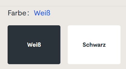
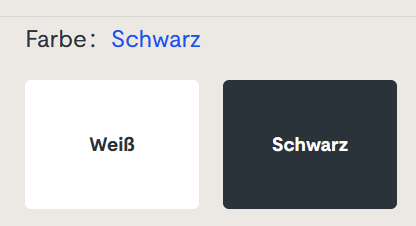
But there is another type of ambiguous signal that I see more often than I like. It is silent and tries to shift the blame for the inevitable frustration on you: The vague selection field:

Sorry for the german text, I didn’t find it on an english website. The german website this is from is still online, so if you can find it, you can try it yourself. I won’t link it here, though. (Maybe search for “steckdosenleiste klemmbar” and roam the results)

Let me describe your experience: you can select the color of a product, either white or black. The selected color is stated above, inexplicably written in the color blue. The selected field is “highlighted” black. Or is it? Maybe the white field is the highlighted one? And why is the selection field for the color black presented in mostly white?

The selection is not communicating properly, but I feel intimidated and stupid by a simple choice between two colors.

You can probably think of dozens of improvements and that’s fine. But the designer was certainly restricted by a corporate design rulebook and had to use three colors only: blue, white and black. You decide if he used his potential successfully.

Which brings me back to the introductory example: Give an engineer a single color LED and he will implement an elaborate morse code scheme to make the most of it. The problem is the initial restriction, not the shenanigans that follow.

How We Incidentally Increased Our Display Count Up to Five per Workplace

At the beginning of the year 2023, we had the plan to improve our office desk setup in two ways:

  • All desks should be electrically height-adjustable
  • All computers should be attached to the desk and not sitting on the floor

Had we known just how much turbulence this plan brings, we might have reconsidered it. But we finally finalized the project last week, just a few days before the year was over.

This blog entry tries to recap the story of the improvement project and mentions some particular products. We really use those products and are not affiliated with the manufacturers.

Our company has ten desks on two floors. A quick survey revealed that we have five electrically height-adjustable desks already in use. The remaining five desks were not really adjustable. Our plan was to move the five existing desks on one floor and equip the second floor with brand new ones. And because we wanted to achieve the second improvement in the same step, we switched the desk model.

Our new office tables are larger than before (180×80 cm instead of 160×80 cm) and definitely leeter. They are so leet, they are even called LeetDesks. Yes, we exchanged our boring classic office desks with modern pro-gaming desks. Our reasoning is that gaming is hard work, too. The nice thing is that the LeetDesks can be equipped with additional accessories like cable trays, monitor arms and the PC holder that would achieve our second goal.

So we ordered five individually configured gaming desks last year. Deconstructing the existing desks and assembling the new ones was an ongoing task. We bought a new cordless screwdriver after the first table.

When the team began to realize that we are really adjusting our work environment from ground up, new ideas emerged. The idea with the most impact was the change from workstation PC to “notebook desk”. Instead of a dedicated office PC in addition to the mobile work notebook, the office desk should accomodate the notebook in the best possible manner.

Ok, we swapped the PC holder with a notebook holder, no big deal. But how do you connect a notebook with many displays? We bought the only docking station that we could find that can drive three 4k displays over displayport cable: The Icy Box IB-DK2254AC. The fourth display is connected via HDMI directly with the notebook.

Now, the “pandemic setup” of displays is extended by a fifth display on one side: The integrated notebook display can be used to host the e-mails exclusively or show the company chat.

Request for picture requests: I don’t have an action shot of a five-displays workplace right now. But if you are interested how the setup looks like, leave us a comment and we try to supply one later.

Because the distance between displays and computer is now fixed-length and much shorter because the docking station adds its cable length, all the existing cables were too long. We had installed cables with a length of 3 meters to enable full vertical maneuverability. Now we switched back to 2 meters (or even shorter).

Not all of our notebooks were capable of driving that many pixels. Some older models had chipset graphics that gave up after the first external display. So we replaced them with newer models with dedicated notebook graphic cards.

Six of ten desks are now converted to notebook desks, which leaves four desks with PC holders and classic tower PCs. Traditionally, our PCs live in a “normal size” tower case, the Fractal Design Define series. This case is too big and too heavy for the PC holder. So we had to transplant the remaining PCs to a smaller case, the Fractal Design Defince Compact. We transplanted two of them and replaced the other ones a little bit sooner with new computers.

There were even more minor improvements that resulted in additional purchases, but those aren’t directly focussed on a single desk. So let’s recap:

We wanted our desks to be electrically height-adjustable and our floor free of computers. We ended up buying five new desks, six new docking stations, three new notebooks, two new computers, two empty computer cases, a bunch of notebook holders and many, many cables. The amount of cables that is necessary to operate a modern computer desk is astonishing.

We deconstructed, assembled, connected and hauled many days. The project ran the whole length of 2023 and racked up material costs north of 20k EUR.

But now, the floor is unobstructed and our work stance can change from minute to minute. And we increased our display count once more!