The charged charging switch

In this blog post, I’ll describe my experiences with a certain product (a computer monitor) and its manual. It might serve as an example of how ridiculous a poorly designed customer experience is perceived on the receiving end. Hopefully, it inspires some readers to think about sensible defaults and how to communicate them.

Let’s start with the context. In a previous blog post, I described my journey from one small monitor to four monitors in total (three big ones, one small additional one). Well, it is not just my journey – all of my co-workers have now four computer monitors for their office workplace.

This meant that we bought a lot of smaller monitors in the last months. We decided to go the monoculture route and bought one piece of our favorite model.

It arrived faulty. The only thing that this device did was to indicate “battery full” when the battery status button was pressed (yes, this particular monitor has its own battery for mobile usage). Everything else didn’t work, especially not the power button. The device was a dead fish. I returned it to the supplier.

The replacement unit was also dead on arrival. This puzzled me, because the odds of having two duds in a row seem very small. So I investigated and found an interesting fact: The unpacking and assembly instruction sheet is incomplete. Well, even more than that. It’s plain misleading.

It starts with a big lettered alert that reads “Please follow the illustration and text description strictly when opening the package and installing the display.” It then shows three illustrations of a totally different monitor and ends the instructions at the step when the styrofoam is removed (and no cables attached). At the bottom of the sheet, there’s an explanation: “The machine picture and styrofoam shown are for illustration purpose only and may differ from the actual product”. You can’t make this up.

The manual urges me to follow it “strictly” and then vaguely tells me how to unwrap the monitor from the styrofoam and nothing more. Even better, in the illustrations, there are different options given like “For binding-less, please ignore the untying action” (actual quote!). You can’t follow strictly if given multiple options and hand-wavey instructions. “Unpack the monitor correctly” is more actionable than this manual.

But that was just the beginning. The user manual actually references the correct monitor and gives usage instructions for common use cases, but it lacks a troubleshooting section. The user manual starts with a working device – and my device(s) don’t work. They don’t turn on if the power button is pressed – and it has to be pressed for 3 seconds to turn on the monitor! Yes, the manual is clear on this one: To turn the monitor on by using its power button, you have to press for three, long, “twenty-two”, tedious, “twenty-three”, seconds. That’s like having a light switch, but if you press it in the dark, it requires you to keep pressing because it could be a mistake – do you really want to have the lights on?

The device is still dead, the manual is no help for my situation, so I inspect the material a little bit more thorough. There is a sticker at the bottom of the monitor (at the opposite side from the power plug and the power button) that catches my eye. I have photographed it, because nobody would believe me otherwise. Here it is:

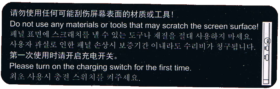
The first sentence is a no-brainer. But the second one is a head-scratcher: “Please turn on the charging switch for the first time”.

There is no mention of a “charging switch” in the manual. There is no switch labeled “charging” on the device. All the buttons/switches and ports that are present are described in the manual and can’t be interpreted as a “charging switch”.

But if you look at the sticker more closely, you’ll see the illustration at the right side. In reality, it is 3 mm wide and 18 mm in height. It is very small. Even smaller are the depicted things – they resemble the input ports on the right side! From the bottom up, there is a USB-C port, a micro-HDMI port and something that is encircled in the illustration. The circle is probably our hint that this is indeed the “charging switch” mentioned on the sticker.

I searched for the switch and only found a notch in the plastic, about 3 mm wide. Only by using a magnifying glass did I find a small black plastic knob at the bottom of the notch (2 mm deep). The knob is probably one square-millimeter tiny. It was situated more to the top of the notch.

I have built electronics since the early nineties. I know how to solder and recognize all kinds of electronic parts. This thing was a DIP-switch, but one of the smallest ones I’ve ever seen. And it wasn’t labeled at all. The only hint we get to search for it is the illustration on the sticker.

So – is it in the “on” position? I decided to find out by moving it down. A paper clip wire was too big to fit, so I used the smallest screwdriver my micro-mechanic screwdriver set would offer. Just a bit smaller and I would have resorted to an actual hair. The DIP-switch moved half a millimeter down and got stuck more to the bottom of the notch.

The monitor suddenly worked – after the three second pressing. The unlabeled “on” position of the unlabeled “charging switch” that you have to manipulate by using the smallest metal rod that you can find in an electronics lab is at the bottom. Good to know.

I won’t reiterate the madness that we just experienced. It gets even worse, so buckle up.

Right now, I have a working monitor that is actually pleasing to use. I buy it again – the same routine. I wonder if I should report the trick to the supplier.

We have more than two workplaces, so I buy the monitor – the same product for the same price – again, but five times now.

I get five packages with identical content. Well, nearly identical. The stickers are different!

Three monitors have the same sticker as seen above. One of them needs to be switched to turn on, the other two were already in the “on” position.

But the other two monitors have a different sticker:

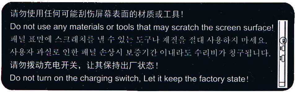
Both monitors were already in the “on” position, so nothing needed to be done. But this sticker tells you to leave the charging switch alone – A switch that is never mentioned in the manual, that is so small that you probably miss it even if you search for it and that needs special equipment to be changed. That’s as if my refrigerator came with a warning sticker not to disable a particular fuse when this fuse is safely hidden away in the internals of the refrigerators electronics and never mentioned in the manual. Why point it out if my only job is to ignore it?

Remember the first manual that “strictly” tells a vague story? This is the same logic. And it gets even better with the second sentence, the one with an exclamation mark! “Let it keep the factory state!” means that it is turned off when coming from the factory? Or does it mean to keep it in the state that is delivered, regardless of the monitor being functional or disabled by it?

I still don’t know what the “on” position of this switch really is and now I’m even more confused than before.

My mind invented this elaborate fantasy story about a factory that produces monitors. One engineer is tasked with designing the charging functionality and adds the “charging switch” to enable or disable the whole feature. But she/he forgets to remove it before the blueprint is committed into production and now the switch is part of the consumer product. The DIP switch is on the “off” position by default from its producer. This renders the first batches of monitors useless because the documentation doesn’t mention the magic switch that needs to be flipped once to have the monitors turn on. The return rates are horrendous and management gets involved. They decide to get rid of the problem by applying a quick fix – the first sticker. This sentences their customers to perform a scavenger hunt of subtle hints to have the monitors work. They also install a new production line station – the switch flipper. This person needs training and is only available for the day shift – Half of the monitors leave the factory with the switch in the “on” position, the other half is in the “off” position. The first sticker remains, it is still a mystery, but the return rates are cut in half nearly overnight.

In my story, the original engineer recognizes her/his error and tries to correct it – by reversing the switch positions. The default position (“off”) now enables the feature, while the “on” position disables it. Just by turning the (still unlabeled) positions around, the factory produces ready-to-use monitors without requiring intervention from the customer.

The problem? A lot of customers have now learned the switch-flip trick and deactivate their product. And the switch flipper still deactivates half of the production without noticing. They need to inform their customers! They apply the second sticker, hoping to clear this matter once and for all.

And here I am, having bought 7 monitors so far and received nearly every possible combination of sticker and initial switch position. I am more confused and wary as if they had stuck to their original approach and just updated their manual.

But there is one indicator that might be helpful: The serial number of the monitors start with some letters and then two digits:

  • 79: You get sticker 1 and need to flip the switch
  • 99: You get sticker 2 and need not flip the switch
  • 69: You get sticker 1, but the switch is already flipped

At least that was my observation with the samples at hand.

What can we, as software developers, learn from this disaster?

First, keep an eye on your feature switches! One non-sensible default and you chase that error forever.

Second, don’t compensate the first error by making the complemental error, too. Sometimes, the cure is worse than the disease.

Third, don’t ever not avoid negative logic! Boolean logic is hard enough itself, if you further complicate it, people like me will just resort to guessing and trial-and-error.

Fourth, and that is the most important one for me: Don’t explain things that need no attention from the user. I’m definitely guilty of that one. Often, I want my documentation to be “complete” and to “show all opportunities” when all I do is confuse my users with sentences like “Do not turn on the charging switch. Let it keep the factory state!” and then never mention the “charging switch” anywhere again.

How my display usage changed over time

When I was eight years old, my parents bought our first computer. With it came a tiny monochrome display that could be used to show 80×25 characters in amber yellow. I’m typing this text on my most recent computer that is equipped with several displays that show a combined amount of nearly 27 million pixels with at least 2^24 colors each. I don’t dare to count the number of characters that are on screen right now. Something happened along the way.

The formative years

Me as an eight year old boy immediately “clicked” with that first computer. It became my destiny to unlock its full potential. I was delighted when my parents upgraded to a much better PC years later with a color display that could actually show 256 colors at once on a 14″ frame. It was still a CRT monitor, so the refresh rate was probably around 30 Hz and I remember the “fishbowl eyes” you got from longer computer sessions.

If we want to have a visual representation of this monitor, it looks like this:

14″ CRT, 4:3

My first own computer came with a 17″ CRT monitor, which was considered a luxury size and didn’t really fit on the desk. I used this monitor up until my first year of my studies. Nothing in my world would suggest that using more than one monitor per computer is even possible. This computer had a mouse without scroll wheel and no internet access:

17″ CRT, 4:3

When I studied computer science, I came in contact with a lot of people that all took computing and programming serious. Some had monitors the size of a freezer, which hinted at me (and my peers) that 17″ is not as lavish as we thought. But still, a computer had one CPU and one monitor. I scraped my money together and bought a 19″ flat panel CRT monitor. Flat panel just meant that the display area didn’t resemble a fish bowl by itself. It could run up to 60 Hz:

19″ CRT, 4:3

The professional setup

That was my personal computing situation when I founded my company in the third year of my studies. I knew that the equipment had to be better and more professional. Our first work computers still had one CPU and one monitor. It just happened to be gigantic 21″ CRTs. Our desks had extra depth to provide a healthy distance between eyes and display area. Those monitors were delicate enough to provide a “de-gauss” button that would unhinge random electronics around it if pressed:

21″ CRT, 4:3

This was how software was developed in the early 2000s. A “fast” computer with lots of RAM (1 GB were not unheard of), a magnetic harddisk with 160 GB of storage and still one CPU and one monitor. At least, they had internet access and a mouse with a scroll wheel now.

Everything we did, we did in the same place

This setup lasted for four or five years, with better computers, but still the same old monitors. Then, virtually over night, the prices for the new and very cool TFT “flat panel” monitors dropped to readonable numbers. These monitors were really flat and very thin compared to the CRT fish bowls that hogged our desks. We were thrilled and replaced all of our monitors within one year.

The double setup

But just as the CPUs now got two “cores”, we didn’t just replace our one monitor, we doubled it. Every workplace now had two monitors:

2x 24″ TFT, 16:10

And not just that. The monitors were bigger, better, smaller, easier on the eye and had a greater resolution (called WUXGA, essentially FullHD with some extra pixels on the vertical axis).

And we had two of them! This was a game changer because things that used to be done one after another could now be done in parallel – on the CPU and on the monitors. We began to dedicate screen estate to fixed activities:

The monitors are now assigned to certain tasks

The left monitor was the “coding space” while the right monitor was the “tryout space”. The actual distribution of activity to screen location differed from developer to developer, but we all agreed that we would not go back to single monitoring.

During that time, I was sometimes asked if two monitors “are worth the investment”. I blogged about it and I’m still convinced that a second monitor is the single most profitable investment you can do for a developer.

The triple setup

In the blog post above, I made one statement that I soon took back: A third monitor is not the game changer like the transition from one to two monitors, but – if the hardware issues are solved – the next step in the evolution that truly separates work, work result and communication:

3x 27″ TFT, 16:9

This setup is probably wider than your standard desk and requires a dedicated monitor stand, but it is the first time you can do the three essential things a programmer does in parallel:

  • Browse the internet (like stackoverflow or an API documentation)
  • Edit your source code in a fullscreen IDE
  • Watch the result of your changes live (with hot reloading)

Your workflow essentially moves your head from the left (gather new knowledge) over the middle (apply the new knowledge) to the right (evaluate the result of the new knowledge) and back again for the next step:

A typical left-to-right setup

This is our default workplace setup since 2018, with two possible resolution levels:

  • QHD: 3x 2560 x 1440 pixels. This results in 11 million pixels per computer
  • UHD: 3x 3840 x 2160 pixels. You now have almost 25 million pixels at your disposal

There is a biological limit what a human can see at once. This setup nearly fills your complete viewspace. You cannot fit a fourth monitor to the sides that you can really see. The only possibility to expand is now the vertical axis, with additional monitors above and maybe below.

The pandemic setup

I would probably still use the triple monitor setup if there hadn’t happened a fundemental change in the way we develop software in early 2020. In March 2020, we decided within days to abandon our office desks and retreat into home office workplaces that were improvised at first. Now, nearly two years later, all these workplaces are fully equipped and still continually improved. But not only our places changed, our communication as well. Video calls are a natural component of our workday now. And in my case, they happen in parallel to my normal work. So I had to dedicate screen space to videoconferencing. And I’ve done it by adding a fourth monitor:

3x 27″ TFT, 1x 10″ TFT, 16:9

This small monitor sits right next to the webcam, so if I look at my dialog partner, I also seem to look right into the camera. This setup adds a new distinctive activity to the mix:

You can guess what I’m doing by following my gaze

I’ve described the other ingredients for a fully equipped home office in a previous blog post. You can see an early photo of my setup in this post.

Conclusion

And this is the setup I’m writing this blog post on. 27 million pixels that I can use to speed up my workflow by assigning dedicated working zones. If you had asked my in 2009 if I can imagine to double the amount of monitors and have nearly six times more pixels available, I would have said no way.

But by looking back to the beginning, I can see how the fundamentals of personal computing changed in every aspect. A computer is no longer “one CPU” and it doesn’t have only one monitor. Today’s displaying technology is capable of providing a lot of screen estate. The main limiting factor is our own imagination. Reaping the benefits of dedicated display areas is satisfying and increases your work troughput effortlessly.

If you ask yourself how your ideal monitor setup should look like, try to reflect on how you move your application windows around or how often you switch applications without moving your head. If you would like to make the switch without hiding the previous context, you’ve just found a use case for an additional monitor.

What is your monitor setup and your usage pattern with it? Tell us in the comments!

On developer workplace ergonomics

Most developers don’t care much about their working equipment, especially their intimate triple. That’s a missed opportunity.

workplace_failMost developers don’t care much about their working equipment. The company they work in typically provides them a rather powerful computer with a mediocre monitor and a low-cost pair of keyboard and mouse. They’ll be given a regular chair at a regular desk in a regular office cubicle. And then they are expected (and expect themselves) to achieve outstanding results.

The broken triple

First of all, most developers are never asked about their favorite immediate work equipment: keyboard, mouse and monitor.

With today’s digitally driven flat-screens, the monitor quality is mostly sufficient for programming. It’s rather a question of screen real estate, device quantity and possibility of adjustments. Monitors get cheaper continuously.

The mouse is the second relevant input device for developers. But most developers spend more money on their daily travel than their employer spent for their mices. A good mouse has an optimal grip, a low monthly mouse mile count, enough buttons and wheels for your tasks, your favorite color and is still dirt cheap compared to the shirt you wear.

The keyboard is the most relevant device on a programmer’s desk. Your typing speed directly relies on your ability to make friends with your keyboard. Amazingly, every serious developer has her own favorite layout, keystroke behavior and general equipment. But most developers still stick to a bulk keyboard they were never asked about and would never use at home. A good keyboard matches your fingertips perfectly and won’t be much more expensive than the mouse.

Missed opportunities

The failure is two-fold: The employer misses the opportunity to increase developer productivtiy with very little financial investment and the developer misses the opportunity to clearly state her personal preferences concerning her closest implements.

Most employers will argue that it would place a heavy burden on the technical administration and the buying department to fit everybody with her personal devices. That’s probably true, but it’s nearly a one-time effort multiplied by your employee count, as most devices last several years. But it’s an ongoing effort for every developer to deliver top-notch results with cumbersome equipment. Most developers will last several years, too.

Some developers will state that they are happy with their devices. It really might be optimal, but it’s likely that the developer just hasn’t tried out alternatives yet.

Perhaps your organizational culture treats uniformity as professionality. Then why are you allowed to have different haircuts and individual ties?

Room for improvement

Our way to improve our workplaces was to introduce an annual “Creativity Budget” for every employee. It’s a fair amount of money destined to use one’s own creativity to improve productivity. It could also have been named “Productivity Budget”, but that would miss the very important part about creative solutions. There is no formal measurement of productivity and only loose rules on what not to do with the money. Above all, it’s a sign to the developer that she’s expected to personally care for her work environment, her equipment and her productivity. And that she’s not expected to do that without budget.

The Creativity Budget outcome

The most surprising fact about our budgets was that nearly none got fully spent. Most developers had very clear ideas on what to improve and just realized them – without further budget considerations. On top of that, everybody dared to express their preferences, without fear of overbearance. It’s not a big investment, but a very worthwile one.