How to Eat Last

A good book about leader mentality is “Leaders Eat Last” from Simon Sinek. The book is not about your diet, but your approach towards your subordinates and your peer group.

I don’t want to recapitulate the content of the book – it is worth the read or at least a presentation about it. I want to talk about one specific implementation of the principle in my company that I did even before reading the book, but could only name and highlight after Simon Sinek lend me his analogy.

I’m a software developer and founded a software development company. I hired other software developers and they develop software with me. I might be the founder, owner and director of the company (so, in a short team, the “leader”), but I’m still a fellow developer and understand the developer’s mindset. So I know what a developer wants, because I want it, too.

Except, I make sure that I’m the last one in the company to get it.

Two examples:

We bought our second round of office desks in 2010, when we moved into a new office. They were still traditional desks that could only be height-adjusted with tremenduous effort. We only did it once and settled for “good enough”. Our first electrically height adjustable desk was bought in 2013 because of a specific medical requirement. But it opened the door to the possibility of having the desk at any height throughout the day. You might even work standing up.

We slowly accumulated more electrically height adjustable desks until we had 50 percent classic and 50 percent electric desks. At that point, I bought the other half at once (and they are fancy “gamer nerd” desks, because why not?). The last classic desk in the company was my own. I replaced it with the oldest electric desk in the portfolio. Now I can work while standing up, too.

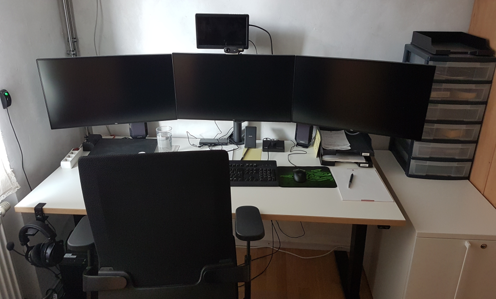
When the Corona pandemic hit in 2020, we moved to home offices all of a sudden. I wrote about this change several times on this blog. This physical separation led to an increased demand for video calls. I made sure everyone is covered with the basic equipment (webcam, headphones, etc.), including me. But I also experimented with the concept of a “virtual office”. It consisted of a video meeting room that I hung out in all workday. I turned the camera and microphone off, but was instantly present if somebody had a desire to talk to me – just like in the real office. For this use case, I installed an additional monitor on my setup, the fourth one, called the “pandemic display” in a blog post about it. Because I didn’t know if the experiment would work, I bought the smallest and cheapest display available for me.

The experiment went fine and I decided to equip everyone with an additional “videoconference display”. The new models were bigger and better. If an employee didn’t see the benefit of it, I didn’t force them to install one in their home office, but every workplace in the office has at least four monitors. Guess were the original one is still installed? I made sure everybody had a better monitor than me.

With this process, I can guarantee that my employees have the work equipment that is good enough for their boss. Because I have it too – or something inferior. If I feel the need to upgrade my gear, I upgrade everybody else and then lift my things to their level. If I feel comfortable with my gear, so does everybody else (except for individual demands and we have a process installed for that, too).

I love self-regulating systems and this is one: The whole company is equipped in a manner that is sufficient or even better for me to do the work. If I want more or better things, everybody gets the upgrade before me because only then do I allow myself to have the same luxury. No “upward” exception for the boss, and only temporarily “downwards”. My wants and needs define the lower limit of equipment quality for all of us. If I can’t buy it for everyone, I don’t buy it.

That is the whole trick: Equip yourself last or lowest. You can be sure everybody is well-equipped that way. Thanks, Simon!

Don’t Just Blink at Me

I have a lot of electronic devices that essentially only do one thing. A flashlight, a hair trimmer, a razor, a toothbrush, some smoke detectors and a handful of power banks and other energy storage devices. They have a few things in common:

  • They have their own rechargeable battery
  • They store a (more or less) complex internal state
  • They have exactly one status LED
  • They try to communicate with me using the LED

The razor is an exception, because it has a lot more signal lights than just the LED, but I include it as the positive example. The LED of the razor changes its color to show what it wants from me.

All other devices try to convey meaning by different styles of blinking. Let’s take the hair trimmer as the negative example: It blinks when it is happy because it is fed energy. The blinking stops to indicate that it is fully loaded.

The flashlight blinks when it is unhappy and hungry. It will stop blinking when it is fed. It never indicates that it has enough, you have to guess.

The smoke detectors flash shortly once in a while to show that they are still on duty. They might flash more vigorously if they get hungry. But they have another means to get the message across: They sound a short alarm. You’ll feed them instantly and always have a spare battery at hands.

The point of this story is that it is impossible to decipher a blinking LED. What does it mean? The device is busy and I don’t need to do something? The device is on the verge of starvation and I should intervene? It’s the most ambiguous signal I can think of.

If there were a standard that blinking means the desire for human intervention, I would learn the signal and adhere to it. But nearly half of my devices blink when they are busy and don’t need anything from me. And some try to talk to me in morse.

I’m not going to learn dozens of LED signal dialects. If a device wants to be understood, it should be designed in an understandable way. Give it a color-changing LED and we can talk:

  • Steady green: I’m happy.
  • Steady orange: I’m content, but it could be better. You might allocate some care for me.
  • Steady red: Please care for me.
  • Blinking red: Attention! I need urgent care.

What does this interaction design rant have to do with software development?

I often see the same categorical error in the design of software user interfaces. And while manufacturers of cheap consumer electronics can argue that a multi-color LED is more expensive, we software developers can’t really hide behind costs.

Anything that pops up, slides in or just blinks on my screen better has a damn good reason to try to grab my attention. Grabbing not only my attention but also my input focus is the upmost interruption, comparable to the alarm signal of the smoke detector. I blogged recently about a blocking dialog that shows up unprompted and informs about some random unprompted background work.

But there is another type of ambiguous signal that I see more often than I like. It is silent and tries to shift the blame for the inevitable frustration on you: The vague selection field:

Sorry for the german text, I didn’t find it on an english website. The german website this is from is still online, so if you can find it, you can try it yourself. I won’t link it here, though. (Maybe search for “steckdosenleiste klemmbar” and roam the results)

Let me describe your experience: you can select the color of a product, either white or black. The selected color is stated above, inexplicably written in the color blue. The selected field is “highlighted” black. Or is it? Maybe the white field is the highlighted one? And why is the selection field for the color black presented in mostly white?

The selection is not communicating properly, but I feel intimidated and stupid by a simple choice between two colors.

You can probably think of dozens of improvements and that’s fine. But the designer was certainly restricted by a corporate design rulebook and had to use three colors only: blue, white and black. You decide if he used his potential successfully.

Which brings me back to the introductory example: Give an engineer a single color LED and he will implement an elaborate morse code scheme to make the most of it. The problem is the initial restriction, not the shenanigans that follow.

How We Incidentally Increased Our Display Count Up to Five per Workplace

At the beginning of the year 2023, we had the plan to improve our office desk setup in two ways:

  • All desks should be electrically height-adjustable
  • All computers should be attached to the desk and not sitting on the floor

Had we known just how much turbulence this plan brings, we might have reconsidered it. But we finally finalized the project last week, just a few days before the year was over.

This blog entry tries to recap the story of the improvement project and mentions some particular products. We really use those products and are not affiliated with the manufacturers.

Our company has ten desks on two floors. A quick survey revealed that we have five electrically height-adjustable desks already in use. The remaining five desks were not really adjustable. Our plan was to move the five existing desks on one floor and equip the second floor with brand new ones. And because we wanted to achieve the second improvement in the same step, we switched the desk model.

Our new office tables are larger than before (180×80 cm instead of 160×80 cm) and definitely leeter. They are so leet, they are even called LeetDesks. Yes, we exchanged our boring classic office desks with modern pro-gaming desks. Our reasoning is that gaming is hard work, too. The nice thing is that the LeetDesks can be equipped with additional accessories like cable trays, monitor arms and the PC holder that would achieve our second goal.

So we ordered five individually configured gaming desks last year. Deconstructing the existing desks and assembling the new ones was an ongoing task. We bought a new cordless screwdriver after the first table.

When the team began to realize that we are really adjusting our work environment from ground up, new ideas emerged. The idea with the most impact was the change from workstation PC to “notebook desk”. Instead of a dedicated office PC in addition to the mobile work notebook, the office desk should accomodate the notebook in the best possible manner.

Ok, we swapped the PC holder with a notebook holder, no big deal. But how do you connect a notebook with many displays? We bought the only docking station that we could find that can drive three 4k displays over displayport cable: The Icy Box IB-DK2254AC. The fourth display is connected via HDMI directly with the notebook.

Now, the “pandemic setup” of displays is extended by a fifth display on one side: The integrated notebook display can be used to host the e-mails exclusively or show the company chat.

Request for picture requests: I don’t have an action shot of a five-displays workplace right now. But if you are interested how the setup looks like, leave us a comment and we try to supply one later.

Because the distance between displays and computer is now fixed-length and much shorter because the docking station adds its cable length, all the existing cables were too long. We had installed cables with a length of 3 meters to enable full vertical maneuverability. Now we switched back to 2 meters (or even shorter).

Not all of our notebooks were capable of driving that many pixels. Some older models had chipset graphics that gave up after the first external display. So we replaced them with newer models with dedicated notebook graphic cards.

Six of ten desks are now converted to notebook desks, which leaves four desks with PC holders and classic tower PCs. Traditionally, our PCs live in a “normal size” tower case, the Fractal Design Define series. This case is too big and too heavy for the PC holder. So we had to transplant the remaining PCs to a smaller case, the Fractal Design Defince Compact. We transplanted two of them and replaced the other ones a little bit sooner with new computers.

There were even more minor improvements that resulted in additional purchases, but those aren’t directly focussed on a single desk. So let’s recap:

We wanted our desks to be electrically height-adjustable and our floor free of computers. We ended up buying five new desks, six new docking stations, three new notebooks, two new computers, two empty computer cases, a bunch of notebook holders and many, many cables. The amount of cables that is necessary to operate a modern computer desk is astonishing.

We deconstructed, assembled, connected and hauled many days. The project ran the whole length of 2023 and racked up material costs north of 20k EUR.

But now, the floor is unobstructed and our work stance can change from minute to minute. And we increased our display count once more!

The Asylum Now Chooses Its Own Endeavors

There is a classic book from 1998 about interaction design and user experience called “The Inmates Are Running the Asylum” by Alan Cooper. It essentially points out that technology that is too hard to understand or handle is a self-chosen burden. We humans decided that our technology should be the way it is. We are the inmates of our digital (or technological) asylum and we built it ourselves.

There is another classic law of software design and software evolution, called Zawinski’s law:

Every program attempts to expand until it can read mail. Those programs which cannot so expand are replaced by ones which can.

Jamie Zawinski, 1995

If you interpret the law with some degree of freedom, that might mean that e-mail client applications are the pinnacle of software evolution, because they are designed to perform the one task every other application sets out to achieve.

You might think that an e-mail client can lean back and relax, knowing that it won’t be replaced and doesn’t need to adapt. It can concentrate on the one task it is asked to do, provide the perfect service and be the most essential tool for any digital worker.

But, for reasons that baffle me, my e-mail client apparently has better things to do than to deal with those pesky mails that I receive or want to send.

Let me tell you about my e-mail client. It is a Thunderbird running on Windows. If you want to attribute all the problems I’m about to point out to these two decisions, you probably miss the greater point that I’m trying to make with this blog post. It isn’t about Thunderbird or e-mail clients, it is about a software ecosystem that strays from its original intent: To serve the human operator.

Every morning, I open my e-mail client and let it run on a secondary monitor, just visible in my peripheral vision. Most of the day, it has nothing to do. I suspect that this causes boredom, because sometimes, it shows this dialog window out of the blue:

There are a few things wrong with this dialog:

  1. I didn’t ask for a folder compaction, so it is not necessary to tell me to “try again later”.
  2. Because I didn’t ask for anything, it surprises me that Thunderbird needs my interaction with a modal dialog in order to proceed with… doing nothing?
  3. If there is “another operation” that causes problems, I can only help if it has a name. Without more details given, I can only deduce that my Inbox is involved.
  4. My only choice is to close the modal dialog window. I cannot interact with Thunderbird until I dismiss the dialog. I cannot choose to “retry” or “view details”, even if I had resolved the unnamed problem outside of Thunderbird.

Think about what really happens here from an interaction design viewpoint: I command my e-mail client to stand ready to receive or send e-mails. It suddenly decides that something else is important, too. It does the thing and fails. It fails in such a grandiose manner that it needs to inform me about it and blocks all other interaction until I acknowledge its failure. It cannot fail silently and it cannot display the alert notification in a non-modal manner. My e-mail client suddenly commands me to click an arbitrary button or else… it won’t do my e-mail stuff anymore.

The digital asylum isn’t there to serve the inmates, the inmates are there to serve the asylum. Thunderbird doesn’t help me doing my e-maily things, I need to support Thunderbird to do its own things. The assistant involves the boss for secondary (or even less important) tasks.

The problem is that I recognize this inversion of involvement all the time:

  • The windows operating system decides that it needs to update right now. My job is to keep the machine running under all circumstances. Once I ran from one train to the next with the updating notebook in my hands, carefully keeping the lid open and the updates running.
  • My text editor might open the file I want to edit later, but first I need to decide if the latest update is more important right now. I cannot imagine the scenario when an update of a text editor is so crucial that it needs to happen before my work.
  • My IDE is “reconstructing the skeletons” or “re-indexing the files” whenever it sees fit. My job is to wait until this clearly more important work is done. I can see that these things help me do my thing later. But I want to do my thing now, maybe with slightly less help for a while.

Sometimes, I feel more like a precatory guest than the root administrator on my own machine. I can use it in the gaps between computer stuff when all applications decide that they generously grant me some computation time.

It’s not that there aren’t clear rules how computers should behave towards users. The ISO norm 9241-110 is very on point about this:

Users should always be able to direct their interaction with the product. They retain control over when to begin, interrupt, or end actions.

https://www.usability.de/en/usability-user-experience/glossary/controllability.html

We just choose to ignore our own rules.

We build a digital asylum for ourselves that is complicated and hard to grasp. Then we demote ourselves to guests in the very same asylum that we built and after that, we let the asylum choose its own endeavors.

If you translate this behaviour in the real world, you would call it “not customer-centered”. It would be the barkeeper that cleans all the glasses before you can order your drink. It would be the teacher that delays all student questions to the end of the lecture. Or it would be the supermarket that you can only enter after they stored all the new products on the shelves, several hours after “being open”.

By the way, if you want to help me with my mutinous Thunderbird: The problem is already solved. It is just a striking example of the “controllability violations” that I wanted to describe.

You probably have another good example of “inversed involvement” that you can tell us in the comments.

How my display usage changed over time

When I was eight years old, my parents bought our first computer. With it came a tiny monochrome display that could be used to show 80×25 characters in amber yellow. I’m typing this text on my most recent computer that is equipped with several displays that show a combined amount of nearly 27 million pixels with at least 2^24 colors each. I don’t dare to count the number of characters that are on screen right now. Something happened along the way.

The formative years

Me as an eight year old boy immediately “clicked” with that first computer. It became my destiny to unlock its full potential. I was delighted when my parents upgraded to a much better PC years later with a color display that could actually show 256 colors at once on a 14″ frame. It was still a CRT monitor, so the refresh rate was probably around 30 Hz and I remember the “fishbowl eyes” you got from longer computer sessions.

If we want to have a visual representation of this monitor, it looks like this:

14″ CRT, 4:3

My first own computer came with a 17″ CRT monitor, which was considered a luxury size and didn’t really fit on the desk. I used this monitor up until my first year of my studies. Nothing in my world would suggest that using more than one monitor per computer is even possible. This computer had a mouse without scroll wheel and no internet access:

17″ CRT, 4:3

When I studied computer science, I came in contact with a lot of people that all took computing and programming serious. Some had monitors the size of a freezer, which hinted at me (and my peers) that 17″ is not as lavish as we thought. But still, a computer had one CPU and one monitor. I scraped my money together and bought a 19″ flat panel CRT monitor. Flat panel just meant that the display area didn’t resemble a fish bowl by itself. It could run up to 60 Hz:

19″ CRT, 4:3

The professional setup

That was my personal computing situation when I founded my company in the third year of my studies. I knew that the equipment had to be better and more professional. Our first work computers still had one CPU and one monitor. It just happened to be gigantic 21″ CRTs. Our desks had extra depth to provide a healthy distance between eyes and display area. Those monitors were delicate enough to provide a “de-gauss” button that would unhinge random electronics around it if pressed:

21″ CRT, 4:3

This was how software was developed in the early 2000s. A “fast” computer with lots of RAM (1 GB were not unheard of), a magnetic harddisk with 160 GB of storage and still one CPU and one monitor. At least, they had internet access and a mouse with a scroll wheel now.

Everything we did, we did in the same place

This setup lasted for four or five years, with better computers, but still the same old monitors. Then, virtually over night, the prices for the new and very cool TFT “flat panel” monitors dropped to readonable numbers. These monitors were really flat and very thin compared to the CRT fish bowls that hogged our desks. We were thrilled and replaced all of our monitors within one year.

The double setup

But just as the CPUs now got two “cores”, we didn’t just replace our one monitor, we doubled it. Every workplace now had two monitors:

2x 24″ TFT, 16:10

And not just that. The monitors were bigger, better, smaller, easier on the eye and had a greater resolution (called WUXGA, essentially FullHD with some extra pixels on the vertical axis).

And we had two of them! This was a game changer because things that used to be done one after another could now be done in parallel – on the CPU and on the monitors. We began to dedicate screen estate to fixed activities:

The monitors are now assigned to certain tasks

The left monitor was the “coding space” while the right monitor was the “tryout space”. The actual distribution of activity to screen location differed from developer to developer, but we all agreed that we would not go back to single monitoring.

During that time, I was sometimes asked if two monitors “are worth the investment”. I blogged about it and I’m still convinced that a second monitor is the single most profitable investment you can do for a developer.

The triple setup

In the blog post above, I made one statement that I soon took back: A third monitor is not the game changer like the transition from one to two monitors, but – if the hardware issues are solved – the next step in the evolution that truly separates work, work result and communication:

3x 27″ TFT, 16:9

This setup is probably wider than your standard desk and requires a dedicated monitor stand, but it is the first time you can do the three essential things a programmer does in parallel:

  • Browse the internet (like stackoverflow or an API documentation)
  • Edit your source code in a fullscreen IDE
  • Watch the result of your changes live (with hot reloading)

Your workflow essentially moves your head from the left (gather new knowledge) over the middle (apply the new knowledge) to the right (evaluate the result of the new knowledge) and back again for the next step:

A typical left-to-right setup

This is our default workplace setup since 2018, with two possible resolution levels:

  • QHD: 3x 2560 x 1440 pixels. This results in 11 million pixels per computer
  • UHD: 3x 3840 x 2160 pixels. You now have almost 25 million pixels at your disposal

There is a biological limit what a human can see at once. This setup nearly fills your complete viewspace. You cannot fit a fourth monitor to the sides that you can really see. The only possibility to expand is now the vertical axis, with additional monitors above and maybe below.

The pandemic setup

I would probably still use the triple monitor setup if there hadn’t happened a fundemental change in the way we develop software in early 2020. In March 2020, we decided within days to abandon our office desks and retreat into home office workplaces that were improvised at first. Now, nearly two years later, all these workplaces are fully equipped and still continually improved. But not only our places changed, our communication as well. Video calls are a natural component of our workday now. And in my case, they happen in parallel to my normal work. So I had to dedicate screen space to videoconferencing. And I’ve done it by adding a fourth monitor:

3x 27″ TFT, 1x 10″ TFT, 16:9

This small monitor sits right next to the webcam, so if I look at my dialog partner, I also seem to look right into the camera. This setup adds a new distinctive activity to the mix:

You can guess what I’m doing by following my gaze

I’ve described the other ingredients for a fully equipped home office in a previous blog post. You can see an early photo of my setup in this post.

Conclusion

And this is the setup I’m writing this blog post on. 27 million pixels that I can use to speed up my workflow by assigning dedicated working zones. If you had asked my in 2009 if I can imagine to double the amount of monitors and have nearly six times more pixels available, I would have said no way.

But by looking back to the beginning, I can see how the fundamentals of personal computing changed in every aspect. A computer is no longer “one CPU” and it doesn’t have only one monitor. Today’s displaying technology is capable of providing a lot of screen estate. The main limiting factor is our own imagination. Reaping the benefits of dedicated display areas is satisfying and increases your work troughput effortlessly.

If you ask yourself how your ideal monitor setup should look like, try to reflect on how you move your application windows around or how often you switch applications without moving your head. If you would like to make the switch without hiding the previous context, you’ve just found a use case for an additional monitor.

What is your monitor setup and your usage pattern with it? Tell us in the comments!

Key ingredients for the home office

Since March 2020, we transformed from an “on-site” company to a remote company, not particularly because we wanted to, but because the corona pandemic forced us to. Our office is not suitable to ensure transmission safety, so I decided that work from home is the lesser problem. When I say “transform” and “decided”, please bear in mind that these are retrospect notions. The decision was made at Monday, March 16th 2020 and the transformation happened in the next two days.

But there is a real difference between being operable and fully equipped for the situation. We were operable in the remote situation within 48 hours. But we still work on improving our equipment to match the situation that seems to linger a lot longer than initially anticipated. This blog post tries to summarize what we’ve learned since March 2020 in regards to equipping home office workplaces past the makeshift phase.

The fundamentals

The most fundamental ingredients of any office workplace are the table and the chair. If any of those lack in necessary ergonomic features, your comfort will never be the same as in the office (provided that your equipment there is adequate). And this constant discomfort will permeat everything you do.

The chair was easier to detect because it shows up in the video calls, it is part of the “zoom room”. Still, it took some time to order new chairs or transport existing office chairs to the home offices. If you experience back pain or mechanically induced headaches, review your chair thoroughly.

The table was more tricky, because it is typically invisible during video calls. My approach was to retrieve a photo of every home office space and talk about the possible improvements. During these talks, we came up with two solution categories that I want to present.

The notebook workplace

We all had work notebooks as secondary computers before the pandemic. So it was not a problem to start with working from home on that notebook, we’ve done it before. But if all you do is to work directly at a notebook, you might have the best chair and table, your body posture will be suboptimal. We equipped the notebook-based workplaces with the following extras:

  • An external keyboard
  • An external computer mouse
  • One (or better: two) additional monitors
  • A matching docking station, at least to connect to the monitors
  • A notebook riser stand

The last item, the notebook riser stand, was the game changer when it came to multi-monitoring (two or three monitors). It elevates your notebook to the same height as the other displays and might even change its angle. This transforms your notebook from being the CPU unit with cumbersome monitor to a secondary monitor with a CPU. The riser stand doesn’t cost much (if you don’t go overboard with its design) and provides you with more table space and improved displays.

The existing computer workplace

Because we are software developers, we mostly have a very decent computer already fully equipped at home. The only problem: The computer is for private tasks and should stay that way. We want to separate our work environment from our leisure environment as much as possible. But several developers wanted to use their usual “battlestation” for home office work, too.

In this case, we bought a lavish SSD as an additional boot drive for the home PC. This separates the work operating system from the leisure drive as much as the notebook approach. And the existing hardware can be used for both timeslots, much to the comfort of the developer.

The video conference equipment

But regardless of your approach (notebook or existing computer), there are still some things missing that improve the quality of work of yourself and your colleagues tremendously:

  • A good headset, preferably with top-notch comfort and active noise cancelling (ANC)
  • An at least decent webcam

Most notebooks provide a mediocre webcam and some low quality microphone. Do yourself (and your communication partners) a favor and invest in a good microphone. Oftentimes, it is coupled with good headphones. The difference between a good audio setup and an echo-prone makeshift solution is the deciding factor when essentially all communication with your colleagues go through this channel.

The webcam is not as essential as the audio equipment, because it “only” affects your communication partners, but it adds a nice touch to your other equipment. You don’t have to go overboard on it, a model for one hundred euros is already an improvement.

The bottleneck

One thing that can really invalidate most of the other improvements is a small internet connection. This is probably to hardest thing to fix in a timely manner, but give it some thoughts. If your internet connection is too slow for your daily work and communication pattern, it will be a constant annoyance. Just because it takes some time to improve doesn’t mean you shouldn’t try.

We will probably remain in this situation long enough to still reap the profit of our effort. And even if not (at least we can hope), nobody ever complained about an internet connection that is a bit oversized.

TL;DR

If you didn’t read the article, here are the major take-away points neatly summarized:

  • Ergonomic chair and table
  • Notebook with external keyboard, mouse and monitor
  • Notebook riser stand
  • SSD for dual boot systems
  • Good headset
  • External webcam
  • “Broadband” internet

If you miss an item from this list for your home office, give it a thought. And if you plan to only think about one item, think about your chair first.

What are your experiences with working from home? What accessory makes your work life better? Give us a hint by writing a comment below. Thank you!

Personas: The great misunderstanding

Personas are a typical user research and design tool but are often misunderstood

Reminder: What are personas ?

Personas were first described by Alan Cooper in his ground breaking book “The inmates are running the asylum”:

Our most effective tool is profoundly simple: Develop a precise description of our user and what he wishes to accomplish.

He goes on to define personas as “hypothetical archetypes of actual users” and states that personas “are defined by their goals”.
One of the key points here is that personas are never made up but are grounded in research. They are used to provide condensed information about the result of the user research. Another take away is that a persona description should include its goals.

The misunderstanding

In recent times some designers dumped personas because they are 1) imaginary and 2) defined by attributes that leave out causality. The problem here is that personas are often seen as a collection of mere demographic data (like age, job, income, …). But this only describes marketing personas not the personas imagined by Alan Cooper. As seen in his books the data of a persona is never made up but inferred from user research. Also demographics play only a minor role in creating personas, citing Mr. Cooper again:

Personas are segmented along ranges of user behaviour, not demographics or buying behaviour.

So the behaviour of our users defines the persona not any demographic trait.

The causality mentioned in the criticism misses a vital part of a persona: the scenario. Personas go hand-in-hand with scenarios (by Alan Cooper, About Face):

Persona-based scenarios are concise narrative descriptions of one or more personas using a product or service to achieve specific goals.

and

Scenario content and context are derived from information gathered during the Research phase and analyzed during the Modeling phase

So with these scenarios personas describe the context and the goals and behaviours of our users.

As we see with the criticism the context, goals and motivations of our users are important. Personas and scenarios should not be made up but condensed from research. They are used to say ‘no’ to decisions in the process of designing. A word of warning: do not abstract your persona too far away from your users. One goal of personas are to built empathy. If your personas are too artificial your empathy will suffer. Also I like how Jeff Patton uses research findings: for him they are like vacation photos, if you’ve been there they are reminder what happened.

Consensus

The criticism largely comes from designers favoring the jobs-to-be-done (JTBD) methodology. Jobs-to-be-done is a framework to analyse and describe why a users hires a product or service to get something done. It provides a very useful perspective on the context and behaviour of users. Both approaches (personas and jobs) can be combined. Where personas provide a human connection, jobs provide a contextual one. Shahrzad Samadzadeh provides a sketch how both can be combined with the help of a journey map. All three methods help to balance each approach: the personas help to avoid making the jobs too analytic, the jobs help to ground and limit the personas in research valuable to the problem at hand and journeys can bring all together.

Learning UX from your clients

One of our web apps is based around many lists of different domain specific things like special pdf documents with metadata, affiliations and users. In most places you need pagination and different filter options to effiecently work with the data. Since the whole development process is highly incremental these features are only added when needed. That way we learned something about user experience from our clients:

One day we did a large import of users and with around 2K user accounts our user management looked ugly because we had around 160 pages with default settings. Our client rightfully told us he will not use the pagination featureall-users-pagination. Our brains immediately thought about technical solutions to the problem when the client came up with a super-simple dramatic improvement: Instead of preselecting the "all" filter just preselect the "a" filter to only show the users starting with the letter 'a'.  This solution fixed 95% of the clients problems and was implemented in like 10 minutes.

In another place we were dealing with similar amounts of affiliations which consist of several lines of address information and the like. Again we immediately thought about pagination, better layouting to save space and various performance improvements to help the usability. The dead-simple solution here was using the context information available and pre-filling a filter text box to reduce the number of entries in the list to a handful of relevant items. No other changes were needed because an important thing was implemented already: The controls for the list were either at the top of the list or integrated with each item making selection and scrolling down unnecessary.

Conclusions

It often helps to listen to your client/users to learn about the workflows and the information/options really needed to accomplish the most relevant tasks. They might come up with really simple solutions to problems where it is easy to put days of thought into. Using available context information and sensible preselections may help immensly because you display the informations the users most likely needs first and above while still allowing him to navigate to less important or more seldom needed things.

Another take-away is that pagination does not scale well. In most applications with large amounts of user visible items you will need more modern features like filters, type-ahead search and tags to narrow down the results and let the users focus at the currently needed items.

SSD and (One)-touch Backup solution

As explained a while ago we (developers) get an annual creativity budget. This time I decided to improve my notebook working experience and reliability by introducing two new items:

  1. A fast SSD replacing the conventional relatively slow 2,5″ hard disk
  2. An one-touch backup solution which in fact is a no touch solution

The SSD is a X25-m from Intel with 160Gb and the backup solution is a Seagate Replica with 500Gb disk space. Although there are recurring problems with the firmware and toolbox software the Intel SSD seemed to be the best choice price/performance/reliability wise. To be on a safer side data wise we paired it with the backup solution. Let me first explain the migration which went really smooth and was the first stress test for the backup system. The steps were the following:

  1. Backup the existing system with the replica which does not require any user interaction after the client backup software is automatically installed
  2. replace the original harddisk with the SSD
  3. reboot the system with the recovery CD of the replica solution and restore the backed up system
  4. reboot the recovered system from the SSD

The whole process went really smooth and only took some hours of data copying. There were no hickups whatsoever. After booting from the SSD my system was exactly like before, so the replica already proved that it really works even in the worst case of a complete drive loss.

The performance of the whole system is noticable better especially at system and application startup as you would expect.

Conclusion

The backup solution is so damn easy to use that I would recommend it to all people running Windows and caring about the data on their system. To keep your backup up to date just plug the external hard drive in a free USB port and continue working. You don’t have to do any configuration and other hassles which often end any effort of deploying a working backup solution. This is even more true for private people who do not have the knowledge to fiddle with system details. So go for a “one touch backup” if you do not have some working solution in use already!

A modern SSD can really improve your working experience especially on notebooks where hard disk performance is far worse than in an workstation environment. So older hardware can get new life and make your life easier and more productive.

On developer workplace ergonomics

Most developers don’t care much about their working equipment, especially their intimate triple. That’s a missed opportunity.

workplace_failMost developers don’t care much about their working equipment. The company they work in typically provides them a rather powerful computer with a mediocre monitor and a low-cost pair of keyboard and mouse. They’ll be given a regular chair at a regular desk in a regular office cubicle. And then they are expected (and expect themselves) to achieve outstanding results.

The broken triple

First of all, most developers are never asked about their favorite immediate work equipment: keyboard, mouse and monitor.

With today’s digitally driven flat-screens, the monitor quality is mostly sufficient for programming. It’s rather a question of screen real estate, device quantity and possibility of adjustments. Monitors get cheaper continuously.

The mouse is the second relevant input device for developers. But most developers spend more money on their daily travel than their employer spent for their mices. A good mouse has an optimal grip, a low monthly mouse mile count, enough buttons and wheels for your tasks, your favorite color and is still dirt cheap compared to the shirt you wear.

The keyboard is the most relevant device on a programmer’s desk. Your typing speed directly relies on your ability to make friends with your keyboard. Amazingly, every serious developer has her own favorite layout, keystroke behavior and general equipment. But most developers still stick to a bulk keyboard they were never asked about and would never use at home. A good keyboard matches your fingertips perfectly and won’t be much more expensive than the mouse.

Missed opportunities

The failure is two-fold: The employer misses the opportunity to increase developer productivtiy with very little financial investment and the developer misses the opportunity to clearly state her personal preferences concerning her closest implements.

Most employers will argue that it would place a heavy burden on the technical administration and the buying department to fit everybody with her personal devices. That’s probably true, but it’s nearly a one-time effort multiplied by your employee count, as most devices last several years. But it’s an ongoing effort for every developer to deliver top-notch results with cumbersome equipment. Most developers will last several years, too.

Some developers will state that they are happy with their devices. It really might be optimal, but it’s likely that the developer just hasn’t tried out alternatives yet.

Perhaps your organizational culture treats uniformity as professionality. Then why are you allowed to have different haircuts and individual ties?

Room for improvement

Our way to improve our workplaces was to introduce an annual “Creativity Budget” for every employee. It’s a fair amount of money destined to use one’s own creativity to improve productivity. It could also have been named “Productivity Budget”, but that would miss the very important part about creative solutions. There is no formal measurement of productivity and only loose rules on what not to do with the money. Above all, it’s a sign to the developer that she’s expected to personally care for her work environment, her equipment and her productivity. And that she’s not expected to do that without budget.

The Creativity Budget outcome

The most surprising fact about our budgets was that nearly none got fully spent. Most developers had very clear ideas on what to improve and just realized them – without further budget considerations. On top of that, everybody dared to express their preferences, without fear of overbearance. It’s not a big investment, but a very worthwile one.