Web Components – Reusable HTML without any framework magic, Part 1

Lately, I decided to do the frontend for a very small web application while learning something new, and, for a while, tried doing everything without any framework at all.

This worked only for so long (not very), but along the way, I found some joy in figuring out sensible workflows without the well-worn standards that React, Svelte and the likes give you. See the last paragraph for a quick comment about some judgement.

Now many anything-web-dev-related people might have heard of Web Components, with their custom HTML elements that are mostly supported in the popular browsers.

Has anyone used them, though? I personally haven’t had, and now I did. My use case was pretty easy – I wanted several icons, and wanted to be able to style them in a unified fashion.

It shouldn’t be too ugly, so why not take something like Font Awesome or heroicons, these give you pure SVG elements but now I have the Font Awesmoe “Magic Sparkles Wand” like

<svg xmlns="http://www.w3.org/2000/svg" viewBox="0 0 576 512"><!--!Font Awesome Free 6.5.1 by @fontawesome - https://fontawesome.com License - https://fontawesome.com/license/free Copyright 2024 Fonticons, Inc.--><path d="M234.7 42.7L197 56.8c-3 1.1-5 4-5 7.2s2 6.1 5 7.2l37.7 14.1L248.8 123c1.1 3 4 5 7.2 5s6.1-2 7.2-5l14.1-37.7L315 71.2c3-1.1 5-4 5-7.2s-2-6.1-5-7.2L277.3 42.7 263.2 5c-1.1-3-4-5-7.2-5s-6.1 2-7.2 5L234.7 42.7zM46.1 395.4c-18.7 18.7-18.7 49.1 0 67.9l34.6 34.6c18.7 18.7 49.1 18.7 67.9 0L529.9 116.5c18.7-18.7 18.7-49.1 0-67.9L495.3 14.1c-18.7-18.7-49.1-18.7-67.9 0L46.1 395.4zM484.6 82.6l-105 105-23.3-23.3 105-105 23.3 23.3zM7.5 117.2C3 118.9 0 123.2 0 128s3 9.1 7.5 10.8L64 160l21.2 56.5c1.7 4.5 6 7.5 10.8 7.5s9.1-3 10.8-7.5L128 160l56.5-21.2c4.5-1.7 7.5-6 7.5-10.8s-3-9.1-7.5-10.8L128 96 106.8 39.5C105.1 35 100.8 32 96 32s-9.1 3-10.8 7.5L64 96 7.5 117.2zm352 256c-4.5 1.7-7.5 6-7.5 10.8s3 9.1 7.5 10.8L416 416l21.2 56.5c1.7 4.5 6 7.5 10.8 7.5s9.1-3 10.8-7.5L480 416l56.5-21.2c4.5-1.7 7.5-6 7.5-10.8s-3-9.1-7.5-10.8L480 352l-21.2-56.5c-1.7-4.5-6-7.5-10.8-7.5s-9.1 3-10.8 7.5L416 352l-56.5 21.2z"/></svg>

Say I want to have multiple of these and I want them to have different sizes. And I have no framework for that. I might, of course, write JavaScript functions that create a SVG element, equip it with the right attributes and children, and use that throughout my code, like

// HTML part
<div class="magic-sparkles-container">
</div>

// JS part
for (const element of [...document.getElementsByClassName("magic-sparkles-container")]) {
    elements.innerHTML = createMagicSparkelsWand({size: 24});
}

// note that you need the array destructuring [...] to convert the HTMLCollection to an Array

// also note that the JS part would need to be global, and to be executed each time a "magic-sparkles-container" gets constructed again

But one of the main advantages of React’s JSX is that it can give you a smooth look on your components, especially when the components have quite speaking names. And what I ended up to have is way smoother to read in the HTML itself

// HTML part
<magic-sparkles></magic-sparkles>
<magic-sparkles size="64"></magic-sparkles>

// global JS part (somewhere top-level)
customElements.define("magic-sparkles", MagicSparklesIcon);

// JS class definition
class MagicSparklesIcon extends HTMLElement {
    connectedCallback() {
        // take "size" attribute with default 24px
        const size = this.getAttribute("size") || 24;
        const path = `<path d="M234.7..."/>`;
        this.innerHTML = `
            <svg
                xmlns="http://www.w3.org/2000/svg"
                viewBox="0 0 576 512"
                width="${size}"
                height="${size}"
            >
                ${path}
            </svg>
        `;
    }
}

The customElements.define needs to be defined very top-level, once, and this thing can be improved, e.g. by using shadowRoot() and by implementing the attributesChangedCallback etc. but this is good enough for a start. I will return to some refinements in upcoming blog posts, but if you’re interested in details, just go ahead and ask 🙂

I figured out that there are some attribute names that cause problems, that I haven’t really found documented much yet. Don’t call your attributes “value”, for example, this gave me one hard to solve conflict.

But other than that, this gave my No-Framework-Application quite a good start with readable code for re-usable icons.

To be continued…

In the end – should you actually go framework-less?

In short, I wouldn’t ever do it for any customer project. The above was a hobby experience, just to have went down that road for once, but it feels there’s not much to gain in avoiding all frameworks.

I didn’t even have hard constraints like “performance”, “bundle size” or “memory usage”, but even if I did, there’s post like Framework Overhead is bikeshedding that might question the notion that something like React is inherently slower.

And you pay for such “lightweightness” dearly, in terms of readability, understandibility, code duplication, trouble with code separation, type checks, violation of Single-Level-of-Abstraction; not to mention that you make it harder for your IDE to actually help you.

Don’t reinvent the wheel more often than necessary. Not for a customer that just wants his/her product soon.

But it can be fun, for a while.

How to design a dynamic website with flex containers

Every frontend developer will know this situation: You design a frontend so that all components fit together perfectly. You invest your time, heart, and soul, working tirelessly and frequently testing to see the results. And then you deliver it to a customer, only to find that their display presents something different. The beautiful design looks bad, or some parts are no longer accessible.

To avoid these unpleasant surprises, you should make your layout dynamic. One possibility for achieving this is by using the flex container. In the following, I will demonstrate how to dynamically build an example page using flex containers.

Example page

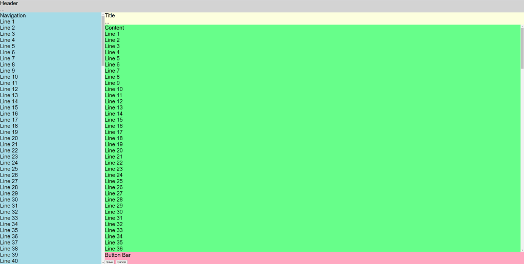
My example page has a header spanning the entire content. The content is divided into a navigation area on the left and the content page on the right. The content page itself has a header, main content and a button bar. Now let’s cast that into HTML.

<!doctype html>
<html>
    <body>
        <div class="whole-page">
            <div class="header">
                Header<br>
                ...
            </div>
            <div class="content">
                <div class="navigation">Navigation</div>
                <div class="content-page">
                    <div class="content-header">
                        Title<br>
                        ...
                    </div>
                    <div class="main-content">
                        Content
                    </div>
                    <div class="button-bar">
                        Button Bar<br>
                        <button>Save</button>
                        <button>Cancel</button>
                    </div>
                </div>
            </div>
        </div>
    </body>
</html>

And now for the design: I want my page to take up the entire screen. The navigation area should take up 20% of the width, and the page should take up the rest. I want the button bar to be at the bottom of the screen and the main content to take up as much space as possible between the heading and the bar.

Let’s implement this with CSS:

html, body {
    font-family: sans-serif;
    font-size: 20pt;
    height: 100%;
    margin: 0;
}
.whole-page{
    display: flex;
    flex-direction: column;
    height: 100%;
    width: 100%;
}

.content {
    display: flex;
    flex-direction: row;

    flex-grow: 1;
    min-height: 0;
}
.navigation {
    min-width: 20%;
    overflow: auto;

}
.content-page {
    display: flex;
    flex-direction: column;
  
    flex-grow: 1;
    min-width: 0;
}

.main-content {
    flex-grow: 1;
    overflow: auto;

}

First, we configure html and body to take up the entire screen. To do this, we set the height to 100% and remove margins.

In the next step, we say that the layout of the whole page should build up flexibly among itself (column) and set the size to the maximum size of the screen.

For the parts with fixed sizes, like headers and the button bar, no further settings are needed.

The content also gets a dynamic layout, but side-by-side (row). Since row is the default, you would not have to write it explicitly, but I did it here for explanation. With “flex-grow: 1” we make the content take the maximum remaining height. With “min-height: 0” we prevent it from hogging more space than is still available and overflowing the screen.

Our navigation area gets the min-width of 20%. In most cases, width is sufficient, but, for example, with tables with large test cells, the table steals more space from the navigation than allowed. With min-width, this does not happen. As a bonus, the area gets a scrollbar with “overflow: auto” if the content is too big.

The content page arranges the elements in columns again and takes the maximum available width. The main content takes all the space left next to the header and button bar and gets a scrollbar if there is not enough space available.

When I fill my containers with background color and example content, I get the following views:

Conclusion

Flex containers are an easy way to create page layouts dynamically. Thus, applications can run independently of the screen to a certain extent. Of course, the whole thing also has its limits, and for very small devices such as smartphones, completely different operating concepts and layouts must be developed.

CSS: z-index can be weird.

Before I start this post, there are three things I want to state:

  1. If you think the “z-index” is quite simple, you probably never bothered to care.
  2. When in doubt, one can always read the official specification
  3. There are multiple good elaborations available already (see bottom of this post), but I was missing a comprehensive list of the most important points.
Quick Motivation (skip that if you only want the facts)

Yes. We know: The web has become a place which it never intended to be. Nowadays, it seems to be accommodate everything. You want live control of measurement devices? 3D camera applications? Advanced data wizardry? Or in my case, a kind of sophisticated layout engine? … Web Dev in 2021 gives you the impression that it is all merely a matter of time (or cost).

But then, there are always the caveats. Some semi-suggestive idea turns out to be not that accessible at all. Our user experience considerations made us implement “kind of basic” windows (in the operation system sense), that appear at times and disappear at other times, and give the user maximum information while maintaining minimum clutter.

Very early on, I noticed that I had to implement my own drag’n’drop functionality, because HTML5 isn’t really there yet. But I consider that as something advanced, which also has its idiosyncrasy in every conceivable use case, so that’s ok.

But then again, a somewhat-native-feeling windowing system (even if they are only rectangles with text) makes use of a seemingly simple thing: That stuff gets drawn over other stuff in the right order. And this comes with certain pecularities.

The painting order of HTML elements is divided into stacking contexts. Stacking contexts can be stacked above or below each other, and most of the times they behave as expected, but sometimes, they are not. So, for the roundup…

Stacking Context – Essential Rules

(This assumes CSS knowledge, but don’t hesitate to comment if you have any questions.)

  • If you set any z-index, you set that z-index within the current stacking context.
    • You can never enter an outside stacking context, only create new ones inside
  • One stacking context as a whole is always either above or below other stacking contexts as a whole
  • The root stacking order (from the <html> element) is as you expect:
    • Further down in the HTML source means more upfront
  • Higher z-index means “more upfront”, but
    • z-index doesn’t mean a thing if your neighboring elements do not live inside the same stacking context!
  • Within any parent stacking context, new child stacking contexts are created by
    • Setting CSS “position” to something other than “static”
    • Setting a z-index different from the default value “auto”
      • For clarity: “z-index: 0;” is nearly the same as “z-index: auto;”, but the latter doesn’t open up a child stacking context, while the former does.
    • Setting CSS “display: flex;” or “display: grid”
    • Setting CSS: “isolation: isolate;” (what is that even?)
    • Setting CSS: “will-change” to something non-initial (what is that even?)
    • Setting one of the “graphically advanced” CSS properties like
      • opacity, transform, filter, mix-blend-mode, clip-path, mask, …

There is more, but maybe this can help you bugtracing. And two meta-points:

  • CSS evolves, so with new features, always have stacking context in mind
  • In a framework context (like the React biosphere), you might not know what your imported dependencies do under the hood. Maybe better isolate them.
Reading recommendations:

They have nice illustrations, too.

If everything fails, go back to square one:

https://www.w3.org/TR/CSS2/visuren.html#propdef-z-index

Be aware.

Changing the keyboard navigation behaviour of form inputs

The default behaviour in HTML forms is that you can move the focus from one input element to the next via the tab key and submit the form via the enter key. This is also how dialogs work on most operating systems when using the native UI components. This behaviour is consistent across all browsers, and changing it messes with the user’s expectations and reduces accessibility. So I would normally advise against changing this behaviour without good reasons.

However, one of our customers wanted a different behaviour for an application developed by us. This application replaced an older application where the enter key did not submit the form, but moved the focus to the next input element. The ‘muscle memory’ effect made users accidentally submit the form by hitting the enter key, causing frustration. Since this application is not a public web site, but merely a web technology based intranet application with a small and specialized user base, changing the default behaviour is acceptable if the users want it.

So here’s how to do it. The following JavaScript function focusNextInputOnEnter takes a form element as a parameter and changes the focus behaviour on the input elements within this form.

function focusNextInputOnEnter(form) {
  var inputs = form.querySelectorAll('input, select, textarea');
  for (var i = 0; i < inputs.length; i++) {
    var input = inputs[i];
    input.addEventListener('keypress', (function(index) {
      return function(event) {
        if (!isEnter(event.which)) {
          return;
        }
        var nextIndex = index + 1;
        while (nextIndex < inputs.length) {
          var nextInput = inputs[nextIndex];
          if (nextInput.disabled) {
            nextIndex++;
            continue;
          }
          nextInput.focus();
          break;
        }
      };
    })(i));
  }

  function isEnter(keyCode) {
    return keyCode === 13;
  }
}

It works by handling the keypress events on the input elements and checking the key code for the enter key (code 13). It has an additional check so that disabled input elements are skipped.

To apply this change in behaviour to a form we have to call the function when the DOM content is loaded:

<form id="demo-form">
  <input type="text">
  <input type="text" disabled="disabled">
  <input type="checkbox">
  <select>
    <option>A</option>
    <option>B</option>
  </select>
  <textarea></textarea>
  <input type="text">
  <input type="text">
</form>

<script>
  document.addEventListener('DOMContentLoaded', function() {
    focusNextInputOnEnter(document.getElementById('demo-form'));
  });
</script>

I want to reiterate my warning that you should definitely not do this for public web sites, and elsewhere only if you know that this is what your users want.

Dynamic addition and removal of collection-bound items in an HTML form with Angular.js and Rails

A common pattern in one of our web applications is the management of a list of items in a web form where the user can add, remove and edit multiple items and finally submit the data:

form-fields

The basic skeleton for this type of functionality is very simple with Angular.js. We have an Angular controller with an “items” array:

angular.module('example', [])
  .controller('ItemController', ['$scope', function($scope) {
    $scope.items = [];
  }]);

And we have an HTML form bound to our Angular controller:

<form ... ng-app="example" ng-controller="ItemController"> 
  <table>
    <tr>
      <th></th>
      <th>Name</th>
      <th>Value</th>
    </tr>
    <tr ng-repeat="item in items track by $index">
      <td><span class="remove-button" ng-click="items.splice($index, 1)"></span></td>
      <td><input type="text" ng-model="item.name"></td>
      <td><input type="text" ng-model="item.value"></td>
    </tr>
    <tr>
      <td colspan="3">
        <span class="add-button" ng-click="items.push({})"></span>
      </td>
    </tr>
  </table>
  <!-- ... submit button etc. -->
</form>

The input fields for each item are placed in a table row, together with a remove button per row. At the end of the table there is an add button.

How do we connect this with a Rails model, so that existing items are filled into the form, and items are created, updated and deleted on submit?

First you have to transform the existing Ruby objects of your has-many association (in this example @foo.items) into JavaScript objects by converting them to JSON and assigning them to a variable:

<%= javascript_tag do %>
  var items = <%= escape_javascript @foo.items.to_json.html_safe %>;
<% end %>

Bring this data into your Angular controller scope by assigning it to a property of $scope:

.controller('ItemController', ['$scope', function($scope) {
  $scope.items = items;
}]);

Name the input fields according to Rails conventions and use the $index variable from the “ng-repeat” directive to provide the correct index value. You also need a hidden input field for the id, if the item already has one:

  <td>
    <input name="foo[items_attributes][$index][id]" type="hidden" ng-value="item.id" ng-if="item.id">
    <input name="foo[items_attributes][$index][name]" type="text" ng-model="item.name">
  </td>
  <td>
    <input name="foo[items_attributes][$index][value]" type="text" ng-model="item.value">
  </td>

In order for Rails to remove existing elements from a has-many association via submitted form data, a special attribute named “_destroy” must be set for each item to be removed. This only works if

accepts_nested_attributes_for :items, allow_destroy: true

is set in the Rails model class, which contains the has-many association.

We modify the click handler of the remove button to set a flag on the JavaScript object instead of removing it from the JavaScript items array:

<span class="remove-button" ng-click="item.removed = true"></span>

And we render an item only if the flag is not set by adding an “ng-if” directive:

<tr ng-repeat="item in items track by $index" ng-if="!item.removed">

At the end of the form we render hidden input fields for those items, which are flagged as removed and which already have an id:

<div style="display: none" ng-repeat="item in items track by $index"
ng-if="item.removed && item.id">
  <input type="hidden" name="foo[items_attributes][$index][id]" ng-value="item.id">
  <input type="hidden" name="foo[items_attributes][$index][_destroy]" value="1">
</div>

On submit Rails will delete those elements of the has-many association with the “_destroy” attribute set to “1”. The other elements will be either updated (if they have an id attribute set) or created (if they have no id attribute set).

A more elegant way to HTTP Requests in Java

The support for sending and processing HTTP requests was always very basic in the JDK. There are many, many frameworks out there for sending requests and handling or parsing the response. But IMHO two stand out: HTTPClient for sending and HTMLUnit for handling. And since HTMLUnit uses HTTPClient under the hood the two are a perfect match.

This is an example HTTP Post:

HttpClient client = new HttpClient();
PostMethod post = new PostMethod(url);
for (Entry param : params.entrySet()) {
    post.setParameter(param.key, param.value);
}
try {
    return client.executeMethod(post);
} finally {
    post.releaseConnection();
}

and HTTP Get:

WebClient webClient = new WebClient();
return (HtmlPage) webClient.getPage(url);

Accessing the returned HTML via XPath is also very straightforward:

List roomDivs=(List)page.getByXPath("//div[contains(@class, 'room')]");
for (HtmlElement div:roomDivs) {
  rooms.add(
    new Room(this,
      ((HtmlElement) div.getByXPath(".//h2/a").get(0)).getTextContent(),
      div.getId())
  );
}

One last issue remains: HTTPClient caches its cookies but HTMLUnit creates a HTTPClient on its own. But if you override HttpWebConnection and give it your HTTPClient everything works smoothly:

public class HttpClientBackedWebConnection extends HttpWebConnection {
  private HttpClient client;

  public HttpClientBackedWebConnection(WebClient webClient,
      HttpClient client) {
    super(webClient);
    this.client = client;
  }

  @Override
  protected HttpClient getHttpClient() {
    return client;
  }
}

Just set your custom webconnection on your webclient:

webClient.setWebConnection(
  new HttpClientBackedWebConnection(webClient, client)
);

How to find the HTML Entity you look for

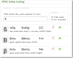
As a webdeveloper have you ever wondered how a special character has to be encoded as a html entity? There is a nice little tool available online that will answer your call for help.EntityLook for 'b' What makes the tool really rock is the simplicity and great incremental search. Typing in the letter ‘c’ will present you entities for “cent”, “copyright”, the greek “sigma” and mathematical entities like “superset” because the basic shape of the resulting special character is also considered. Upon entering a ‘b’ you will get the german ß as one of the results.This kind of search is almost a “do what I mean” feature and very helpful if you do not know exact substrings or meaning of your special character.

There is a Firefox-Extension and as a special goodie for our beloved Mac-users there is even a dashboard widget available that works without internet connection and is a bit more convenient to use than the web application.